The New York Times reports on how the CDC struggled and failed on many levels. On the data front, where it was so important in the beginnings to gauge what was about to happen, the CDC failed to get accurate data to the people who needed to make decisions quickly:
The C.D.C. could not produce accurate counts of how many people were being tested, compile complete demographic information on confirmed cases or even keep timely tallies of deaths. Backups on at least some of these systems are made on recordable DVDs, a technology that was state-of-the-art in the late 1990s.
The result is an agency that had blind spots at just the wrong moment, limited in its ability to gather and process information about the pathogen or share it with those who needed it most: front-line medical workers, government health officials and policymakers.
Painful.
Also, a little too familiar.
In 2014, I wrote a guide on how to make government data sites better. I used the CDC data offerings as my running example.
I criticized how hard it was to get data in a usable format, how the extraction tools were a chore to use, the lack of context to go with the data, and the challenge of just finding the data on a sprawling website.
The kicker at the end:
There’s plenty more stuff to update, especially once you start to work with the details, but this should be a good place to start. It’s a lot easier to point out what you can do to improve government data sharing than it is to actually do it of course. There are so many people, policies, and oh yes, politics, that it can be hard to change.
Maybe give it a try anyway.
Seek out the people who care.
Maybe start with an area you are already strong, improve on it, and branch from there. In the case of CDC, a start with WONDER or Data.CDC might be where it’s at. Or maybe start by unifying the topic pages and all those spreadsheets.
As an outsider looking in, I can’t say for sure the best place to start. I don’t know all the administrative baggage that comes with updating these sites. I would just hate to come back to this five years from now and see that nothing changed or worsened because of age.
Nothing changed. And it worsened with age.

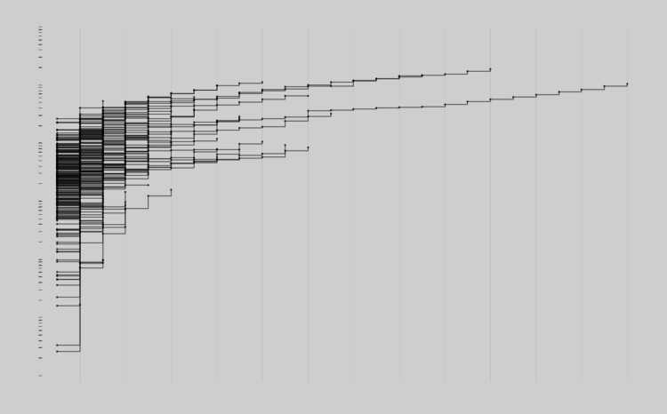
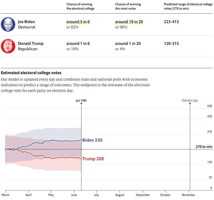


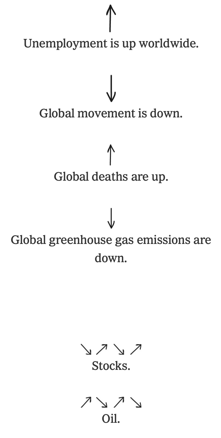 The coronavirus has changed everything. Larry Buchanan, for The New York Times,
  Visualize This: The FlowingData Guide to Design, Visualization, and Statistics (2nd Edition)


