Every month I collect useful visualization tools and resources to make better charts. Here’s the good stuff for May.
It’s hard to think of much else. These maps show the racial divide between black and white people in major cities.

We like to complain about how data is messy, not in the right format, and how parts don’t make sense. Reality is complicated though.

The Census Bureau has been running the Household Pulse Survey since April 23, 2020 to get some gauge for how the pandemic is changing things at home. Here’s how things look so far.
Every month I collect useful visualization tools and resources to make better charts. Here’s the good stuff for May.
The Federal Procurement Data System tracks federal contracts of $10,000 or more. For ProPublica, Moiz Syed and Derek Willis made the data for coronavirus-related contracts more accessible with a searchable database. Browse the items, the companies, and the amounts. Somehow it seems like so much, and yet so not enough.
See also the accompanying article highlighting some of the more questionable contracts.
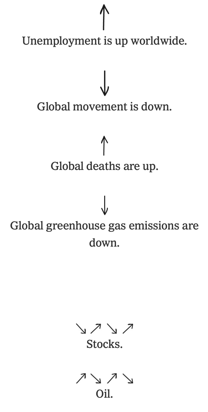 The coronavirus has changed everything. Larry Buchanan, for The New York Times, goes minimalist with a series of up and down arrows to show which direction things moved.
Even though there’s no magnitude or axes, it still works. In some ways, the simplistic view is more effective than regular charts.
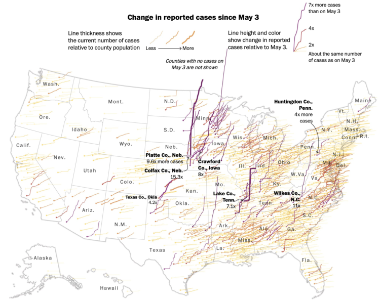
This map by Tim Meko for The Washington Post uses time series lines to show change in confirmed cases by county. Using a combination of line thickness, height, and color, the map highlights the counties with the greatest change since early May.
Hairy.
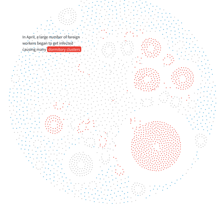
For Reuters, Manas Sharma and Simon Scarr animated a coronavirus outbreak in Singapore between January and April, going with the force-directed bubble view. It starts small, then there’s the spread, and clusters form.
A Yahoo News/YouGov poll recently showed this:
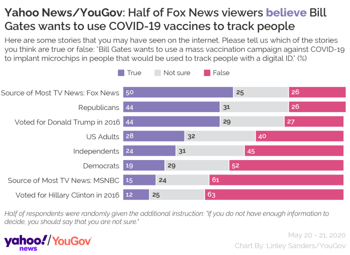
Only 40% of American adults are like, “No way. This is false.” But then there are 32% who are like, “Well… maybe? I don’t know.” Then there are over a quarter who are like, “Yeah, he’s trying to track us.”
Really? Please tell me there is some study that shows internet-based polls are crazy. My brain is having trouble processing these results.
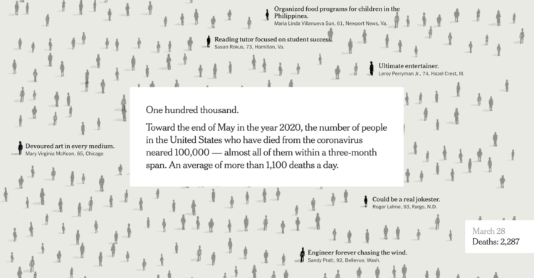
The New York Times used their full front page to list 1,000 names of the 100,000 who died due to the virus. There is an online version, which is equally moving.

This is The New York Times front page for Sunday, May 24, 2020.
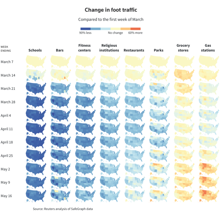
Using anonymized cellphone data from SafeGraph, Reade Levinson and Chris Canipe for Reuters mapped the change in foot traffic for different types of businesses over time.
Orange represents more movements since the first week of March. Blue means less. Yellow means about the same. We’re working towards all orange. Fingers crossed.
Sidenote: Now isn’t really the time, but when it is, we’re gonna have to come back to this mobile data stuff. Clearly it has its uses, but with so many offerings, there’s bound to be a less than useful leak.
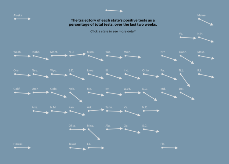
With coronavirus testing, many governments have used the percentage of tests that came back positive over time to gauge progress and decide whether or not it’s time to reopen. To calculate percentage, they divide confirmed cases by total tests. The denominator — total tests — often comes from the CDC, which apparently hasn’t done a good job calculating that denominator, because not all tests are the same.
Alexis C. Madrigal and Robinson Meyer for The Atlantic:
Mixing the two tests makes it much harder to understand the meaning of positive tests, and it clouds important information about the U.S. response to the pandemic, Jha said. “The viral testing is to understand how many people are getting infected, while antibody testing is like looking in the rearview mirror. The two tests are totally different signals,” he told us. By combining the two types of results, the CDC has made them both “uninterpretable,” he said.
Oh.
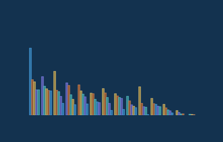
The Georgia Department of Public Health published a questionable chart showing confirmed Covid-19 cases over time. Intentionally misleading or poorly made chart?
States are reopening. Some seem ready, and some less so. Lena V. Groeger and Ash Ngu for ProPublica made a reference so that you can quickly see how your state is doing in five important metrics:
To give people context on state reopenings, and what happens afterward, we are tracking metrics derived from a set of guidelines published by the White House for states to achieve before loosening restrictions. Even if these criteria are met, without a vaccine, reopening may cause an increase in cases. What’s more, some states may meet all of the criteria and still have a high infection rate.
There’s a national overview, as shown above, and then it quickly goes to the individual states.
Check out Groeger’s thread for some process.
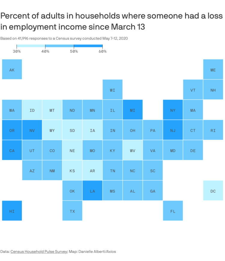
This straightforward grid map by Danielle Alberti for Axios shows the percentage of adults in a household where someone lost employment income. In all likelihood, you know someone affected in one way or another.
The data comes from the Census Household Pulse Survey, which is an effort to gauge the impact of Covid-19.
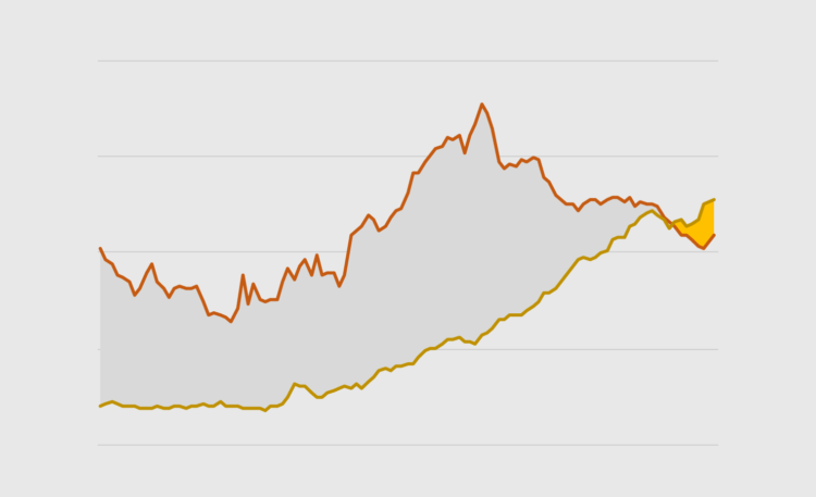
Also known as a bivariate area chart, the plot type focuses on the comparison between two time series.

What does the coronavirus look like? Rebekah Frumkin for The Paris Review highlights various illustrations and renderings, focusing on why each looks the way it does:
The disease that has put the entire world on pause is easily communicable, capable of stowing silently away in certain hosts and killing others, and, to the human eye, entirely invisible. In media parlance it’s become our “invisible enemy”: a nightmarish, oneiric force that can’t be seen, heard, or touched. But with the use of modeling software, scientists and illustrators have begun to visualize coronavirus, turning it into something that can be seen, understood, and, hopefully, eventually vanquished by science. Many of us imagine the virus as a sphere radiating red spikes—but why? Certain elements of these visualizations are based on the way coronavirus appears under a microscope, and others are choices that were made, an exercise of artistic license.
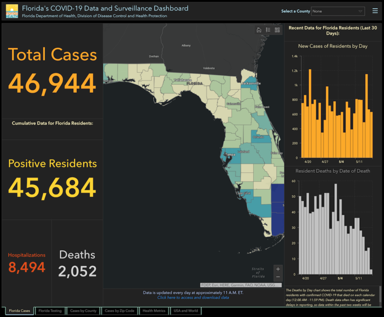
Rebekah Jones, GIS manager for the Florida Department of Health, was fired a couple of weeks ago, apparently for making the state’s Covid-19 data more accessible and transparent. Florida Today reports on an email that Jones sent to researchers:
She warned that she does not know what the new team’s intentions are for data access, including “what data they are now restricting.”
“I understand, appreciate, and even share your concern about all the dramatic changes that have occurred and those that are yet to come,” she wrote.
“As a word of caution, I would not expect the new team to continue the same level of accessibility and transparency that I made central to the process during the first two months. After all, my commitment to both is largely (arguably entirely) the reason I am no longer managing it.”
Hm.
 Visualize This: The FlowingData Guide to Design, Visualization, and Statistics (2nd Edition)
New tools, refined process.


