I guess we’re going to learn a good bit about tariffs over the next few years. Bloomberg is keeping track by target and possible impact. While WaPo used four tariff stages, Bloomberg goes with three: imposed, threatened, or suspended.
-
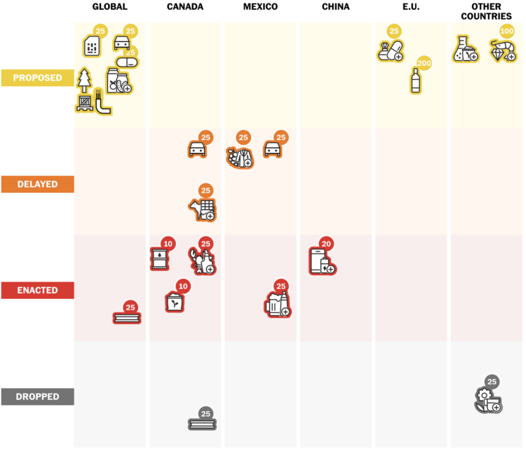
Tariff announcements seem to waver in tone and finality depending on the day. It’s hard to keep track of what might happen and what is actually happening. For the Washington Post, Alyssa Fowers, Leslie Shapiro, and Amaya Verde provide a scrolling timeline to show where we’ve been and where things are at.
The icons, with tariff percentages attached, move between four stages: proposed, delayed, enacted, and dropped. There seems to be a lot of switching.
-

Any Map Puzzle by Ahmad Barclay lets you search for a location and play the location as a slide puzzle. Choose the map tiles (Stamen Watercolor, OpenStreetMap, and ESRI World Imagery) and grid size and puzzle away.
-
Aggregating Time Use Microdata
Being able to work with microdata from the American Time Use Survey, via IPUMS, means you can subset, filter, and categorize how you want. This makes it easier to explore questions.
-
You’re familiar with AD and BC, but you probably haven’t heard of AiP for after iphone or ATP for after toilet paper. Jonny Thaw made a fun interactive that shows a given year compared against a lot of other things in history. So dumb, yet so informative.
-
23andMe, the business predicated on people sending cheek swabs to have their DNA analyzed, exposed the personal data of half of customers in a data breach a couple years ago. The company filed for bankruptcy. Lily Jamali for BBC reports:
Founded in 2006, the company went public in 2021 but has never turned a profit.
In September, the firm settled a lawsuit alleging that it failed to protect the privacy of nearly seven million customers whose personal information was exposed in a 2023 data breach.
In some cases, hackers gained access to family trees, birth years and geographic locations, by using customers’ old passwords. The data stolen did not include DNA records, according to the company.
If you used the service, maybe keep an eye on what happens to your data if the company goes under or is sold off. The California attorney general issued a customer alert with instructions on how delete your data, destroy your sample, and revoke data permissions.
-
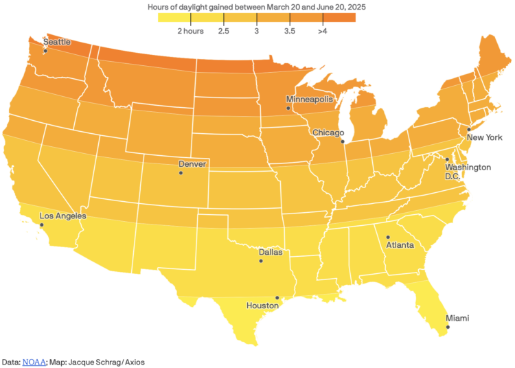
Spring officially started last week here in the Northern Hemisphere. For Axios, Jacque Schrag mapped the hours of daylight gained in between the spring equinox on March 20, 2025 and summer solstice on June 20, 2025.
This is based on sunrise and sunset times from NOAA.
I started spring this weekend with yard work in a warm but not too hot low 70s. Not too shabby.
-

What if the game Asteroids used Wikipedia edits to drive the volume and size of the objects hurling towards your ship? Kevin Payravi makes your dreams into reality with WikiAsteroids:
I recently launched WikiAsteroids (asteroids.wiki), a browser game that takes the classic arcade space shooter concept and adds a Wikipedia twist: each time someone makes an edit on Wikipedia, a new asteroid spawns. The size of the asteroid corresponds to the size of the edit. Blue asteroids represent edits with a net increase in content, while red ones indicate a net decrease. A new article creation spawns an extra life, and new user registrations spawn one of several possible power-ups (such as a shield, faster shooting, or slow-motion).
-
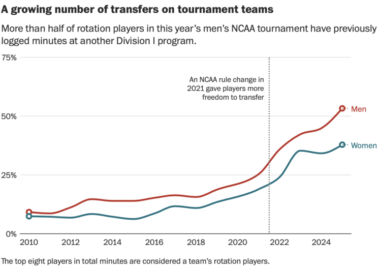
For the Washington Post, Emily Giambalvo, Kati Perry, and Jesse Dougherty analyze the playing time for players who transferred from another program.
To understand the phenomenon and its impact, look no further than the men’s and women’s NCAA tournament fields. On the men’s side, 53 percent of all rotation players previously logged minutes at another Division I school, according to a Washington Post analysis. Roughly one-third of these key contributors — the top eight players in total minutes on each roster — played for another D-I program just last season.
Now I want an analysis for academics and research prowess. “I will be taking my statistical talents to the University of California, Berkeley this semester.”
-
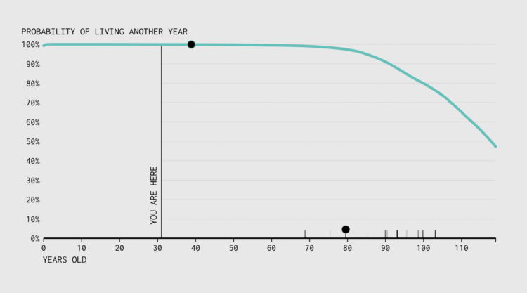
With absolute certainty, you will die. When will it happen? That is a trickier question. But we can run simulations to explore the possibilities.
-

For Letterform Archive, designer Angie Wang examines a collection of chopstick sleeves as it relates to Japan:
Paper chopstick sleeves emerged at the turn of the 20th century when disposable chopsticks and packaged meals gained popularity with the advent of train travel. In addition to ensuring cleanliness, printed paper chopstick sleeves became vernacular advertisements for shops and restaurants.
The latest addition to the Archive’s holdings of Asian ephemera is the hashibukuro collection of Mr. Susumu Kitagawa of Fuji City, Japan. While individually modest in their design and messaging, when considered as a whole the sleeves that comprise this collection map a singular history of Japanese ideology and aesthetics.
-

The purpose of onomatopoeia is to imitate sounds with words, so you might expect the words for animal sounds to be similar across languages. For the Pudding, Vivian Li shows that this is not always the case.
Onomatopoeia offers a fascinating glimpse into the interaction between sound and language. The way humans mimic animal sounds reflects not only shared biological instincts but also distinct cultural filters. Although onomatopoeia intends to imitate faithfully, its differences are ultimately far from arbitrary. In trying to capture the same auditory essence, English interprets a pig’s sound as [ojŋk], yet Hungarian hears [røf], and Vietnamese hears [ʔut it]. Even among the three animals discussed, cats are more consistent in their sound interpretation, while pigs are more variable — whether because pigs’ vocalizations are innately more complex, or because they call upon different phonotactic rules.
All the words are clickable so that you can hear pronunciations for different languages. Colors indicate phone groups, such as nasal consonants and mid central vowels.
-
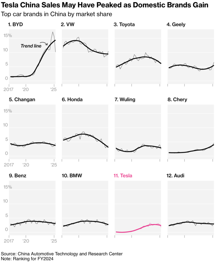
I like this chart set from Bloomberg that shows the top brands, ranked by market share in 2024. Faded lines show true estimates, and thicker lines in the foreground provide the trends. Tick labels are limited to the first column on the left to avoid busyness. Straightforward but effective.
In the U.S., we usually see BYD, an electric vehicle car brand, mentioned in the context of Tesla as the competition. But it doesn’t look like much of a competition. BYD has rapidly gained market share in China over the last five years.
-
FiveThirtyEight is gone, and along with its visualization-centric projects, so is their poll tracking that they and others used to analyze public sentiment. The New York Times is picking up the baton:
As one half of the Times/Siena College poll, which has been recognized as one of the country’s premier pollsters, we believe there’s value in an individual poll. But we also think aggregating polls and providing analysis of them collectively, as we did during last year’s election, is a service worth preserving — one that may be needed even more today with the profusion of polling, contradictory findings and loud partisan voices.
We’re building on the work of the politics website 538, which for several years released this data as a public service until it was shuttered by ABC News this month, and which itself followed in the path of Pollster.com at The Huffington Post. Our goal is to ensure that this resource, which is a foundational tool for many journalists and researchers, remains updated long-term. The data will be made available free for anybody to use as they wish, so long as they provide attribution to The Times. (If you’re still using data collected by 538, you may still need to give it attribution as well.)
They’re starting with presidential approval ratings.
-
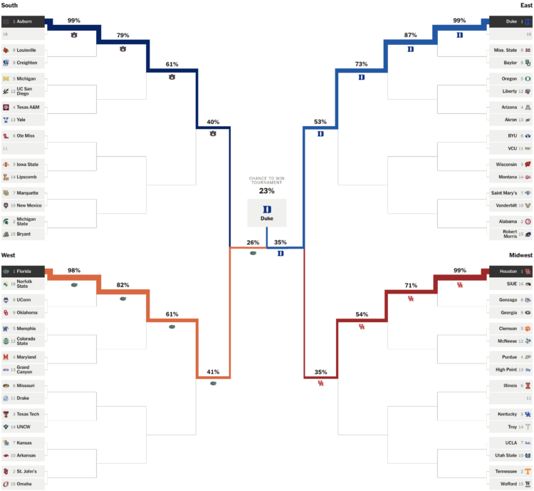
Leading up to the NCAA Men’s basketball tournament, the Athletic has a bracket with projections expressed as win probabilities in each round. Surprise, Duke is heavily favored to win, which can only mean everyone’s brackets will be ruined early.
On methodology:
We create an offensive and defensive projection for every college basketball team using various box score metrics. These projections estimate how many points a team would score and allow in a game against an average opponent on a neutral court. We then assign a probability of how likely a team is to win a given game by adjusting for opponent, location and team health. Taking into account the bracket, we use the projections to simulate the tournament 200,000 times.
After those 200,000 simulations, we calculate how often a team is to make each round of the tournament and win the championship. For example, if a team has a 10 percent chance of making the Final Four, that means that they’ve made the Final Four in 10 percent of the simulations run.
-
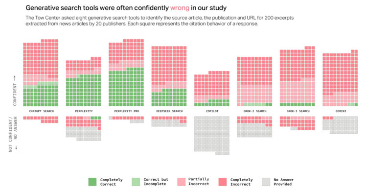
When you enter a query in traditional search engines, you get a list of results. They are possible answers to your question, and you decide what resources you want to trust. On the other hand, when you query via AI chatbot, you get a limited number of answers, as a sentence, that appear confident in the context.
For Columbia Journalism Review, Klaudia Jaźwińska and Aisvarya Chandrasekar tested this accuracy and confidence by using several chatbots to cite articles:
Overall, the chatbots often failed to retrieve the correct articles. Collectively, they provided incorrect answers to more than 60 percent of queries. Across different platforms, the level of inaccuracy varied, with Perplexity answering 37 percent of the queries incorrectly, while Grok 3 had a much higher error rate, answering 94 percent of the queries incorrectly.
So not great.
I am sure someone is working on improving that accuracy, but we’ll have to develop our own skills in separating truth from junk, just like we have with past online things. Going forward, maybe keep an eye out for the younger and older generations who tend to accept online things as automatic truth. Things could get dicey.
-
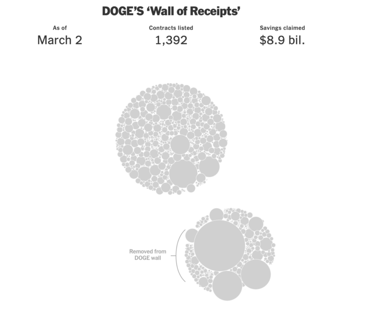
The “Department of Government Efficiency” keeps a “Wall of Receipts” to signal transparency in how they are “saving” money. However, it’s difficult to take it seriously when the data keeps changing, disappearing, and reappearing. Ethan Singer and Emily Badger, for NYT’s the Upshot, go with the clustered bubbles to show the edits since Feburary 16, 2025.
I’ll be the first one to tell you that working with data is tricky and that there are bound to be mistakes. But it’s in everyone’s best interest to find the mistakes first instead of making life-changing decisions and then finding out what breaks after.
-
Pam Johnson got an email from her bank about her husband’s death. The Social Security Administration deducted funds from their account. The problem: her husband, Ned Johnson, is still alive. From Danny Westneat for the Seattle Times:
“We recently received notification of LEONARD A. JOHNSON’s passing,” it began. “We offer our sincerest condolences …”
At first she figured it was a scam — her husband, after all, was sitting right there. But then the bank got to the point.
“We know this is a difficult time, and we’re here to help,” the bank wrote. “We received a request from Social Security Administration to return benefits paid to LEONARD A. JOHNSON’s account after their passing.”
“There’s nothing you need to do — we’ve deducted the funds from LEONARD A. JOHNSON’s account.”
Uh oh. It itemized how $5,201 had been stricken from their bank account, on the grounds that Ned wasn’t justified to get those benefits — because he was dead. That was for payments he’d received in December and January.
After several weeks, they were able to get Johnson revived in the SSA database, but they still don’t know why he was marked dead to begin with. Whatever the reason, it should be obvious why it’s important to measure twice and cut once.
-
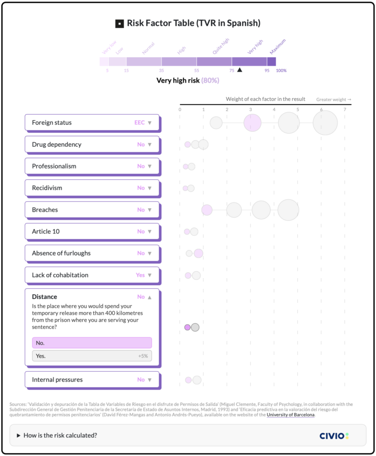
In efforts to reduce repeat offenses in Spain thirty years ago, researchers developed a formula that assigned a risk score to individuals. The score was used to decide if prisons should grant a prisoner temporary release, and the formula still factors into decision-making today. Civio describes the current downsides of using the scores, which are based on a relatively small sample of prisoners from the 1990s.
An interactive graphic, shown above, illustrates the system and how a score goes up and down as you change variables in the drop-down menus. Foreign status increases the risk score the most, even more so than if a prisoner tried to escape.
Recently for Members
Second Edition
 Visualize This: The FlowingData Guide to Design, Visualization, and Statistics (2nd Edition)
 Visualize This: The FlowingData Guide to Design, Visualization, and Statistics (2nd Edition)
New tools, refined process.
Browse by Chart Type See All →


