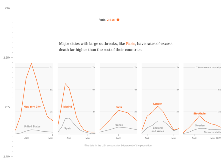
One way to estimate the impact of the coronavirus is to compare it against expected mortality. People are still dying of other causes. The virus has increased the total counts around the world. The New York Times compared these increases against other deadly events:
Only the worst disasters completely upend normal patterns of death, overshadowing, if only briefly, everyday causes like cancer, heart disease and car accidents. Here’s how the devastation brought by the pandemic in 25 cities and regions compares with historical events.
The result is a vertical scroll that starts at a normal mortality rate and takes you through increasingly deadlier events like the HIV/AIDS crisis, Hurricane Katrina, and eventually up to the Spanish Flu outbreak. You see how the coronavirus increased deaths in major cities along the way.
When you couple these events with memories of how we reacted, the current state of affairs is tough to comprehend.
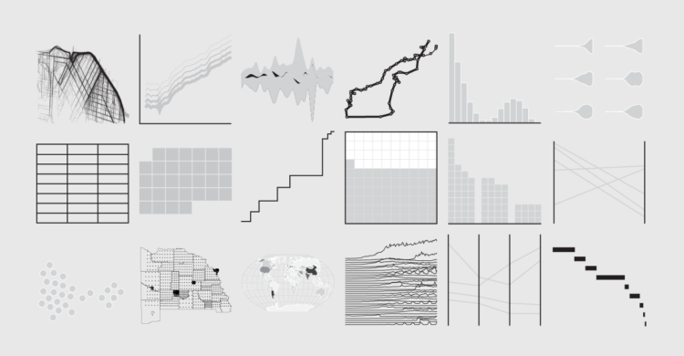


 Visualize This: The FlowingData Guide to Design, Visualization, and Statistics (2nd Edition)


