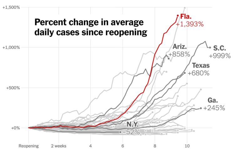
Using the now all too familiar baseline chart, where all of the time series line up relative to to starting point, The New York Times shows how case rates have fared since states reopened. Up, up, and away.
Using the now all too familiar baseline chart, where all of the time series line up relative to to starting point, The New York Times shows how case rates have fared since states reopened. Up, up, and away.
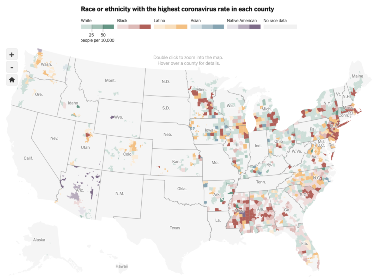
The New York Times obtained data on race and those affected by the coronavirus. Not everyone has been affected equally:
Early numbers had shown that Black and Latino people were being harmed by the virus at higher rates. But the new federal data — made available after The New York Times sued the Centers for Disease Control and Prevention — reveals a clearer and more complete picture: Black and Latino people have been disproportionately affected by the coronavirus in a widespread manner that spans the country, throughout hundreds of counties in urban, suburban and rural areas, and across all age groups.
For reference, here is an interactive map that shows predominant race by county.
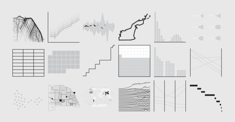
Unique charts and visual encodings are worth exploring, but what about traditional charts? Also, a members’ preview of a new chart catalogue.
Then there’s Cuebiq, which collected location data through its SDK and shared that information with the New York Times for multiple articles about how social distancing changed as stay-at-home orders were lifted and states reopened. This was just a few months after the newspaper gave Cuebiq’s location collection practices a much more critical eye in an expansive feature, and shows a possible shift in public opinion now that this invasive data might be used to save lives or hasten the return to normality.
People worry about Big Brother, but privacy concerns through our phones and computers is just kind of meh. I keep wondering if that will change. Seems unlikely.

Manuel Lima goes into the history of the pie chart, or rather, circle representations in general. Despite many people poo-pooing the chart type over the decades, it keeps hanging around:
We might think of the pie chart as a fairly recent invention, with arguably more flaws than benefits, in regards to the statistical portrayal of data. However, if we look deep into history we realize this popular chart is only a recent manifestation of an ancient visual motif that carried meaning to numerous civilizations over space and time. A graphical construct of radiating lines enclosed by a circle, this motif is also a powerful perceptual recipe. If we look deep into ourselves we uncover a strong proclivity for such a visual pattern, despite the final message it might carry. As one of the oldest archetypes of the circular diagram, the sectioned circle will certainly outlast all of us, and indifferent to criticism, I suspect, so will the pie chart.
Yep.
Lima wrote a whole book on the use of circles in information design, in case you’re feeling yourself drawn to the shape for some unexplained reason.

There are over 1 million international higher-education students enrolled in the United States. This map shows where they reside.
The Paycheck Protection Program was established to provide aid to small businesses. It’s a $669-billion loan program. The data for 4.8 million loans, amounting to $521 billion so far, is now available from the Small Business Administration.
For loans less than $150,000, you can download data for all states individually. Data for loans that were more than $150,000 can be downloaded as a single file. Look up business name, type, address, and loan amount range, among several other fields.
Seems like it’s worth a closer look.
Update: The Washington Post made a search interface for the dataset.
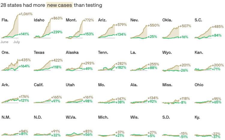
There have been assertions that increased case counts are all from increased testing. As you might expect, it’s not so clear cut. Andrew Witherspoon and Caitlin Owens for Axios show the changes in testing against changes in cases.
So in the wideout view of every state, the more-testing-more-cases assertion isn’t so straightforward.
ProPublica provided a similar comparison a couple of weeks ago, but I like the difference charts here for every state. They make the gaps more obvious.
Going with the shaded triangle peaks to show case counts and deaths, The Economist visualizes the current status across Europe:
To assess how European countries are coping, and to monitor the danger of “second waves”, The Economist has assembled data on covid-19 cases and deaths for 39 countries, and for 173 sub-national areas for which data are available (see map above). We present the total number of deaths per 100,000 in the population. We also break down the infection and death rates for the past seven days to give a better sense of whether the virus is most active.
For Reuters, Feilding Cage provides a series of interactive tidbits to demonstrate why time perception feels like a mess these days.
Various factors skew our perception different directions. On emotion:
A busy day usually goes by quickly, but for some the opposite is true in 2020. Frontline healthcare workers, for example, know they are at high risk of exposure to the coronavirus, and the resulting anxiety heightens their attentiveness and slows their perception of how quickly a day passes.
For others, however, time can fly during joyful moments, such as a video catch-up or dinner with friends.
There’s nothing on why it feels like time is moving backwards though.
Some attribute increased Covid-19 case counts to increased testing. While that is certainly part of the reason, it doesn’t explain it all when you compare testing rates against the increase in positives.
Charles Ornstein and Ash Ngu for ProPublica:
In other states, including Arizona, Texas and Florida, which did not see a wave of early cases and deaths, the increase in positive results has far surpassed testing growth. In Florida, testing has even decreased a bit comparing the seven days through Tuesday to the same period before Memorial Day. (Florida recorded an abnormally high number of new tests on May 20, which may have inflated the rolling average on May 25.)
But what about decreased virus-related deaths? Death doesn’t come right after a positive test, which means death rate doesn’t increase at the same time that cases increase. There’s a lag. So we’re not in the clear yet.

Sometimes a chart type seems terrible. But you’ll never know until you try.
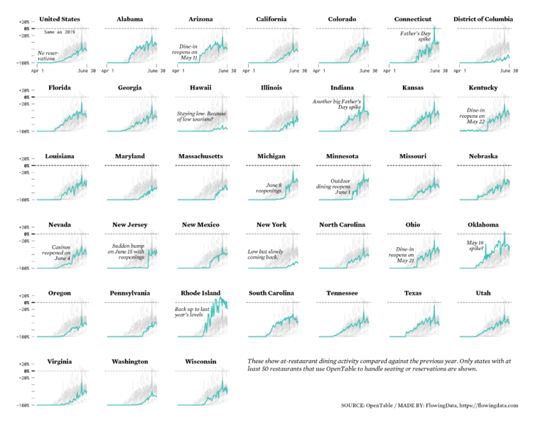
Restaurants are reopening for dining across the United States. Some states are doing it faster than others.
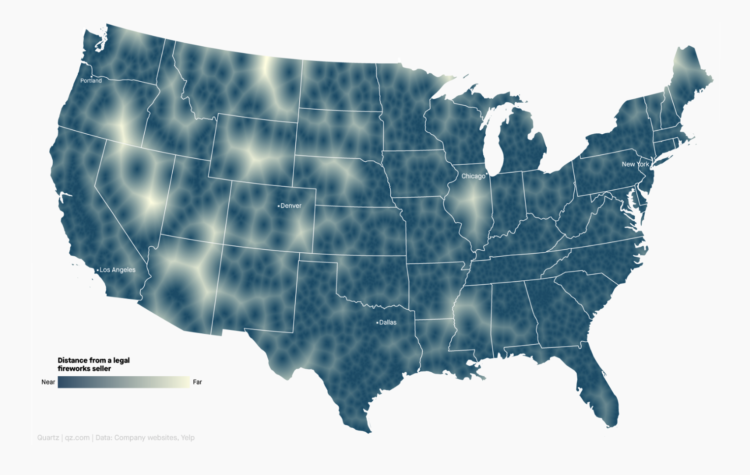
Using a voronoi map, David Yanofsky for Quartz mapped the places in the US that are the farthest away from legal fireworks sellers in case you need to get away from the early celebrations. Or, people could just stop setting off fireworks at 1am. That would be okay too.
NASA’s Solar Dynamics Observatory has been taking a picture of the sun every 0.75 seconds for a decade. Above is a time-lapse of the resulting 20 million gigabytes of data:
This 10-year time lapse showcases photos taken at a wavelength of 17.1 nanometers, which is an extreme ultraviolet wavelength that shows the Sun’s outermost atmospheric layer — the corona. Compiling one photo every hour, the movie condenses a decade of the Sun into 61 minutes. The video shows the rise and fall in activity that occurs as part of the Sun’s 11-year solar cycle and notable events, like transiting planets and eruptions.

Lauren Tierney and William Neff for The Washington Post used a rotating globe to show how connections between countries quickly shut down as the coronavirus spread.
I’m looking forward to when we get to watch the map in reverse.
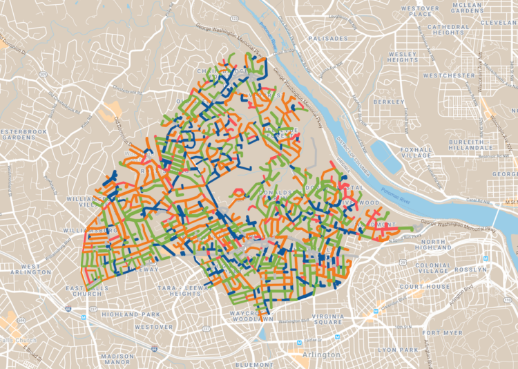
Dan Kois walked all of the blocks in his ZIP Code and collected data on whether houses used serif or sans serif fonts for their house numbers:
Between March 10 and May 25, I walked every street in Arlington, Virginia’s 22207, a total distance of about 200 miles, according to my Fitbit. The ZIP code covers a lot of territory, 6.37 fairly densely populated square miles, from the Potomac River and the Washington border at the east to East Falls Church and the McLean border at the west. It includes some of Virginia’s richest and whitest neighborhoods, but also a number of apartment buildings and townhouses along Lee Highway and the historically Black middle-class neighborhood of Hall’s Hill.
Here’s the final result in a Google map. There doesn’t seem to be much of a pattern in Kois’ ZIP code, but it’s a good walking exercise. I wonder what other types of data one might collect while walking a large area.

Using a spiral might not be the best way to encode data. But here’s how to do it anyway. Just in case.
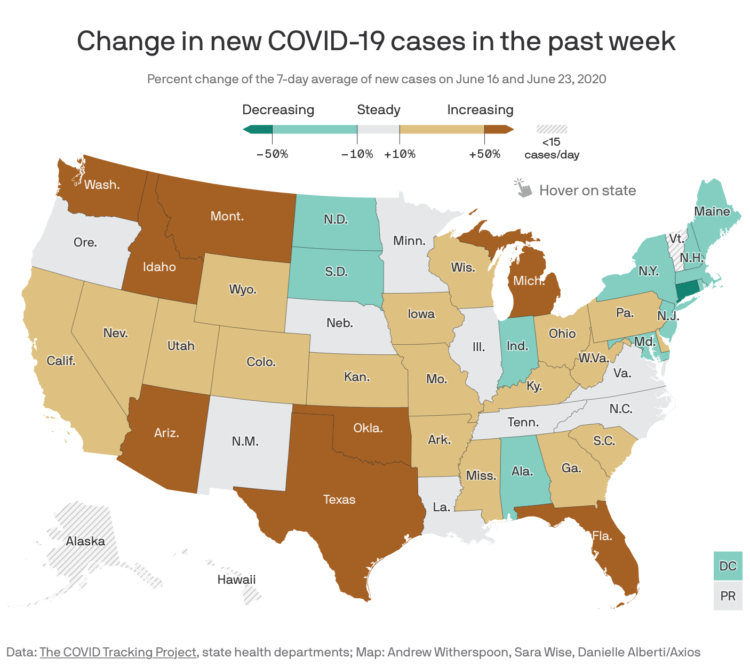
Axios provides a straightforward state map showing the percentage change in the 7-day average for confirmed Covid-19 cases. Numbers are up in a lot of places.
Increased testing does not explain away these numbers. Other data points make clear that we’re seeing a worsening outbreak, not simply getting better data.
So frustrating.
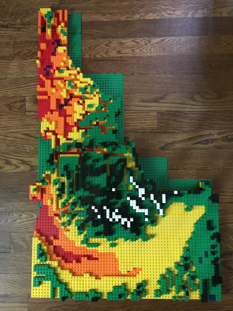
Cameron Bennett made a relief map of Idaho, completely out of LEGO bricks:
In March, the COVID-induced quarantine sent me home, but more importantly, to my childhood Legos. What resulted was too much time, money, and effort spent entertaining some combination of my childhood and young adult self. By building a map. Out of Legos.
What have I even been doing with my time.
 Visualize This: The FlowingData Guide to Design, Visualization, and Statistics (2nd Edition)
New tools, refined process.


