Businesses are still seeing visits mostly down compared to last year, which shouldn’t be much of a surprise. But there is a lot of variation across the states. The New York Times shows the comparison over time, based on mobile location data (which I still feel uneasy about). NYT went with the scrollytelling state-by-state approach to work their way through the spaghetti plot.
-
It’s clear that Covid-19 has affected groups differently across the United States. By geography. By education level. By income. The Marshall Project breaks down excess deaths by race:
Earlier data on cases, hospitalizations and deaths revealed the especially heavy toll on Black, Hispanic and Native Americans, a disparity attributed to unequal access to health care and economic opportunities. But the increases in total deaths by race were not reported until now; nor was the disproportionate burden of the disease on Asian Americans.
With this new data, Asian Americans join Blacks and Hispanics among the hardest-hit communities, with deaths in each group up at least 30 percent this year compared with the average over the last five years, the analysis found. Deaths among Native Americans rose more than 20 percent, though that is probably a severe undercount because of a lack of data. Deaths among Whites were up 9 percent.
Difference charts are used to show deaths above (red) or below (turquoise) normal counts, but of course, it’s mostly red.
See the piece for an additional categorization by state.
-
From the Computer Graphics Lab at Stanford University, the results from an analysis of a decade of cable news:
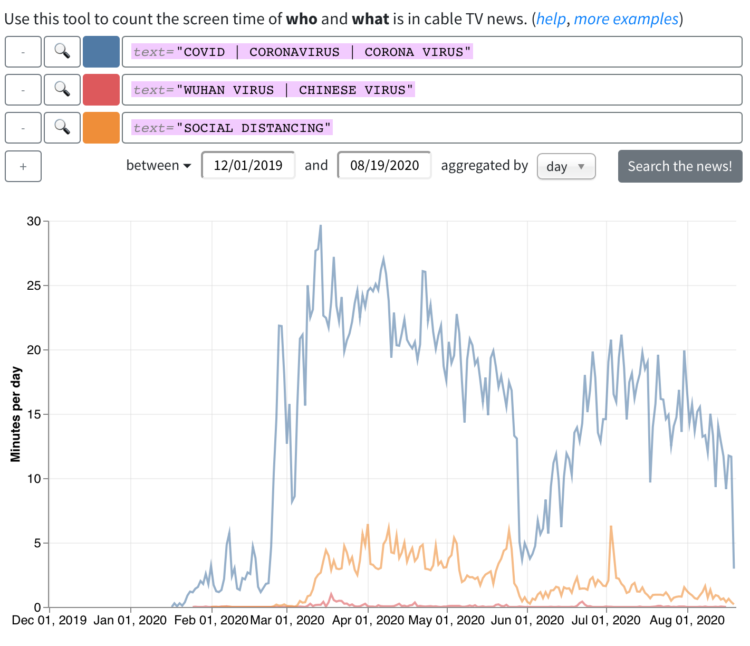
The Stanford TV News Analyzer has applied deep-learning-based image and audio analysis processing techniques to nearly a decade of 24–7 broadcasts from Fox News, CNN, and MSNBC going back to January 1, 2010. That’s over 270,000 hours of video updated daily. Computer vision is used to detect faces, identify public figures, and estimate characteristics such as gender to examine news coverage patterns. To facilitate topic analysis the transcripts are time-aligned with video content, and compared across dates, times of day and programs.
You can search for topics or people, combine queries, and set time ranges. Then you get a time series for how much someone’s face showed up or the number of times a word was used.
-
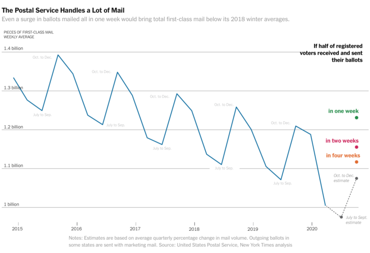
The volume of mail-in ballots will likely be higher than usual this year, but relative to the Postal Service’s usual volumes from years past, the bump doesn’t seem unfathomable. The chart above, which shows average weekly volume over the years, from Quoctrung Bui and Margot Sanger-Katz for NYT’s The Upshot, shows the scale.
Of course, if certain administrations continue to hamper USPS operations, that’s a different story.
-
Members Only
-
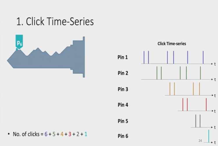
Researchers from the National University of Singapore found a way to infer key shape based on the sound the lock makes when you insert the key.
First they capture a sound recording with a standard microphone. Then they run the audio file through software to filter out the metallic clicks. This provides a time series from which they can infer likely keys.
Soundarya Ramesh presented the work at HotMobile 2020 in the talk below:
Oh to be back in graduate school again. [via kottke]
-
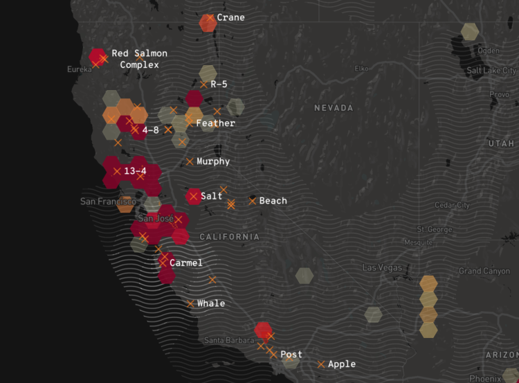
Los Angeles Times provides a California-specific map of the current wildfires to stay updated on what’s happening right now.
In the zoomed out view, hexagons bin the individual fires and color by number of hotspots. Wavy hatching indicates levels of air pollution. In the zoomed in view, see the individual fires and click for current status.
-
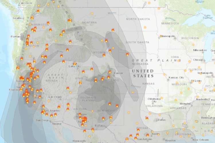
With the rush of wildfires in California, governor Gavin Newsom declared (another) state of emergency. The Fire and Smoke Map from the U.S. Forest Service and Environmental Protection Agency provides a picture of where we’re currently at. The map incorporates data from a variety of sensors across the country:
The sensor data comes from PurpleAir, which crowdsources data from that company’s particle pollution sensors and shows the data on a map. Before the sensor data appear on the AirNow Fire and Smoke Map, EPA and USFS apply both a scientific correction equation to mitigate bias in the sensor data, and the NowCast, the algorithm to show the data in the context of the Air Quality Index.
-
For The Los Angeles Times, Casey Miller went hyperlocal to track mask wearing in three locations in Los Angeles and Orange counties. Over a week, a group of reporters counted people who passed by and tallied if people wore their mask correctly, incorrectly, or no mask at all.
The above is the breakdown for a spot on Main Street in Huntington Beach.
Maybe the best part is that there’s a simple tool at the end so that you can count in your own spot:
If it weren’t so smoky outside, I’d give this a go.
-
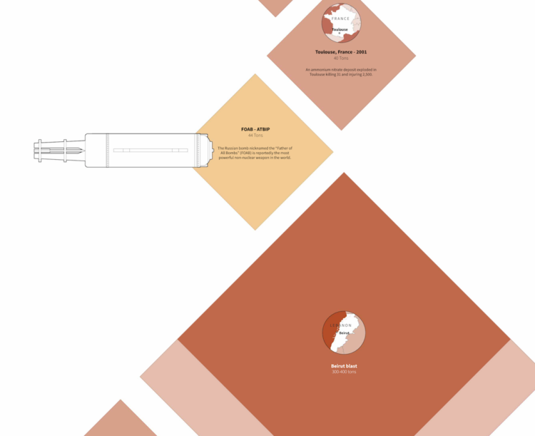
There was an explosion in Beirut. It was big. How big? Marco Hernandez and Simon Scarr for Reuters provide a sense of scale:
George William Herbert, an adjunct professor at the Middlebury Institute of International Studies Center for Nonproliferation Studies and a missile and effects consultant, used two methods to estimate the yield of the explosion. One used visual evidence of the blast itself along with damage assessments. The other calculation was based on the amount of ammonium nitrate reportedly at the source of the explosion.
Both techniques estimate the yield as a few hundred tons of TNT equivalent, with the overlap being 200 to 300, Herbert told Reuters.
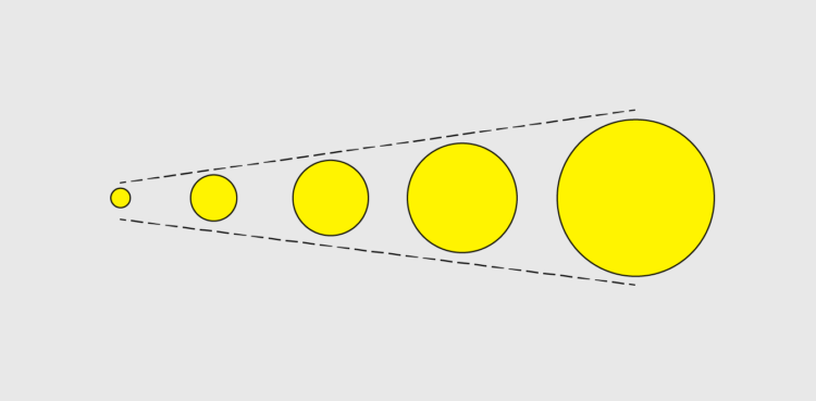
It starts with a Hellfire Missle, which is 0.01 tons. Then it just keeps going.
-
-
Reporting for The New York Times, Giovanni Russonello on the decennial census during these times:
If households can’t be reached, even by enumerators, then census takers rely on a process known as imputation — that is, they use data from demographically similar respondents to take a best guess at what the missing data ought to say.
“This year I can imagine imputation being much higher, and that will itself be a source of controversy — because imputation involves assumptions,” Dr. Miller said. “No matter what you do at that point, you’re going to have a bunch of places around the country that are unhappy with the numbers, and are going to sue. So there’s going to be a lot of controversy around this.”
Where more imputation is needed, Dr. Miller said, the door opens a bit wider for statistical wrangling — and, potentially, more political influence.
In 2010, 74 percent of households responded. This year, with only about a month left, 63 percent have responded.
In a time when data is ubiquitous and affects so many things that we do, the census count grows more uncertain. Strange.
-
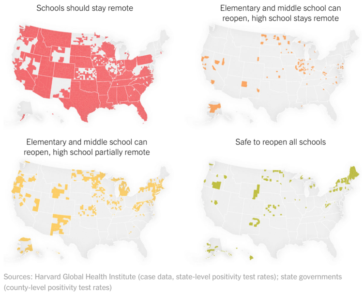
For NYT Opinion, Yaryna Serkez and Stuart A. Thompson estimated where we’re ready:
Our analysis considers two main things: the rate of new infections in a county and the county’s testing capabilities. We used guidelines from the Harvard Global Health Institute, which proposed a variety of ways to open schools as long as the county has fewer than 25 cases of Covid-19 per 100,000 people. We also used the World Health Organization’s proposal to open only if fewer than 5 percent of all those who are tested for the virus over a two-week period actually have it.
The second part matters because if a higher proportion of people are testing positive, it could mean that not enough tests are being conducted to adequately measure the spread.
As you might expect, based on these guidelines, reopening in some places and not others poses disparities when you start breaking down demographics.
-
After seeing stoxart, I was reminded of Michael Najjar’s project High Altitude from 2010-ish. He used photos he captured while climbing Mount Aconcagua, the highest mountain in the Americas, as the backdrop for stock data:
The series visualizes the development of the leading global stock market indices over the past 20-30 years. The virtual data mountains of the stock market charts are resublimated in the craggy materiality of the Argentinean mountainscape. Just like the indices, mountains too have their timeline, their own biography. The rock formations soaring skywards like so many layered folds of a palimpsest bear witness to the life history of the mountain – stone storehouses of deep time unmeasureable on any human scale. The immediate reality of nature thus becomes a virtual experience. Such experience of virtuality is strikingly exemplified by the global economic and financial system. If the focus used to be on the exchange of goods and commodities, it is now securely on the exchange of immaterial information.
The above is the price for Lehman Brothers from 1992 to 2008.
-
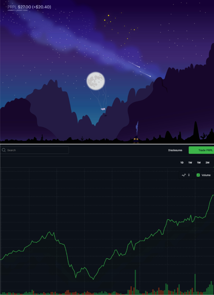
stoxart is a project by Gladys where she turns stock market charts to landscape illustrations. The peaks become mountains, the dips become a space for the moon and the stars. The above is an illustration for Purple, which specializes in mattresses, and its base chart which forms the landscape.
Here’s another for Ford, with an apt illustration of a Ford truck riding the terrain:

Grab a print here (or request a custom one).
It reminds me of Michael Najjar’s project High Altitude from 2010, but instead, he used photoshopped mountains to show stock prices (which I’m surprised I never posted on FD).
-
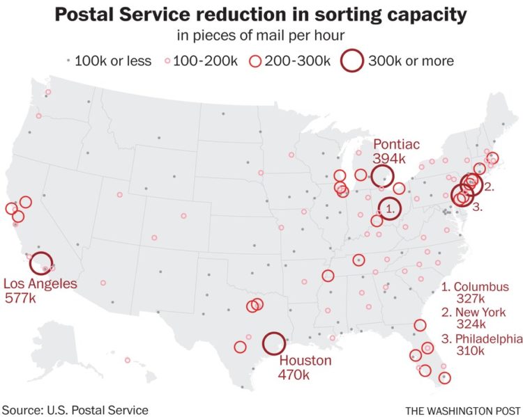
The United States Postal Service is losing mail sorting machines — as an election during a pandemic gets closer. The Washington Post reports on what they know so far, including the map above on reduced sorting capacity.
-
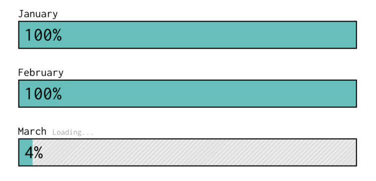
I thought March was only 31 days, but the system seems stuck. Did anyone try turning it off and on again.
-
Members Only
-
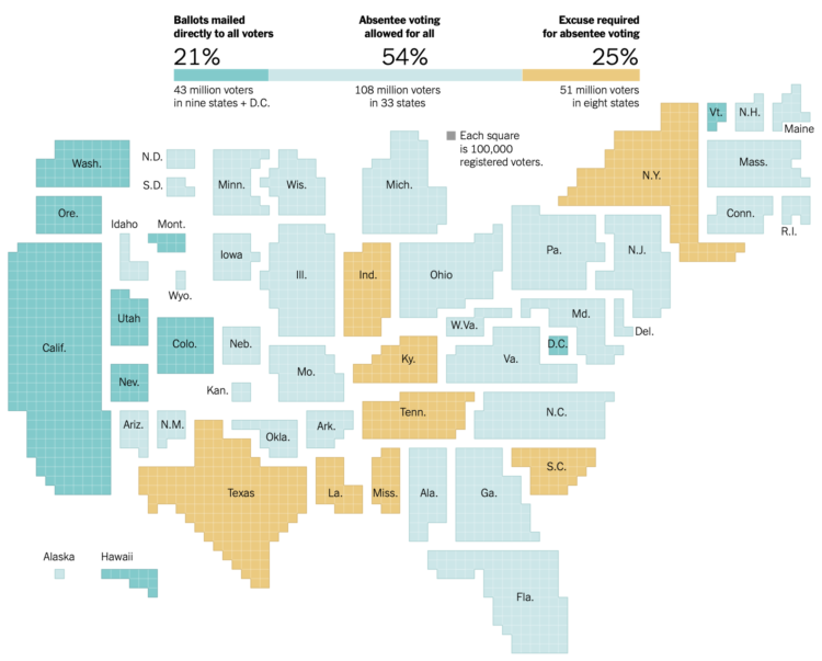
There’s going to be a lot more voting by mail this year. The New York Times shows what each state is doing. It’s a cartogram. So it must be election season.
-
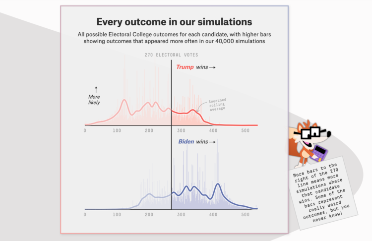
The election is coming. FiveThirtyEight just launched their forecast with a look at the numbers from several angles. Maps, histograms, beeswarms, and line charts, oh my. There is also a character named Fivey Fox, which is like Microsoft’s old Clippy providing hints and tips to interpret the results.
One thing you’ll notice, and I think newsrooms have been working towards this, there’s a lot of uncertainty built into the views. It’s clear there are multiple hypothetical outcomes and there’s minimal use of percentages, opting for fuzzier sounding odds.
Remember when election forecasting went the opposite direction? They tried to build more concrete conclusions than talking heads. Now pundits frequently talk about the numbers (maybe misinterpreted at times), and the forecasts focus on all possible outcomes instead of what’s most likely to happen.



 Visualize This: The FlowingData Guide to Design, Visualization, and Statistics (2nd Edition)


