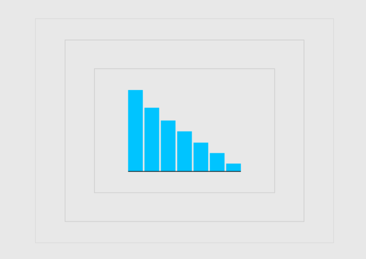
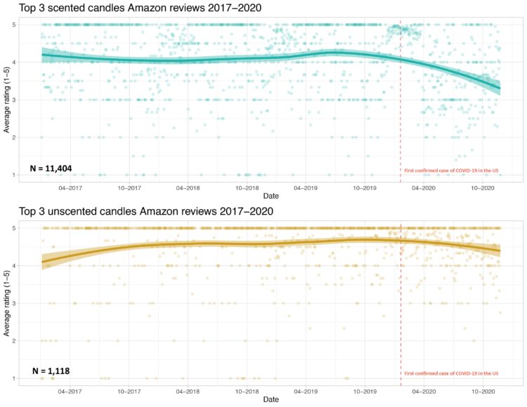
Prompted by a tweet about scented candles without smell and Covid-19, Kate Petrova plotted Amazon reviews for scented and unscented candles over time. Notice the downward trend for scented candles after the first confirmed case for Covid-19.
Interesting if true. I’m imagining a bunch of people opening their new scented candles, taking a big whiff, and not smelling anything.
But I wonder if there are outside forces (a.k.a. confounding factors) at work here. For example, Petrova only looked at reviews for the “top 3” scented candles. What do we see with other candles? Maybe a higher demand for scented candles from more people staying at home put a strain on the manufacturer. Maybe there was a shortage of some scented ingredient, which led to less potent candles. Maybe new scented candles customers have unrealistic expectations of what candles smell like.
I don’t know.
Maybe the decreasing average review really is related to Covid-19 symptoms.
Petrova put up the code and data, in case you want to dig into it.
Update: In my original post, I unknowingly used an offensive word unfit for usage. Thank you to those who pointed it out to me.
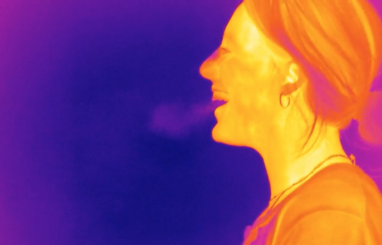

 Talking about the effectiveness of masks on TikTok,

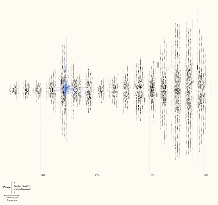
 Visualize This: The FlowingData Guide to Design, Visualization, and Statistics (2nd Edition)


