In 1692, artist A. Boogert published a guide to watercolors, showing the thousands…
Infographics
Telling stories with data and graphics.
-
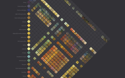
Diagram of watercolors from the 17th century
-

Garbage in space
There are thousands of satellites that orbit Earth, with about half of them…
-
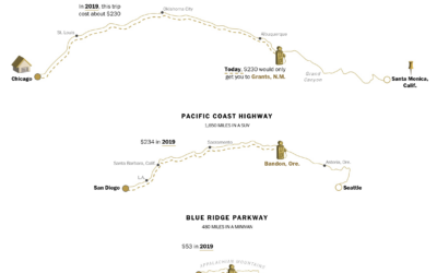
Calculating the new cost of your summer road trip
With gas prices a lot higher than usual, Júlia Ledur, Leslie Shapiro, and…
-
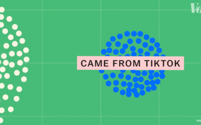
Examination of songs after virality on TikTok
Vox, in collaboration with The Pudding, looked at what happens when a song…
-
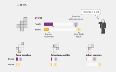
Election modeling explained
In election reporting, there’s a gap between real-time results and final results, so…
-

Final texts
Alicia P.Q. Wittmeyer, for NYT Opinion, approached the one-million mark for Covid deaths…
-
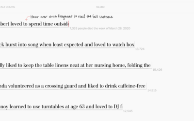
Lives cut short by Covid
Alyssa Fowers and Leslie Shapiro, for The Washington Post, used the stories of…
-
Nuclear winter explained visually
Neil Halloran, known for his documentary films that lean strongly on data visualization,…
-
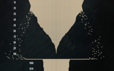
Behind the million
Sergio Peçanha and Yan Wu, for The Washington Post, used a combination unit…
-
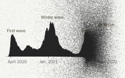
Reaching 1 million deaths
The New York Times narrated the path to one million Covid deaths in…
-
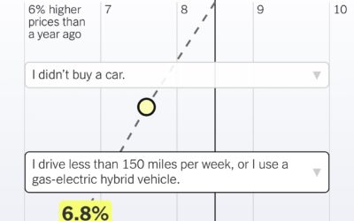
Inflation based on your spending
We’ve been hearing a lot about inflation rates lately on a national scale.…
-
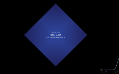
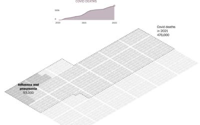
Scale of one million deaths
The United States is about to reach one million confirmed Covid deaths, or…
-

Formula 1 car redesign
The rules around a car’s aerodynamics for Formula 1 racing changed a lot…
-
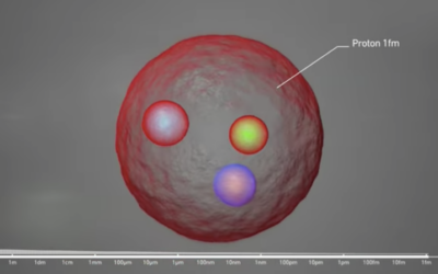
Scale of atoms
…
-
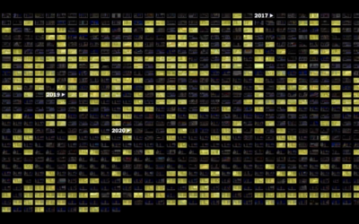
Tucker Carlson word usage and patterns
Tucker Carlson hosts a nightly show viewed by millions. The New York Times…
-
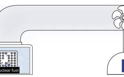
Nuclear energy rebrand
Nuclear energy has bad memories linked to it, which tends to draw fear…
-
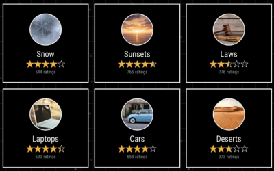
Earth Reviews
Given our love for making our opinions heard for products on the internets,…
-
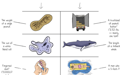
Jeff Bezos wealth to scale
Jeff Bezos’ wealth is difficult to understand conceptually, because the scale is just…
Recently for Members
Second Edition
 Visualize This: The FlowingData Guide to Design, Visualization, and Statistics (2nd Edition)
 Visualize This: The FlowingData Guide to Design, Visualization, and Statistics (2nd Edition)
New tools, refined process.
Browse by Chart Type See All →


