To serve the ball in tennis, a player first tosses the ball in…
Infographics
Telling stories with data and graphics.
-

Science of the tennis toss
-
Gerrymandering detection with simulations
Harry Stevens, for The Washington Post, how simulations can be used to detect…
-
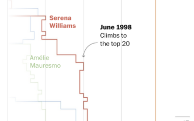
Losses and comebacks of Serena Williams
We tend to celebrate the wins in sports and often forget about or…
-

Welcome to Meltsville
It’s getting hot in cities around the world, each city with its own…
-
Megaflood scenario
Highlighting research by Xingying Huang and Daniel L. Swain, who studied “plausible worst…
-

Breaking down the higher price on a restaurant receipt
If you’ve eaten at a restaurant lately, you might have noticed a substantially…
-

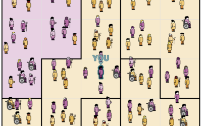
Tracked while reading about being tracked at work
While reading this NYT article, by Jodi Kantor and Arya Sundaram, on the…
-
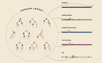
Visual explanations for machine learning
As part of a teaching initiative by Amazon, MLU-Explain is a series of…
-
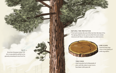
Sequoia tree wildfire protection
For Reuters, Travis Hartman, Ally J. Levine, and Anurag Rao describe the measures…
-

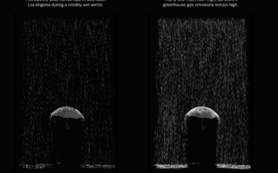
Melting popsicles to visualize a heat wave
Many European countries are experience record high temperatures, so The Washington Post used…
-
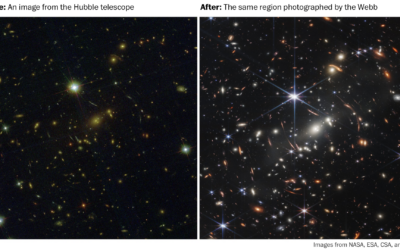
Why the galaxy pictures from the Webb telescope are pretty cool
The first public picture from the James Webb telescope is kind of cool…
-
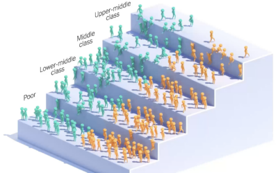
Income ladder for the children of immigrants
You’ve probably seen the moving bubbles that show how something changes over time.…
-
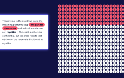
Money distribution for streaming music
From the listener perspective, we pay our monthly or annual fees and just…
-

Absurd trolly problems
You’ve probably heard of the trolley problem, a thought experiment that imagines a…
-
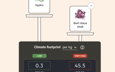
Imagining carbon food labels
By purchasing certain foods, we make decisions about the carbon footprint from the…
-
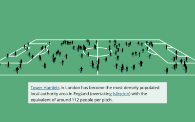
Football field to show population change in the UK
The Office for National Statistics for the UK published an interactive to show…
-
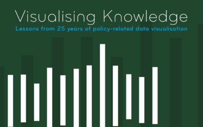
Visualising Knowledge
Visualising Knowledge is an open book from PBL Netherlands Environmental Assessment Agency, based…
-
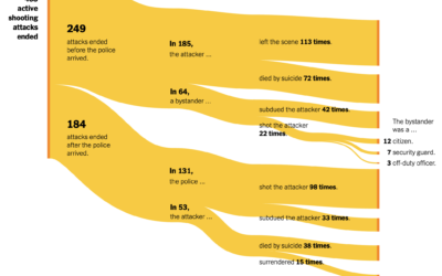
Active shooter endings
For The New York Times, Larry Buchanan and Lauren Leatherby used Sankey diagrams…
Recently for Members
Second Edition
 Visualize This: The FlowingData Guide to Design, Visualization, and Statistics (2nd Edition)
 Visualize This: The FlowingData Guide to Design, Visualization, and Statistics (2nd Edition)
New tools, refined process.
Browse by Chart Type See All →


