For The Washington Post, Bonnie Berkowitz and Artur Galocha report on several facets…
Infographics
Telling stories with data and graphics.
-
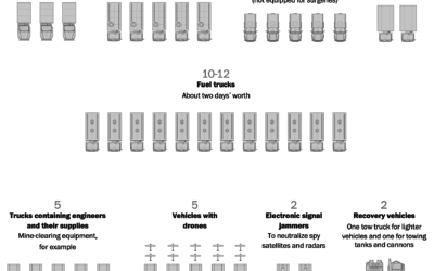
Russia’s logistics problems
-
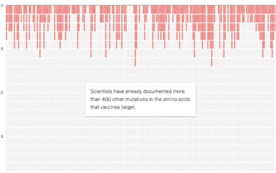
Potential coronavirus mutations
For NYT Opinion, researchers Sarah Cobey, Jesse Bloom, and Tyler Starr, along with…
-

Charting all the vehicles of James Bond
Baryon Design collated data for all the vehicles James Bond used across all…
-

Intercepted Russian radio communications
The New York Times analyzed Russian radio communications near Kyiv. The unencrypted transmissions,…
-
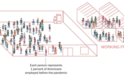
Percentage breakdowns of pandemic life
To broadly show how people have lived in the U.S. during these past…
-

Price increases people have noticed
Inflation is high. For NYT’s The Upshot, Emily Badger, Aatish Bhatia and Quoctrung…
-
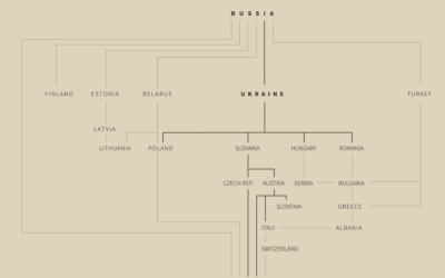
Why Russia is invading Ukraine, a visual guide
RealLifeLore explains the history between the two countries and the multi-faceted motivations behind…
-

Tracking the sanctions against Russia
Correctiv is tracking sanctions against Russian individuals and companies, based on data from…
-

More readable writing illustrated with more readable writing
For The Pudding, Rebecca Monteleone and Jamie Brew (with design and code by…
-
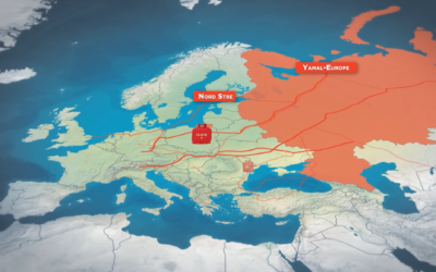
Russian gas supplies in Europe
For Reuters, Prasanta Kumar Dutta, Samuel Granados and Michael Ovaska detail Europe’s dependence…
-
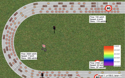
Interactive traffic simulator
Traffic always seems so sensitive to the smallest disruptions. Someone pulls over to…
-

Snowboarding composite photos
If you watched the men’s halfpipe in the Olympics, you were probably impressed…
-

Modernized version of a mid-19th century encylopedia
Between 1849 and 1851, J.G. Heck published a 10-part encyclopedia called Iconographic Encyclopædia…
-
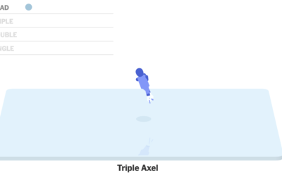
Figure skating animated jumps
Figure skater Nathan Chen set a world record with his performance in the…
-
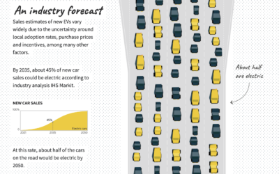
Improving electric vehicle adoption rates
Gas-powered vehicles contribute a big part of total carbon production, so to get…
-
A game to gerrymander your party to power
Ella Koeze, Denise Lu, and Charlie Smart for The New York Times made…
-

How N95 masks work
In efforts to reduce further spread of the virus, the US is set…
-

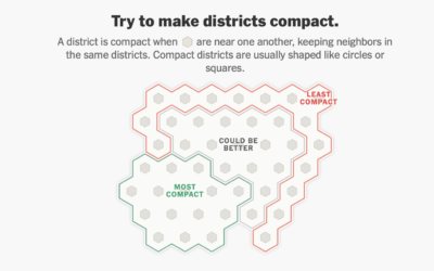
Play miniature golf, learn about congressional redistricting
Congressional redistricting and gerrymandering are important topics, because they can directly change election…
Recently for Members
Second Edition
 Visualize This: The FlowingData Guide to Design, Visualization, and Statistics (2nd Edition)
 Visualize This: The FlowingData Guide to Design, Visualization, and Statistics (2nd Edition)
New tools, refined process.
Browse by Chart Type See All →


