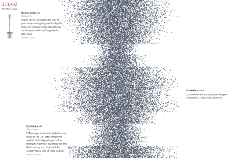
The United States passed the half million mark for confirmed Covid-19 deaths. It’s difficult to imagine 500,000 of anything, let alone deaths in a year, so Reuters used a modified beeswarm chart to show the timeline of events and the individual deaths. Each dot represents a death, and a scaled down version of the chart appears in the top left corner to show where you are in the timeline.
It’s not possible to reflect the true meaning of such a scale through a screen, but the mini-obituaries on the left-hand side help. I had to pause a few times.

 Visualize This: The FlowingData Guide to Design, Visualization, and Statistics (2nd Edition)