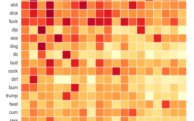
As you know, Reddit is typically a sophisticated place of kind and pleasant…
Statistical Visualization
Finding patterns, distributions, and anomalies.
-
Analysis of compound curse words used on Reddit
-
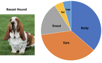
Pie charts of dogs
John Rich made pie charts of dog body proportions. This is very important.…
-
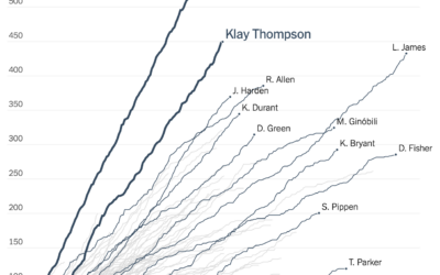
Cumulative 3-pointers for the Splash Brothers
Tonight is game six of the NBA Finals. If the Golden State Warriors…
-
Hands-On Data Visualization, an open-access book on interactive visualization for beginners
Hands-On Data Visualization, by Jack Dougherty and Ilya Ilyankou, is an open-access book…
-
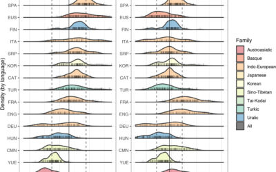
Different languages, but similar information rates
Christophe Coupé and company analyzed speech rate (on the left) across different languages,…
-
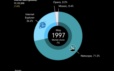
Browser share over time
James Eagle used an animated donut chart to show browser share from 1996…
-
History of heat records in major U.S. cities
Matt Daniels and Russell Goldenberg for The Pudding are tracking heat records in…
-
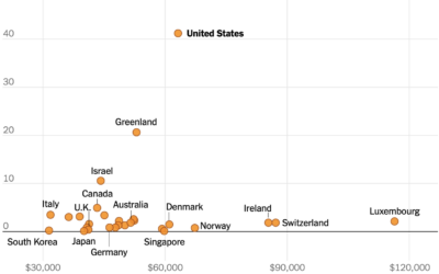
U.S. still the outlier for gun homicide rate
This chart from The New York Times, based on estimates from Our World…
-
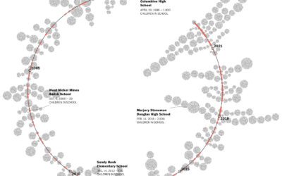
Children exposed to school shootings
The Washington Post maintains a database of school shootings (which is sad in…
-
F1 Racing results plotted as lightning
Joey Cherdarchuk used a lightning metaphor to visualize the outcomes of races from…
-
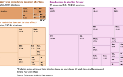
Number of abortions in each state, by restriction status
The Washington Post has a set of charts showing the current status of…
-
A test for a potentially flawed study on randomness and age
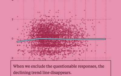
In 2017, a study posited that human behavior complexity peaks at age 25…
-
Redrafting the NBA, based on past player performance
With the NBA playoffs underway, it can be fun to watch the best…
-
Comparing rich people incomes and the taxes they pay
Based on leaked IRS data for the 400 wealthiest Americans, ProPublica provides a…
-
More gender-neutral names
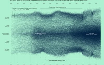
Georgios Karamanis plotted the ratio of girls-to-boys over time for all the names…
-
Working the triple peak
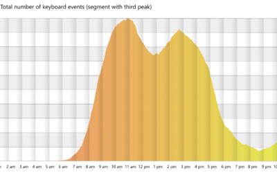
Microsoft researchers analyzed keystrokes by time of day, for a sample of Microsoft…
-
Oscar outfits as public health graphs
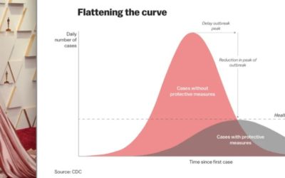
The 2022 Oscars came and went, and it was like all anyone could…
-
Climate spiral to show temperature change
Say what you will about circular visualization, but the spiral plays. This one…






 Visualize This: The FlowingData Guide to Design, Visualization, and Statistics (2nd Edition)


