Animals are going extinct at a faster rate. Reuters shows a developing pattern…
Statistical Visualization
Finding patterns, distributions, and anomalies.
-

Animal extinction over time
-
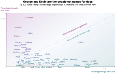
Names that are more dog or more human
There appears to be a trend of using human names for pets. Alyssa…
-
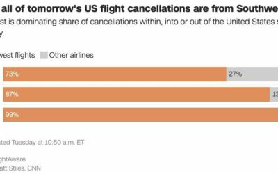
Southwest flight cancellations
There were a lot of flight cancellations this week, but Southwest Airlines is…
-
VIS 2022 talks are online
With the holidays just about here, I’m sure there’s nothing you’d rather do…
-
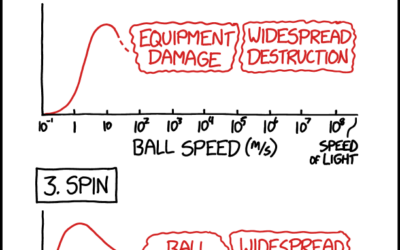
xkcd on optimal bowling metrics
xkcd charted optimal bowling in terms of aim, speed, spin, and weight. This…
-
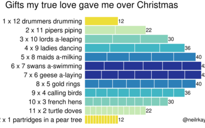
Gifts my true love gave to me over the 12 days of Christmas
From Reddit user neilrkaye. This is very important.…
-
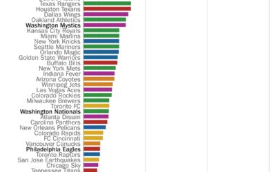
Perfect seasons needed to get over .500 overall
Here’s a fun one from Philip Bump for The Washington Post. Bump simply…
-
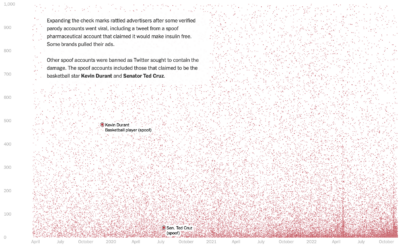
Who pays for Twitter
Twitter Blue is a subscription service from Twitter that primarily provided premium features…
-
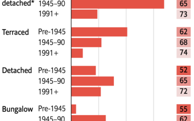
Retrofitting old British homes to improve energy efficiency
Speaking of old homes and energy efficiency in the UK, The Economist describes…
-
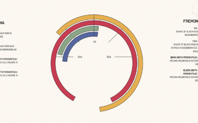
Upward mobility through a personal lens
Aaron Williams, for The Pudding, shows upward mobility through his own experiences, moving…
-
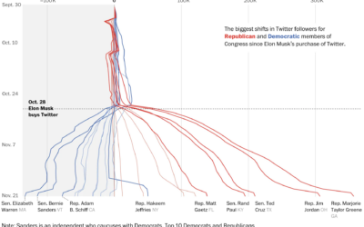
Republican and Democrat follower counts on Twitter
You might have heard that Elon Musk bought Twitter, and among the many…
-
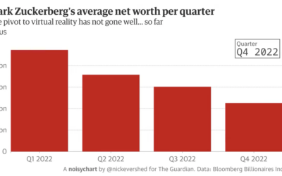
Experimental Noisycharts sonifies data for improved accessibility
Nick Evershed, for The Guardian, describes Noisycharts, an experimental component for their in-house…
-
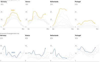
Shifts in European energy sources
Mira Rojanasakul, for The New York Times, dug into current and historical energy…
-
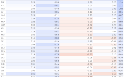
Role of luck in football wins
NFL Football Operations calculated how much luck has contributed to team wins and…
-
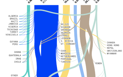
Exports through the Mississippi River
Drought has caused water levels to drop in the Mississippi River, which is…
-
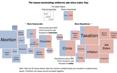
Election ad topics
Midterm election day is just about here in the U.S., so the political…
-
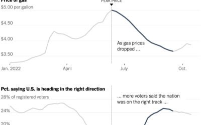
Gas prices and confidence
Everywhere you go, gas prices show up on big boards, like a proxy…
-
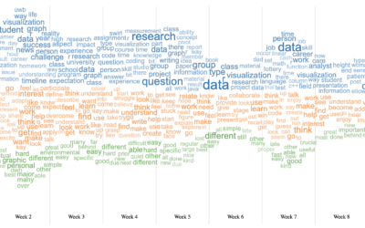
Word cloud + Streamgraph = WordStream
I hear it all the time from chart purists. “I love the streamgraph!”…
Recently for Members
Second Edition
 Visualize This: The FlowingData Guide to Design, Visualization, and Statistics (2nd Edition)
 Visualize This: The FlowingData Guide to Design, Visualization, and Statistics (2nd Edition)
New tools, refined process.
Browse by Chart Type See All →


