It still amazes me that you can give multiple people the same dataset and the results can vary depending on questions, goals, and audience.
Nathan Yau
-
Members Only
Different Points of View from the Same Data – The Process 153
-
Daily Routine, 2020
After looking at how much time we spent on daily activities in 2020, let’s look at when we spent our time.
-
Generative art with R
Generative art seems to be having a moment right now, so it’s only…
-
How vaccines can make a difference with the Delta variant
We see percentages for the vaccinated and unvaccinated, and people can easily misinterpret…
-
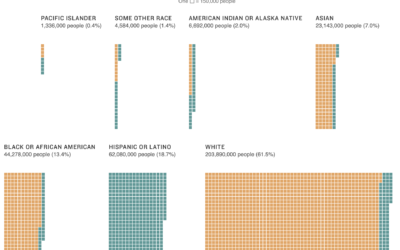
Multiracial people counted in the census
Using unit charts, NPR shows the number of people who identify with each…
-
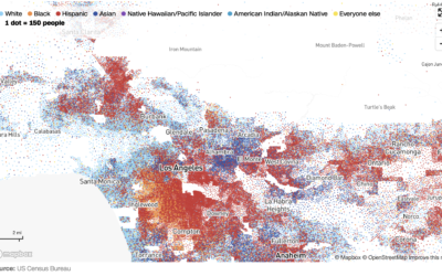
Race and ethnicity map of dots
CNN goes with the dot density map for their first pass on the…
-
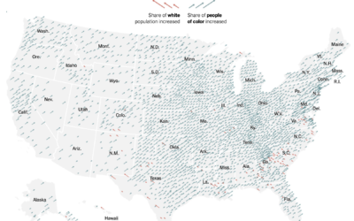
Shift in white population vs. people of color
The New York Times go with the angled arrows to show the shifts…
-
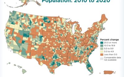
Maps of racial population change
Using their peaks and valleys metaphor, The Washington Post shows the shift in…
-
More detailed data release from Census 2020
After a lot of angst over the past few years around undercount, representation,…
-
Procedurally generated fish drawings
Lingdong Huang’s project fishdraw seems straightforward on the surface. You go to the…
-
Members Only
Seeing Ranges – The Process 152
You’re gonna miss out on all the good stuff if you just stare at the middle.
-
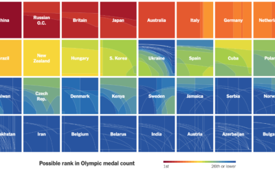
How countries ranked by Olympic medal counts
Ranking countries by medal count change depending on how much value you place…
-
Members Only
How to Use Packed Circles in R
Adjust coordinates, geometries, and encodings with packed circles to make various types of charts.
-
Where America is expanding in developed areas
Zach Levitt and Jess Eng for The Washington Post mapped newly developed areas…
-
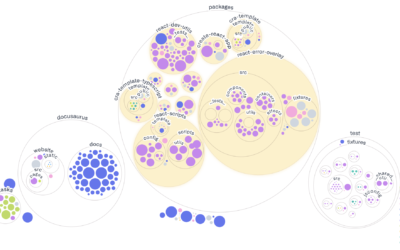
Visualizing GitHub repos
Most people are familiar with the file-and-folder view. Sort alphabetically, date, or file…
-
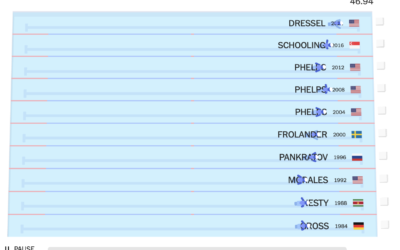
Olympic champions versus past Olympians
With the 2020 Olympics wrapped up, The New York Times raced this year’s…
-
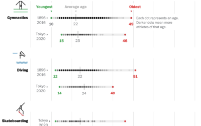
Age range of Olympians
Bonnie Berkowitz and Artur Galocha go with the strip plot to show the…
-
Testing the TikTok algorithm
The Wall Street Journal tested out the TikTok algorithm with bots to see…
-
Members Only
Foundational Visualization Skills – The Process 151
Set a strong base, and build whatever you want after that.
-
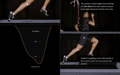
Science behind running fast vs. running far
From The New York Times, the combination of video, motion graphics, and charts,…









 Visualize This: The FlowingData Guide to Design, Visualization, and Statistics (2nd Edition)


