Communicate to fewer people to reach more.
Nathan Yau
-
Members Only
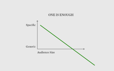
Visualization for One
-
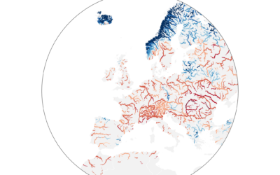
Worst drought in Europe, in 500 years
Dominic Royé mapped river discharge in Europe over the past few months:
A…
-
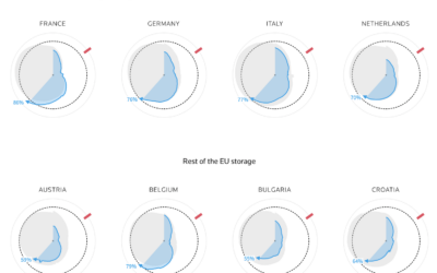
How much gas European sites have stored for the winter
Reuters goes with the radar chart to show gas supplies, as European countries…
-

Tracked while reading about being tracked at work
While reading this NYT article, by Jodi Kantor and Arya Sundaram, on the…
-
Google Maps incorrectly pointing people to crisis pregnancy centers
Davey Alba and Jack Gillum, for Bloomberg, found that Google Maps commonly points…
-
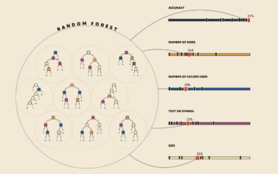
Visual explanations for machine learning
As part of a teaching initiative by Amazon, MLU-Explain is a series of…
-
Where the data from your car flows
Jon Keegan and Alfred Ng, for The Markup, identified 37 companies that collect…
-
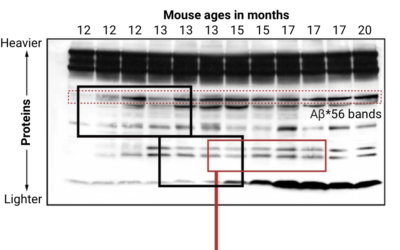
Looking for falsified images in Alzheimer’s study
Charles Piller, for Science, highlights the work of Matthew Schrag, who uses image…
-
Members Only

Edit the Chart
It just needs a little polish.
-
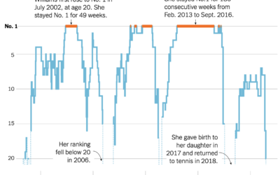
Serena Williams’ career rankings
Serena Williams announced her retirement from professional tennis. As is required for any…
-
EV charging road trip
We hear about electric vehicles being the future, but for that to happen,…
-
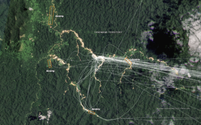
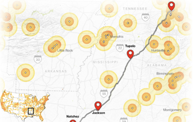
Finding illegal airstrips in Brazil
Using a combination of satellite imagery, crowdsourced databases, and analyses, The New York…
-
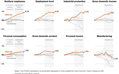
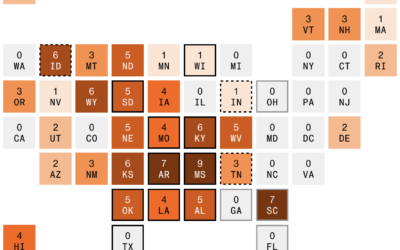
Indicators for a recession
People disagree whether the United States is in a recession or not, because…
-
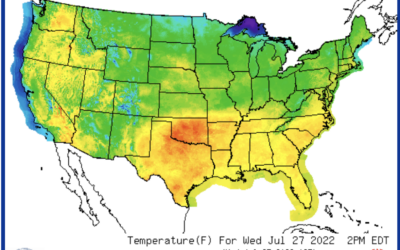
Mapping extreme heat
For Bloomberg, Marie Patino reports on the shifting design choices for mapping weather…
-

Sequoia tree wildfire protection
For Reuters, Travis Hartman, Ally J. Levine, and Anurag Rao describe the measures…
-
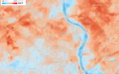
Mapping the cool spots in hot cities
As city centers heat up, people search for cooler areas. For Bloomberg Green,…
-
Members Only

Focus Change
A few lines and a color fill can change how others see a dataset.
-
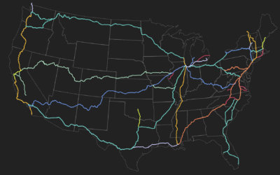
Amtrak train route explorer
This visual explorer by Rachel Binx lets you see Amtrak routes and stations…
-
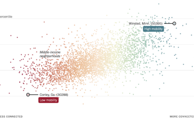
More friendships between rich and poor might mean less poverty
Recently published in Nature, research by Chetty, R., Jackson, M.O., Kuchler, T. et…
-
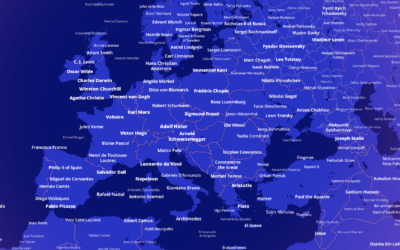
Most notable person, everywhere in the world
Who is the most famous person born in the place you live? This…
Recently for Members
Second Edition
 Visualize This: The FlowingData Guide to Design, Visualization, and Statistics (2nd Edition)
 Visualize This: The FlowingData Guide to Design, Visualization, and Statistics (2nd Edition)
New tools, refined process.
Browse by Chart Type See All →


