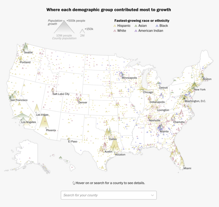
Using their peaks and valleys metaphor, The Washington Post shows the shift in racial population between 2010 and 2020. The open triangles, one for each county, show population with width, population growth with height, and fastest-growing race or ethnicity with color.
You might recognize the form from the Post’s 2016 election results, but there’s a small wrinkle when you look at the breakdowns for individual groups. The triangles flip upside down for where population decreased.

 Visualize This: The FlowingData Guide to Design, Visualization, and Statistics (2nd Edition)