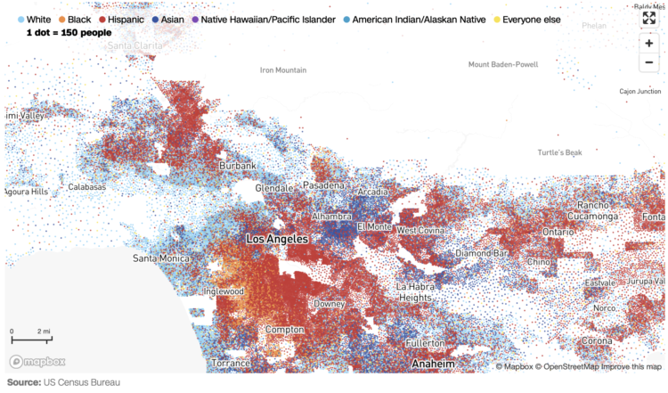
CNN goes with the dot density map for their first pass on the 2020 decennial. Each dot represents a certain number of people depending on your zoom level. Color represents race or ethnicity.
Does CNN have a limited color palette that they’re allowed to use? I would’ve gone for more contrast between the light blue for white and darker-but-still-light blue for American Indian/Alaskan Native.
See also: Dustin Cable’s racial dot map from 2013 and Erica Fischer’s dot maps of the same flavor from 2010.

 Visualize This: The FlowingData Guide to Design, Visualization, and Statistics (2nd Edition)