In case you’re not so good with the words, but feel the social…
Nathan Yau
-
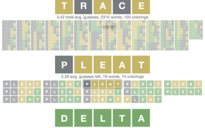
Optimized Wordle solver
-
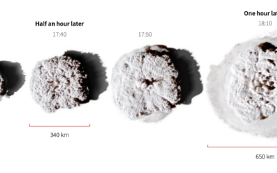
Scale of the Tonga eruption
Manas Sharma and Simon Scarr used satellite imagery to show the scale of…
-
How N95 masks work
In efforts to reduce further spread of the virus, the US is set…
-
Joke machine learning projects to advance your career
In an automated job climate that analyzes resumes and inspects social profiles, it…
-
Members Only
Boring Charts – The Process 173
Thinking about the differences between boring charts and not so boring charts.
-
Declining U.S. Births
The number of births per month has been decreasing over the past decade. The pandemic seems to have sped up the process in the beginning.
-
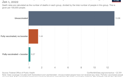
Death rates by vaccination booster status
Our World in Data continues their important work on providing and showing up-to-date…
-
Analytics for U.S. government websites
With the announcement of free Covid-19 tests through the United States Postal Service,…
-
Global ripple effect from underwater volcano
An underwater volcano erupted about 40 miles off the coast of the main…
-
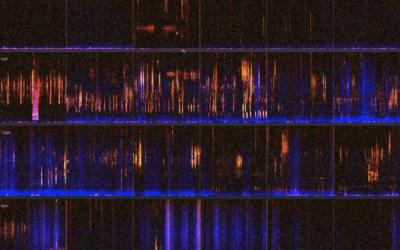
A visual and audio tour of sound at Nap Nap Swamp
When I think swamp noise, I imagine a blob of sound that’s some…
-
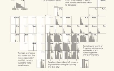
Congressmen who enslaved people
Using old Census records and documents, Julie Zauzmer Weil, Adrian Blanco and Leo…
-
Members Only
Debating About Visualization – The Process 172
The discussions this week felt familiar. Probably because we’ve seen this many times, since the beginning of charts themselves.
-
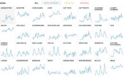
New shopping search patterns from the pandemic
Schema Design, Google Trends, and Axios collaborated on The New Normal, looking at…
-
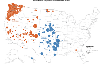
All-time temperature records broken in 2021
Using data from NOAA, Krishna Karra and Tim Wallace for The New York…
-
Settling all the internet debates in one go with a bunch of polling
The internet was once this fun place where people had goofy debates about…
-
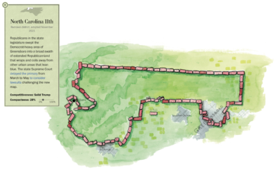
Play miniature golf, learn about congressional redistricting
Congressional redistricting and gerrymandering are important topics, because they can directly change election…
-
Scale of the bigger, more detailed universe
We’ve learned more about the universe since Charles and Ray Eames produced Powers…
-
Powers of Ten
The Powers of Ten by Charles and Ray Eames from 1977 shows the…
-
Members Only
A Quick and Easy Way to Make Spiral Charts in R
Now that we’ve discovered another way to annoy chart snobs, here’s how you can make your own spirals.
-
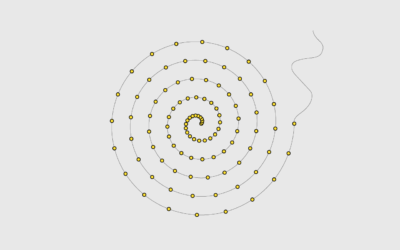
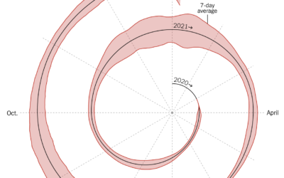
Spiral graph to show Covid-19 cases
This spiralized chart by Gus Wezerek and Sara Chodosh for NYT Opinion has…










 Visualize This: The FlowingData Guide to Design, Visualization, and Statistics (2nd Edition)


