Who is the most famous person born in the place you live? This…
Nathan Yau
-
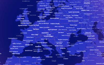
Most notable person, everywhere in the world
-
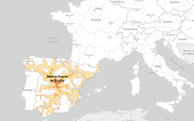
Mapping how far you can travel by train in five hours, from any European station
This European travel map by Benjamin Td shows how far you can travel…
-
Odds of winning the big Mega Millions prize
With tonight’s Mega Millions jackpot estimated at $1.28 billion, you might be wondering…
-

Data visualization(-ish) in the style of famous artists
DALL-E is an AI system from OpenAI that creates images from text. You…
-
Members Only
Visualization Tools and Learning Resources, July 2022 Roundup
Here’s the good stuff for July.
-
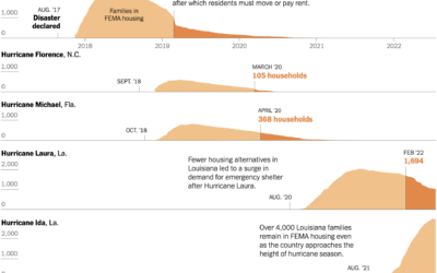
Housing displacement after disasters
Christopher Flavelle, for The New York Times, reported on the lack of support…
-
RStudio changes name to Posit
RStudio, the company behind the IDE of the same name, are changing their…
-
Revisiting data science, the career
In 2012, Thomas Davenport and DJ Patil outlined a budding career choice called…
-

Pizza Exchange Rate
This is a story about pizza, geometry, and making sure you get what you paid for.
-

Florence Nightingale’s use of data visualization to persuade in the 19th century
For Scientific American, RJ Andrews looks back at the visualization work of Florence…
-
A plea to stop climate change from the guy who makes maps
For Washington Post Opinion, a struggling mapmaker makes a plea to stop climate…
-

Visualizing Delaunay Triangulation
Delaunay triangulations have applications in computer graphics, spatial analysis, and visualization. They “maximize…
-
Members Only
Ambiguous Units of Measurement
It’s better to err on the side of obvious than leave things ambiguous.
-
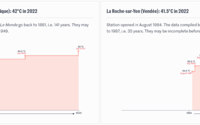
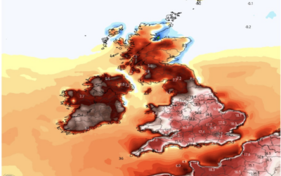
Timelines for record temperatures
Speaking of the heat wave in Europe, Pierre Breteau for Le Monde charted…
-

Melting popsicles to visualize a heat wave
Many European countries are experience record high temperatures, so The Washington Post used…
-

Database of feathers
There’s a database of feathers called Featherbase, because of course there is:
Featherbase… -
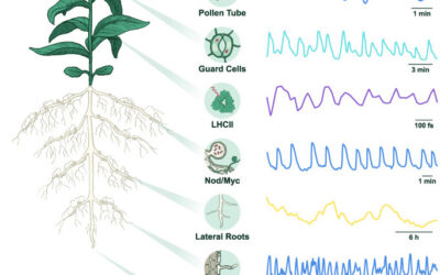
Rhythm in plant cells
Researchers are studying the electrical rhythms in plant cells. I’m not sure what…
-
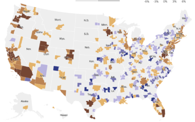
Country-wide housing shortage
Emily Badger and Eve Washington for NYT’s The Upshot show how the housing…
-

Period trackers and legal implications
Given the current restrictions in the U.S., Kendra Albert, Maggie Delano, and Emma…
-
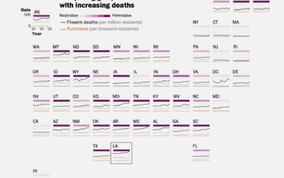
Full scope of gun deaths in the U.S.
As I’m sure you know, mass shootings, which gain attention because the scale…
Recently for Members
Second Edition
 Visualize This: The FlowingData Guide to Design, Visualization, and Statistics (2nd Edition)
 Visualize This: The FlowingData Guide to Design, Visualization, and Statistics (2nd Edition)
New tools, refined process.
Browse by Chart Type See All →


