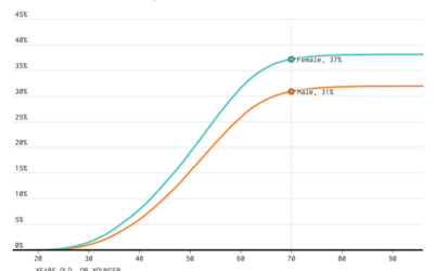
When Americans Had Intercourse with Opposite Sex for the First Time
The National Survey of Family Growth, run by the Centers for Disease Control and Prevention, asks participants about their birth and relationship history.
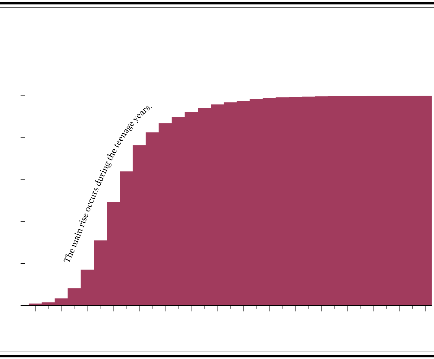
AMONG THOSE WHO HAD INTERCOURSE
WHEN PEOPLE LOST VIRGINITY WITH OPPOSITE SEX
BASED ON ESTIMATES FROM THE NATIONAL SURVEY OF FAMILY GROWTH
CUMULATIVE
100%
80%
60%
40%
20%
0%
10
12
14
16
18
20
22
24
26
28
30
32
34
36
38
40
YEARS OLD
SOURCE: Centers for Disease Control and Prevention, NSFG 2013-2015
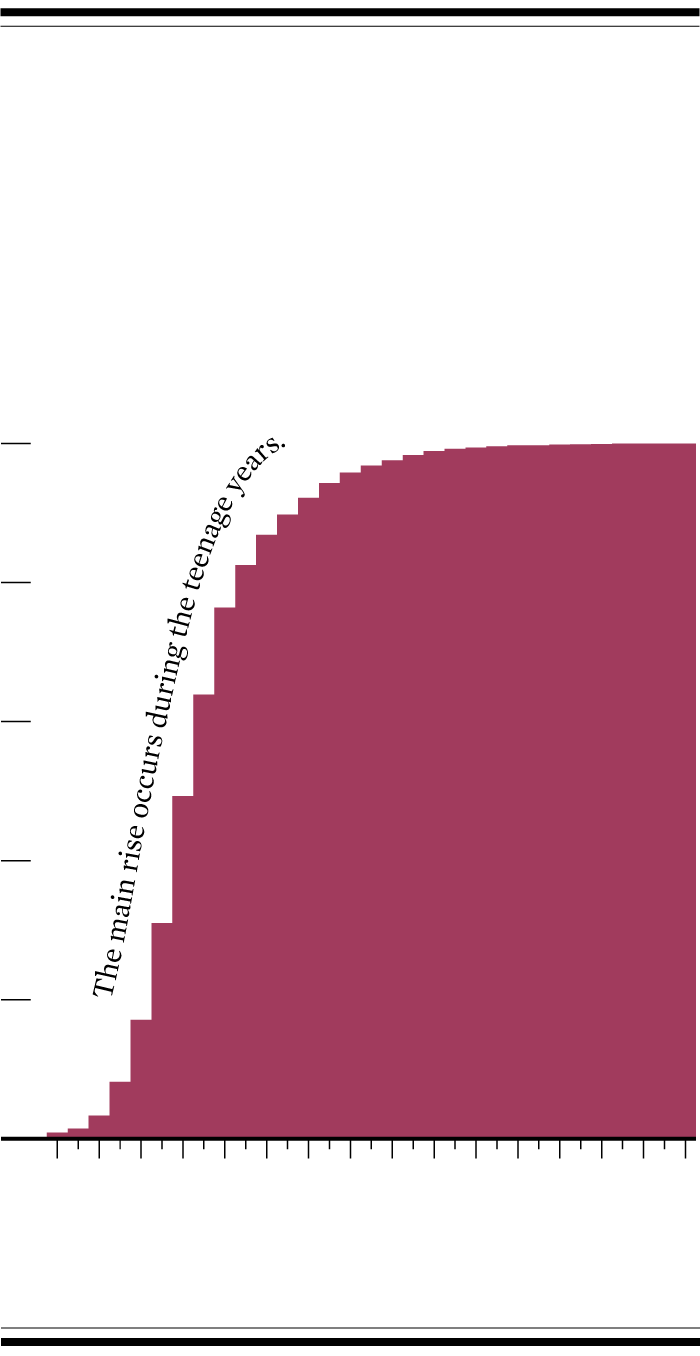
AMONG THOSE WHO HAD INTERCOURSE
WHEN PEOPLE LOST VIRGINITY
WITH OPPOSITE SEX
BASED ON ESTIMATES FROM THE
NATIONAL SURVEY OF
FAMILY GROWTH
CUMULATIVE
100%
80%
60%
40%
20%
0%
10
12
14
16
18
20
22
24
26
28
30
32
34
36
38
40
YEARS OLD
SOURCE: Centers for Disease Control and Prevention, NSFG 2013-2015
I expected a high percentage of people to lose their virginity during their teenage years, but I didn’t expect it to rise that quickly. Maybe I was sheltered.
The cumulative percentages are based on survey results from the 2013-2015 National Survey for Family Growth. There have been two more data releases since, but more data is obscured each year to non-researchers. While I suspect some change, I’d bet it’s not that much.
Chart Type Used

Become a member. Support an independent site. Get extra visualization goodness.
See What You Get