A Tesla Model S, while on “Autopilot”, crashed into a parked truck, killing…
Nathan Yau
-
Hacker accesses crash data against Tesla in $243m ruling
-
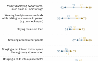
What counts as rude behavior in public, by age group
Pew Research asked U.S. adults if certain behaviors in public, such as cursing…
-

Atlas of Space
Gordon Hart put together a fun interactive atlas of space. Click on objects,…
-
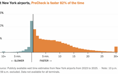
Checking TSA PreCheck time savings
TSA PreCheck allows U.S. travelers to skip the part of airport security where…
-
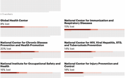
Counting the reduction of federal health workforce
The U.S. federal government does not release official numbers for the cuts to…
-
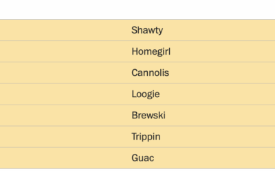
Most American and British words
For WaPo’s Department of Data, Andrew Van Dam goes looking for American and…
-
Members Only

Visualization Tools and Resources – August 2025
Here are tools to use, datasets to poke at, and resources to learn from.
-
Vibe coding from a non-programmer’s perspective
For Wired, Lauren Goode spent a day vibe-coding at Notion:
The next assignment… -

Scraping the Spotify playlists of public figures
New to me, someone anonymously scraped and published the Spotify playlists of a…
-

Will Smith’s AI usage troubles and the fake-ish crowds
Will Smith posted a video showing highlights from his tour, but parts of…
-
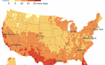
Summer getting longer
For the Washington Post, Kasha Patel and Naema Ahmed mapped the change in…
-

There is no correct map
Speaking of the Correct the Map campaign, Miguel García Álvarez reminds that there…
-

Moving away from Mercator for maps of the world
For Reuters, Catarina Demony and Ayendeng Bior report on the African Union’s push…
-

Breaking competitive yo-yo
Soloham is a yo-yo style where there are two yo-yos off the string.…
-
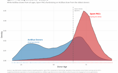
Deceiving seniors for political fundraising, like a Nigerian prince
Adam Bonica analyzed the age of donors across different groups and politicians. For…
-
Members Only
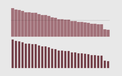
Visualization editing
This week we make a solid, straightforward chart more readable and focused. It’s about the small things.
-
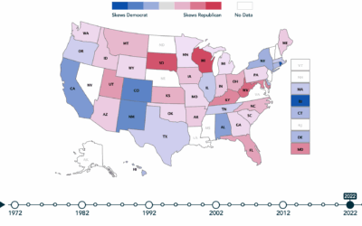
Evaluating the fairness and gerrymandering of district boundaries
PlanScore uses four measures to define partisan gerrymandering, and they’ve made the data…
-

Business of making AI slop videos
For the Washington Post, Drew Harwell reports on the budding industry of AI-generated…
-
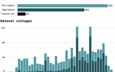
Tracking changes to Census data
Hannah Recht is tracking data through the U.S. Census Bureau APIs:
The Census… -
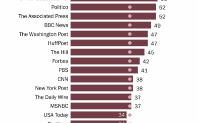
By news source, education levels of the audience
You probably have a rough idea of education levels for each audience, but…
Recently for Members
Second Edition
 Visualize This: The FlowingData Guide to Design, Visualization, and Statistics (2nd Edition)
 Visualize This: The FlowingData Guide to Design, Visualization, and Statistics (2nd Edition)
New tools, refined process.
Browse by Chart Type See All →


