This week, there were a lot of trade-offs between utility and aesthetics. How do you find the balance?
Nathan Yau
-
Members Only
When the visual trade-offs are worth it
-
What it’s like when a data center moves in
For the Verge, Lauren Feiner visited Loudoun County, Virginia, which used to be…
-

Hand-drawn illustration library
Open Peeps by Pablo Stanley is a library of people illustrations. You can…
-
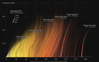
Hotter days and more of them
Summer 2026 is likely the hottest summer on record since 1895. The NYT…
-
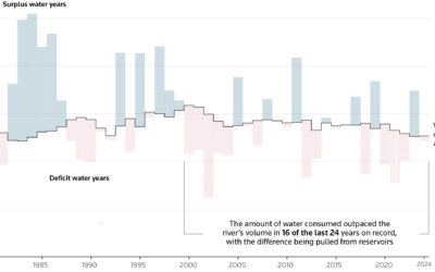
Consuming more than the Colorado River provides
The Colorado River is at risk due to drought and states using more…
-
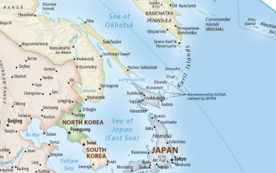
Japan requests revision to UN-supported map
The United Nations voted to support the Equal Area map projection, which more…
-

9/11 in Realtime
9/11 in Realtime, developed by Robbie Byrd, replays the news on the day…
-

Wealth inequality in America, updated for 2026
In 2013, a video on U.S. wealth inequality was posted to YouTube by…
-
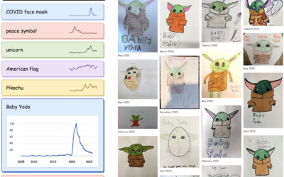
Cultural trends through kid drawings
Riley Walz charted drawing trends on student art portfolio Artsonia.
Kids shape culture,… -
Members Only
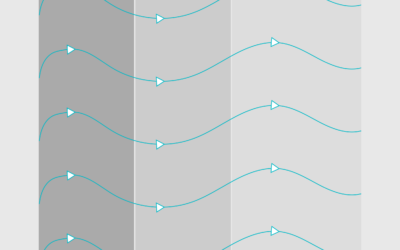
Application of charts and data
This week is about adapting our visualization workflow as the tools change dramatically.
-
Terence Tao on the paradox of solving mathematical problems
Mathematician Terence Tao, a 2006 Fields Medal winner and professor at UCLA, discusses…
-
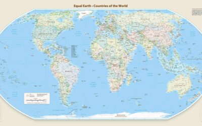
UN votes to support map projection that accurately shows the size of Africa
Last year, the African Union pushed for wider adoption of the Equal Area…
-
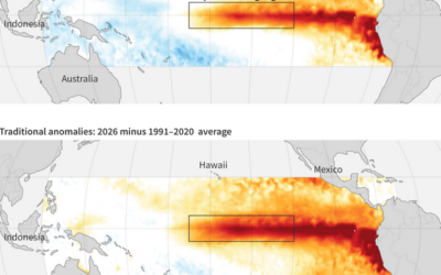
Estimating a much stronger than usual El Niño
For Climate.us, Emily Becker explains why it looks like El Niño is going…
-
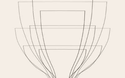
Form a curve, make a pot
Imagine a pottery wheel that turns clay on an axis. A potter forms…
-
Members Only
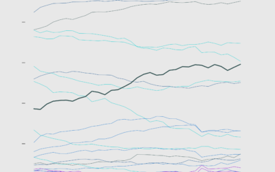
Making a bunch of line charts
This week, I describe the many small choices one must make while working on a set of charts.
-
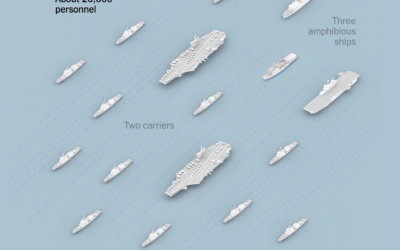
Logistics of fueling aircraft and feeding sailors with a limited supply chain
There are thousands of crew members aboard U.S. warships in the Middle East.…
-
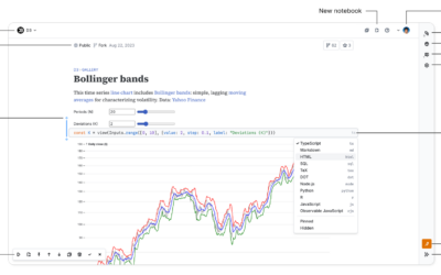
Observable notebooks get a rewrite
Observable, known for visualization-centric notebooks to share code, restarted fresh to adjust for…
-
India enlists 3 million people to count the full population
Due to Covid, India’s census count is overdue by five years. But they’re…
-
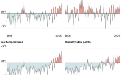
Cooling down less in the evening
The summer of 2026 will most likely be the hottest summer on record…
-
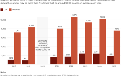
Uncounted heat-related deaths
The U.S Centers for Disease Control and Prevention count causes of death, and…
Recently for Members
Second Edition
 Visualize This: The FlowingData Guide to Design, Visualization, and Statistics (2nd Edition)
 Visualize This: The FlowingData Guide to Design, Visualization, and Statistics (2nd Edition)
New tools, refined process.
Browse by Chart Type See All →