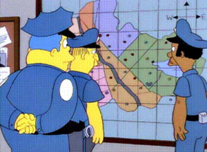
Parabon NanoLabs is working on a service that provides face estimates using DNA…
Nathan Yau
-
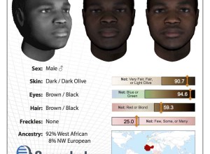
DNA face estimation
-
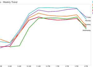
Best time to visit DMV
I think there are people who still go to the Department of Motor…
-
R site updated
The R site has a new face. It looked dated for years —…
-
Members Only
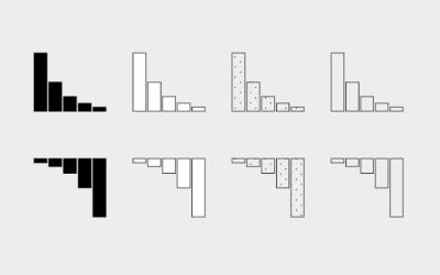
How to Make and Use Bar Charts in R
The chart type seems simple enough, but there sure are a lot of bad ones out there. Get yourself out of default mode.
-
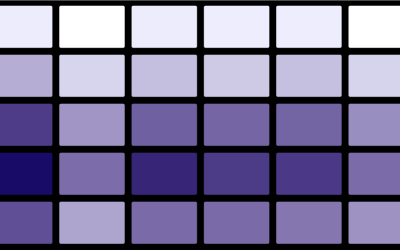
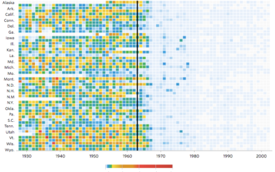
Probably not a heat map
A heat map is a grid of numbers colored by value. I wrote…
-
Where to Find Jeopardy! Daily Doubles
Placement of Daily Double clues, from season 1 to 31. Watch them play out.
-
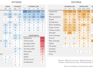
Madden ratings formula
In football video game Madden, NFL players are scored based on skill, which…
-
rvest: R package to scrape web data
Inspired by the Python libraries RoboBrowser and BeautifulSoup, the rvest package by Hadley…
-
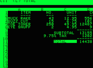
Spreadsheets for life
Planet Money goes back to a 1984 article by Steven Levy that discusses…
-
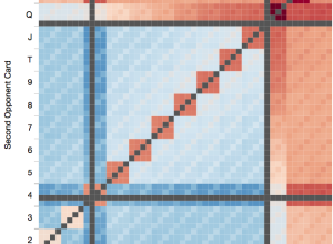
Texas hold ’em win probabilities
Software engineer Chris Beaumont visualized the strength of opponent hands in Texas hold…
-
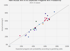
Gambler’s perspective on sports team win probabilities
Michael Beuoy’s win probability model plotted on FiveThirtyEight starts all NBA teams at…
-
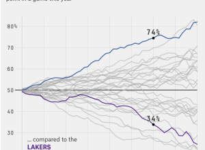
Every NBA team’s chances of winning, by game minute
Michael Beuoy made a win probability model for NBA teams and games, based…
-
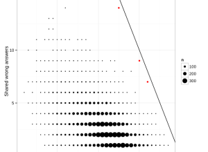
Identifying cheaters in test results, a simple method
Jonathan Dushoff had issues with students in his population biology class cheating on…
-
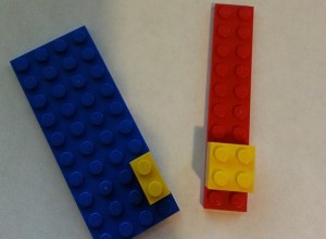
Bayes’ theorem explained with LEGO bricks
Bayes’ theorem is covered in introduction to statistics and probability courses, but I…
-

White House appoints first US Chief Data Scientist
Did you hear the news? The White House officially appointed DJ Patil as…
-
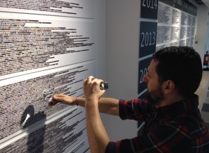
A photo of everything touched, for 11 years
Artist Alberto Frigo took a picture of every object he used with his…
-
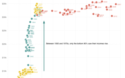
Top 1% earners versus bottom 90%
Quoctrung Bui for Planet Money plotted average income for the top one percent…
-
Members Only
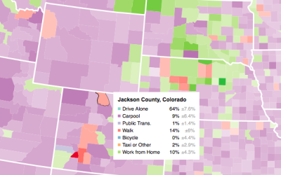
Making an Interactive Map with Category Filters
Let readers focus on the regions they care about to make their own comparisons and conclusions.
-
Impact of vaccines throughout history
Not that anyone who does not vaccinate their kids cares, but Tynan DeBold…
-
Loading Data and Basic Formatting in R
It might not be sexy, but you have to load your data and get it in the right format before you can visualize it. Here are the basics, which might be all you need.
Recently for Members
Second Edition
 Visualize This: The FlowingData Guide to Design, Visualization, and Statistics (2nd Edition)
 Visualize This: The FlowingData Guide to Design, Visualization, and Statistics (2nd Edition)
New tools, refined process.
Browse by Chart Type See All →


