Working from home was an ideal that many strived for. For many, it still is, but for those with kids who have to learn from home, the schedule change is less than ideal.
Nathan Yau
-
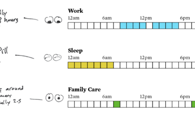
Parenting and Work Schedule During the Pandemic
-
Comparing the coronavirus to past deadly events
One way to estimate the impact of the coronavirus is to compare it…
-
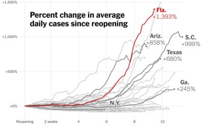
Increase in cases since states reopened
Using the now all too familiar baseline chart, where all of the time…
-
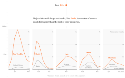
Race and the virus
The New York Times obtained data on race and those affected by the…
-
Members Only
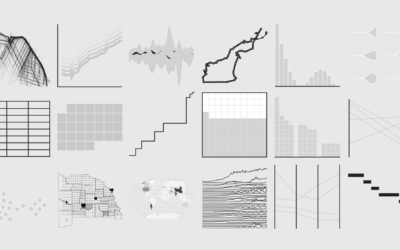
Use Established Chart Types, Because They’re More Straightforward (The Process 097)
Unique charts and visual encodings are worth exploring, but what about traditional charts? Also, a members’ preview of a new chart catalogue.
-
Hidden trackers on your phone
Sara Morrison for Recode:
Then there’s Cuebiq, which collected location data through its… -

Everlasting pie chart
Manuel Lima goes into the history of the pie chart, or rather, circle…
-

Map of Foreign Students
There are over 1 million international higher-education students enrolled in the United States. This map shows where they reside.
-
Data on loans issued through the Paycheck Protection Program
The Paycheck Protection Program was established to provide aid to small businesses. It’s…
-
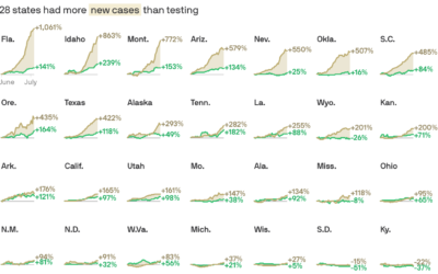
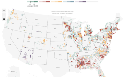
Cases vs. testing
There have been assertions that increased case counts are all from increased testing.…
-
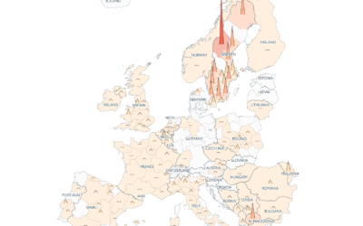
Coronavirus counts across Europe
Going with the shaded triangle peaks to show case counts and deaths, The…
-

Why time feels weird right now
For Reuters, Feilding Cage provides a series of interactive tidbits to demonstrate why…
-
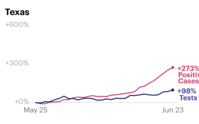
Increased case counts not just from increased testing
Some attribute increased Covid-19 case counts to increased testing. While that is certainly…
-
Members Only

Try New Visual Encodings, Because Something Might Work (The Process 096)
Sometimes a chart type seems terrible. But you’ll never know until you try.
-
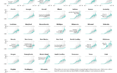
Restaurant Reopenings, a Comparison to Last Year
Restaurants are reopening for dining across the United States. Some states are doing it faster than others.
-
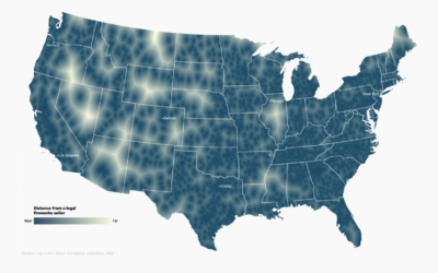
Map shows where to go to get away from fireworks
Using a voronoi map, David Yanofsky for Quartz mapped the places in the…
-

Decade-long time-lapse of the sun
NASA’s Solar Dynamics Observatory has been taking a picture of the sun every…
-
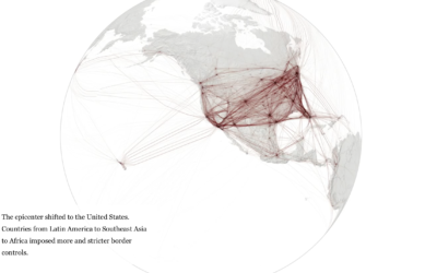
When the world shut down, seen through global flights
Lauren Tierney and William Neff for The Washington Post used a rotating globe…
-
Cataloging all the house number styles
Dan Kois walked all of the blocks in his ZIP Code and collected…
-
Members Only

How to Make a Spiral Chart in R
Using a spiral might not be the best way to encode data. But here’s how to do it anyway. Just in case.
Recently for Members
Second Edition
 Visualize This: The FlowingData Guide to Design, Visualization, and Statistics (2nd Edition)
 Visualize This: The FlowingData Guide to Design, Visualization, and Statistics (2nd Edition)
New tools, refined process.
Browse by Chart Type See All →


