How the American Work Day Changed in 15 Years
The American Time Use Survey, an ongoing survey run by the Bureau of Labor Statistics and the Census Bureau, interviews thousands of people every year for a sense of how we spend our hours. It’s been running since 2003, and the data for 2018 recently went up. I had to ask: How has time use changed during the past 15 years?
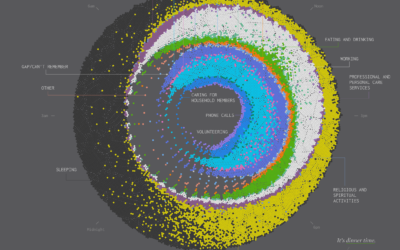
Spending Time in 2003 vs. 2018
Average percentage of people 15 and older who did selected activities on a work day. Color represents activity category.
Notes
- The data comes from the 2003 and 2018 American Time Use Survey. You can poke around at the government pages to get the data, but I downloaded the data via IPUMS.
- For a clearer comparison, I focused only on the non-holiday weekdays, which provided survey results from 4,676 respondents in 2018 and 10,053 in 2003.
- I also looked at average duration for those engaged with an activity. Using the view above, the contrasting hours were confusing. The duration values are more interesting when looking at each activity on its own.
- I analyzed and prepared the data in R. I made the chart with D3.js.
Become a member. Support an independent site. Get extra visualization goodness.
See What You Get