3Blue1Brown goes into more of the math of SIR models — which drive…
Nathan Yau
-
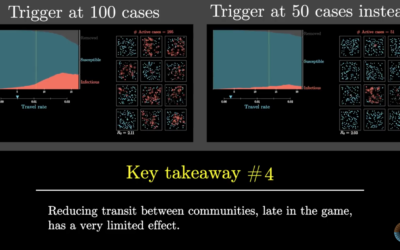
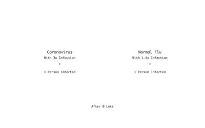
Simulating an epidemic
-

Toilet Paper Calculator
Maybe you’re starting to run low. Here’s how much you’ll need when you go to restock.
-
Coronavirus data at the state and county level, from The New York Times
Comprehensive national data on Covid-19 has been hard to come by through government…
-

Now pull
A comic by Marcos Balfagón attaches action to the curve.…
-
Members Only

Visualization Tools and Resources, March 2020 Roundup – The Process 082
Every month I collect useful visualization tools and resources to help you work better or more efficiently. Here’s the good stuff for March.
-
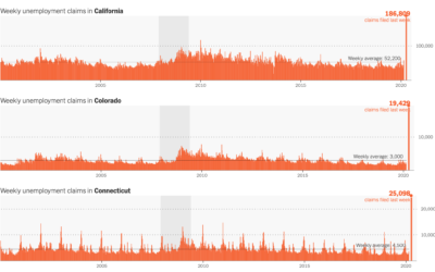
Unemployment spike
The Department of Labor released the numbers for last week’s unemployment filings. 3.28…
-
Johns Hopkins providing course on using epidemiology to understand the Covid-19 numbers
The numbers are fuzzy. You take them at face value, and you end…
-
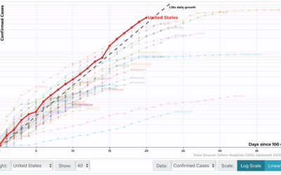
Track confirmed Covid-19 cases by country, state, and region
Wade Fagen-Ulmschneider made a set of interactive charts to track confirmed coronavirus cases.…
-
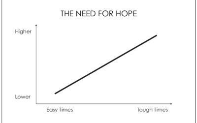
Hope
I read and read and read and read. But almost everything I read…
-
Poor comparison between two bar charts
A chart from Business Insider makes a poor attempt to compare the death…
-
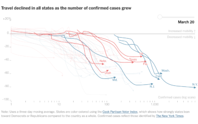
Mobile phone data shows decreased movement nationwide
Stuart A. Thompson and Yaryna Serkez for New York Times Opinion on decreasing…
-
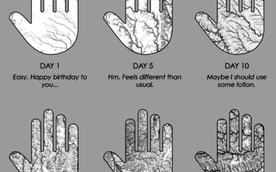
Dry Hands
I spend 50% of my waking hours washing my hands. I spend the…
-
Communicating a crisis
David Spiegelhalter on communicating a crisis:
There are some basic principles, which I… -
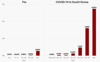
For Everyone Else
In a Channel 4 clip, Hugh Montgomery does some back-of-the-napkin math contrasting the normal flu against the coronavirus. Here’s a chart version.
-

Break the chain
For The Spinoff, Toby Morris illustrates how individuals can break a chain of…
-
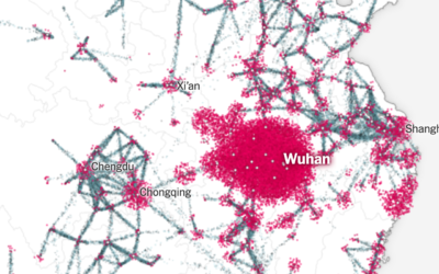
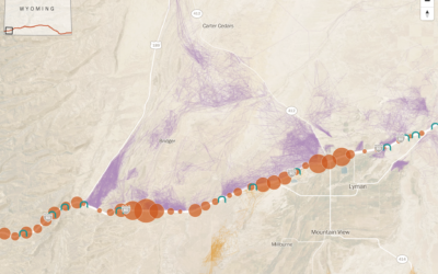
Particle flows show how the coronavirus ramped up
Using a combination of estimates based on cell phone movements and outbreak size,…
-
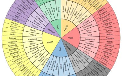
Wheel of emotional words, in case you’re having trouble finding the words these days
You’re probably feeling a range of emotions these days. It helps if you…
-
Deer crossing across highway corridors
With the climate changing, animals will need to migrate to different areas to…
-

Coronavirus Explained and What You Should Do
Kurzgesagt, which make videos to explain complex and abstract concepts in an understandable…
-

How washing your hands for 20 seconds does the trick
Vox used a lotion that mimics viruses to demonstrate the power of washing…
Recently for Members
Second Edition
 Visualize This: The FlowingData Guide to Design, Visualization, and Statistics (2nd Edition)
 Visualize This: The FlowingData Guide to Design, Visualization, and Statistics (2nd Edition)
New tools, refined process.
Browse by Chart Type See All →


