Divorce rates are tied to job security, age, and occupation, so it should make sense that we see a pattern when we plot divorce rates against income.
Nathan Yau
-
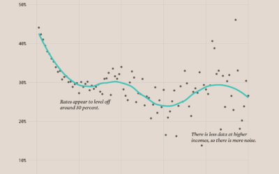
Divorce Rates and Income
-
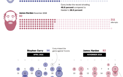
Stephen Curry’s record-setting month for shooting threes
Steph Curry has been on a tear as of late. In April he…
-

Climate change and uncertainty
In his new data-driven documentary, Neil Halloran digs into the uncertainty attached to…
-
Members Only

Visualization Tools and Learning Resources, April 2021 Roundup
Here’s the good stuff for April 2021.
-

Maps of land required to get to net-zero emissions
Princeton University’s Net-Zero America project analyzes and models the infrastructure required to get…
-

Melting glaciers
Niko Kommenda for The Guardian used small multiples to show 90 of the…
-

Population Growth and Seats Gained
The Census Bureau released state population counts for 2020. Here’s how each state gained and lost population and seats.
-
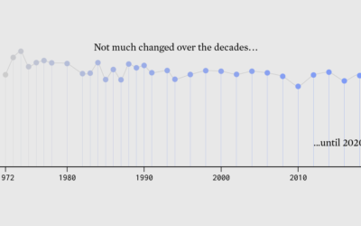
Surprise, Less Happiness During Pandemic
Since 1972, the General Social Survey has asked people about their happiness. It never changed much — until 2020 happened.
-

States that gained and lost seats with 2020 count
The Census Bureau announced their state population totals, so we can see who…
-
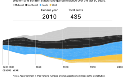
Seat apportionment over time
The 2020 Census count at the state level is set for release this…
-
Where people moved during the pandemic
In another look at migration through the lens of USPS change of address…
-

Using noise in creative coding
Oftentimes visuals generated through code can seem cold and mechanical when you’re after…
-

Compare the scale of any area in the world
Riffing on the Ever Given Ever Ywhere, which lets you place the Ever…
-
Members Only
Relative Comparison – The Process 136
In analysis and visualization, you’re often tasked with the “compared to what” question. Your approach will change the perspective.
-

Visual deconstruction of popular songs
Nate Sloan and Charlie Harding, for NYT Opinion, look at how the structure…
-
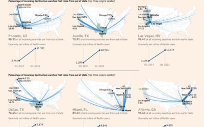
Maps of migration to smaller cities
Steven Bernard for Financial Times, in a report by Claire Bushey and Steff…
-
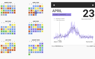
Trending hobbies during the pandemic
This past year has seen a rising interest in long-lost hobbies due to…
-
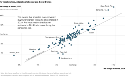
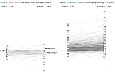
Pandemic migrations
With the restrictions of the pandemic, you might expect an unusually big wave…
-

Converting Minecraft worlds to photorealistic ones using neural networks
Researchers from NVIDIA and Cornell University made GANcraft:
GANcraft aims at solving the… -
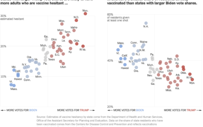
Voting and vaccination rate
Danielle Ivory, Lauren Leatherby and Robert Gebeloff for The New York looked at…
Recently for Members
Second Edition
 Visualize This: The FlowingData Guide to Design, Visualization, and Statistics (2nd Edition)
 Visualize This: The FlowingData Guide to Design, Visualization, and Statistics (2nd Edition)
New tools, refined process.
Browse by Chart Type See All →


