RJ Andrews, in collaboration with the David Rumsey Map Center, curated a collection…
Nathan Yau
-
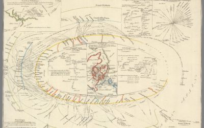
Exhibition of historical visualization
-
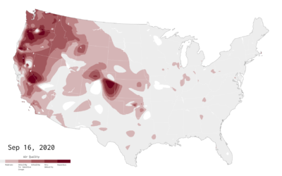
Air Quality Mapped Over Time
With wildfires burning in the western United States, smoke fills the air. This is an animation of the air quality during the past couple of months.
-
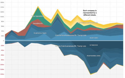
Timeline of the President’s taxes
The New York Times got a hold of the President’s tax records for…
-

I am a book. I am a portal to the universe.
Stefanie Posavec and Miriam Quick have a new book out called I am…
-
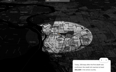
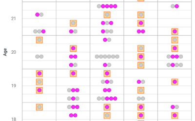
Covid-19 in your neighborhood
With recorded U.S. Covid-19 deaths passing the 200k mark, somehow the number still…
-

What states are doing to make mail-in ballots clearer
Mail-in ballots can be rejected if they’re not filled out or mailed correctly.…
-
Members Only

The Process 108 – Expected Value
Look only at uncertainty and it can feel overwhelming. Look at just averages and it’s not enough information. So, smoosh them together.
-
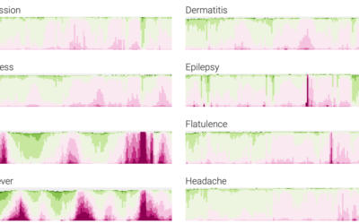
Google search trends dataset for Covid-19 symptoms
Google released a search trends dataset earlier this month. Using this dataset, Adam…
-

Trump’s criminal justice ad spending on Facebook
The Marshall Project contrasted ad spending on Facebook by Trump’s campaign against Joe…
-
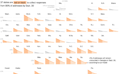
Census undercount
For NYT Opinion, Gus Wezerek and Andrew Whitby on what might happen if…
-
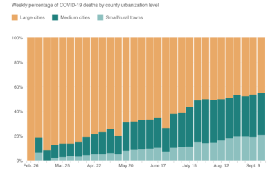
Shift of Covid-19 deaths to medium and small cities
When this all started, Covid-19 was impacting large cities at a much higher…
-
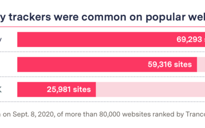
Blacklight, a tool to see how the websites you visit are tracking you
Companies are tracking what you do online. You know this. But it can…
-
Randomization to preserve anonymity
Adam Pearce and Ellen Jiang for Google’s PAIR, explain how granular data can…
-
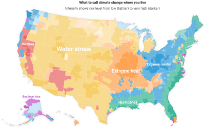
Map of climate threats where you live
For NYT Opinion, Stuart A. Thompson and Yaryna Serkez mapped the most predominant…
-
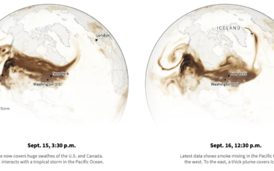
Smoke from the U.S. West Coast travels east and overseas
Smoke from the wildfires made its way to the other side of the…
-
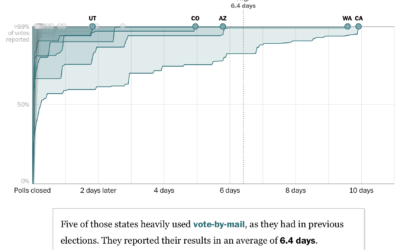
Election night might take weeks
For The Washington Post, Ashlyn Still and Kevin Schaul charted how long it…
-
Members Only

The Process 107 – Misleading or Not? A Map of US Fires
Welcome to another edition of Misleading or Not, where we decide if a map is misleading or not.
-
Arquero, a JavaScript library to query and transform datasets
An often painful yet necessary step in visualization is to get your data…
-
Friends sitcom transcript dataset
For your analytical perusal, Emil Hvitfeldt provides ten seasons’ worth of scripts from…
-

Elevation data molded in the base of a pint glass
North Drinkware molded Half Dome in the bottom of a hand-blown pint glass…
Recently for Members
Second Edition
 Visualize This: The FlowingData Guide to Design, Visualization, and Statistics (2nd Edition)
 Visualize This: The FlowingData Guide to Design, Visualization, and Statistics (2nd Edition)
New tools, refined process.
Browse by Chart Type See All →


