A decade and a half ago, I wrote the first edition of Visualize…
2024
-
Visualize This, Second Edition: Updating a Visualization Guide for My Past Self
-
Access to nature where you live
NatureQuant processes and analyzes satellite imagery to quantify people’s access to nature. They…
-
Members Only
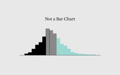
Histograms for Regular People
People need a sense of how distributions work before they can make sense of a histogram. Here’s how I (try to) make these misunderstood charts easier to read.
-
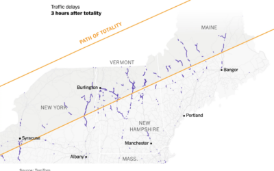
People movements during the eclipse
As you might expect, the path of totality brought increased activities as people…
-
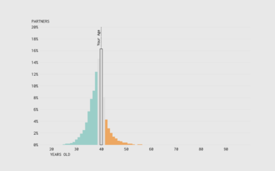
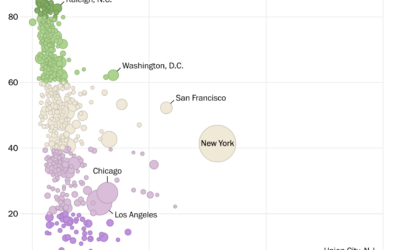
Ages of the People We Marry
Variation kicks in when you look at the later years, consider multiple marriages, divorce, separation, and opposite-sex versus same-sex relationships. This chart breaks it all down.
-
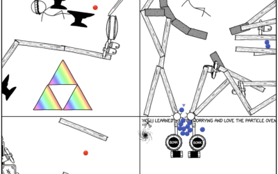
Expanding Rube Goldberg machine that you can edit
From xkcd, a Rube Goldberg machine that keeps on going. Edit a cell…
-
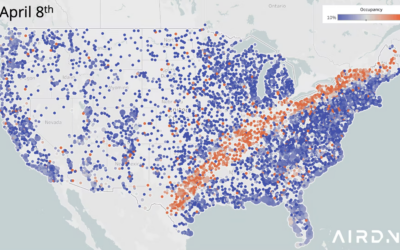
Airbnb occupancy along the eclipse path
Maybe you heard there’s a total eclipse happening today. AirDNA mapped Airbnb occupancy…
-

easystats, an R package
The easystats R package in on my to-try list.
easystats is a collection… -
Members Only
Letting the Data Play Through
Show all the data at once so that you can see a full trend efficiently, but show a bit at a time and show how the data builds.
-

Wind flows displayed with spinning paddles
Joanie Lemercier used a grid of spinning paddles that turn with the wind.…
-
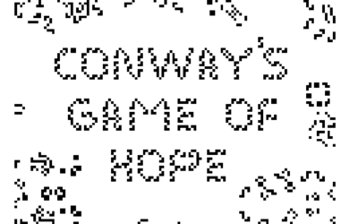
Conway’s Game of Hope
Alexander Miller wrote a “fable of emergence” that combines Conway’s Game of Life…
-
Regulating deepfakes
It continues to get easier to take someone’s face and put that person…
-
OpenAI previews voice synthesis
OpenAI previewed Voice Engine, a model to generate voices that mimic, using just…
-
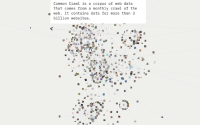
Examining the dataset driving machine learning systems
For Knowing Machines, an ongoing research project that examines the innards of machine…
-
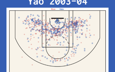
Mapping NBA basketball shots
Alasdair Rae outlines the basics of visualizing basketball shot data with QGIS, an…
-
Members Only
Visualization Tools and Learning Resources, March 2024 Roundup
I collect visualization tools and learning resources and then round them up at the end of each month. Here’s the good stuff for March.
-
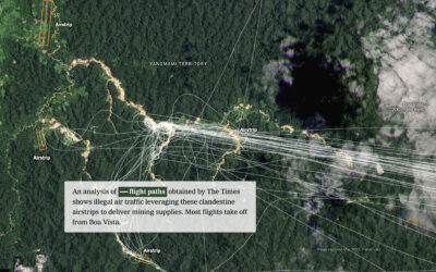
Using satellite imagery to tell stories
Satellite imagery on its own can be limited in what it can say…
-
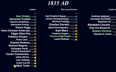
Interactive timeline of notable people throughout history
This is a fun project by Jan Willem Tulp. Based on data from…
-
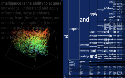
Visualizing the statistical connections behind ChatGPT
To gain a better understanding of how ChatGPT works under the hood, Santiago…
-

Conway’s Game of Life with a third dimension
Alec Singh added another dimension to Conway’s Game of Life for a pretty,…
Recently for Members
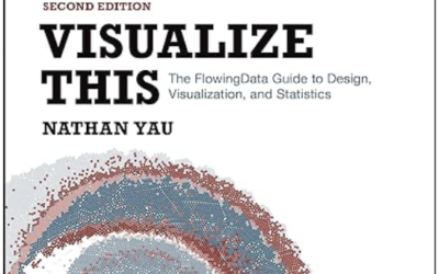
Second Edition
 Visualize This: The FlowingData Guide to Design, Visualization, and Statistics (2nd Edition)
 Visualize This: The FlowingData Guide to Design, Visualization, and Statistics (2nd Edition)
Browse by Chart Type See All →


