Use visual metaphors to shorten the distance between data and what it represents.
-
Members Only
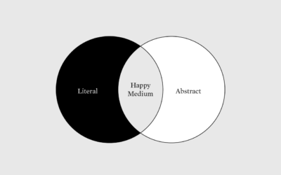
More Literal, Less Abstract
-
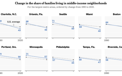
Shrinking middle-class
Income distribution continues to stretch on the high end and squish on the…
-
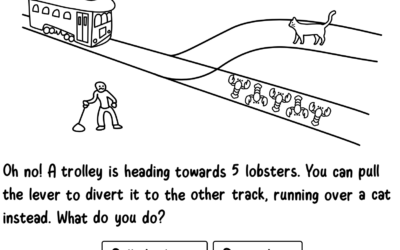
Absurd trolly problems
You’ve probably heard of the trolley problem, a thought experiment that imagines a…
-
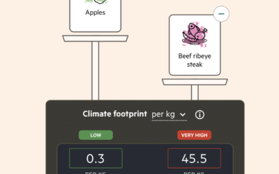
Imagining carbon food labels
By purchasing certain foods, we make decisions about the carbon footprint from the…
-
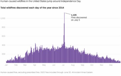
Wildfires caused by fireworks
It’s Independence Day here in the United States, which means there will be…
-
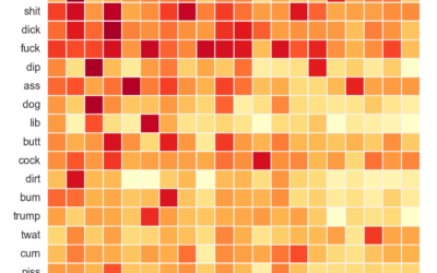
Analysis of compound curse words used on Reddit
As you know, Reddit is typically a sophisticated place of kind and pleasant…
-
Members Only
Visualization Tools and Learning Resources, June 2022 Roundup
Here’s the good stuff for June.
-
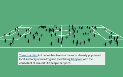
Football field to show population change in the UK
The Office for National Statistics for the UK published an interactive to show…
-
15 years
This past weekend marked 15 years since I first posted on FlowingData. What…
-
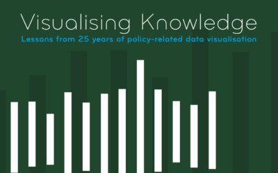
Visualising Knowledge
Visualising Knowledge is an open book from PBL Netherlands Environmental Assessment Agency, based…
-
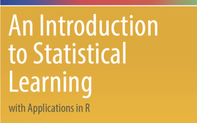
Introduction to statistical learning
An Introduction to Statistical Learning, by Gareth James, Daniela Witten, Trevor Hastie, and…
-
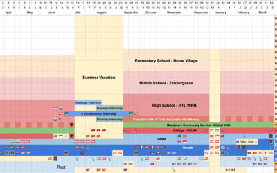
Personal life dashboard
Felix Krause tracks many metrics of his life, both manually and passively, and…
-
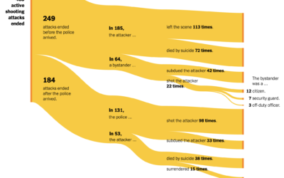
Active shooter endings
For The New York Times, Larry Buchanan and Lauren Leatherby used Sankey diagrams…
-
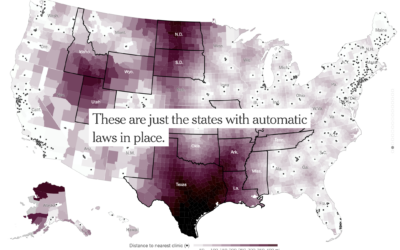
Increased distance to the nearest clinic
With Roe vs. Wade in place, there were areas in the United States…
-
When Americans Had Intercourse with Opposite Sex for the First Time
The National Survey of Family Growth, run by the Centers for Disease Control and Prevention, asks participants about their birth and relationship history.
-
Members Only

Visually Inefficient
Trading optimized visual efficiency in charts for joy and interest.
-
Diagram of watercolors from the 17th century
In 1692, artist A. Boogert published a guide to watercolors, showing the thousands…
-
Mapping the boundaries of history
While geographic boundaries can often seem like a semi-static thing, they’ve changed a…
-
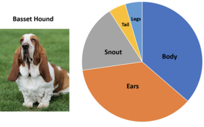
Pie charts of dogs
John Rich made pie charts of dog body proportions. This is very important.…
-
Members Only

How to Make an Animated Donut Chart in R
There are “better” ways to show proportions over time, but sometimes you just want an animated donut.
Recently for Members
Second Edition
 Visualize This: The FlowingData Guide to Design, Visualization, and Statistics (2nd Edition)
 Visualize This: The FlowingData Guide to Design, Visualization, and Statistics (2nd Edition)
New tools, refined process.
Browse by Chart Type See All →


