Connie Jin, who works for NPR and updates a Covid-19 dashboard, talks about…
2021
-
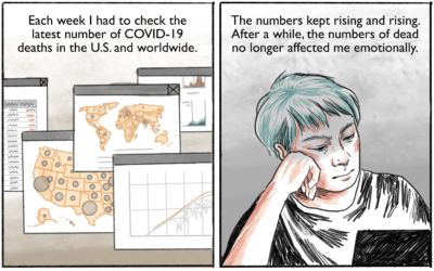
Coping with the big numbers
-
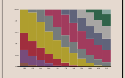
Coming and Going Age Generations
Since no one has figured out how to defeat time, age generations come and go. This chart shows the generational breakdowns since 1920.
-
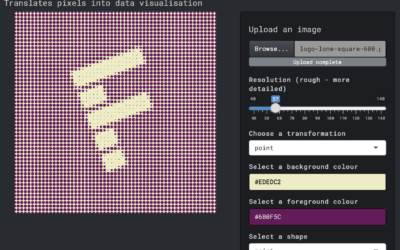
Transform an image into a pixel-ly visual
Here’s a fun interactive by Duc-Quang Nguyen. Upload an image and get back…
-
Historical shifts in where people live
The places in the United States with the highest populations weren’t always like…
-
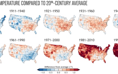
Climate normals mapped over time
Every decade the National Oceanic and Atmospheric Administration releases climate normals to provide…
-
Members Only
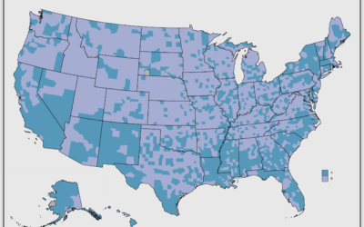
Making a Quick, Custom Prevalence Map – The Process 139
This week I’m describing my process behind a quick map. You can download the code at the end of this issue.
-
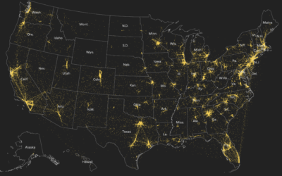
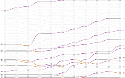
Map of people moving during pandemic
It was only a matter of time before someone showed dots moving across…
-

Information Graphic Visionaries, a book series
The Information Graphic Visionaries book series just launched on Kickstarter. Emma Willard, Florence…
-
‘Less than 10 percent’ outdoors
The CDC said that “less than 10 percent” of coronavirus cases were from…
-
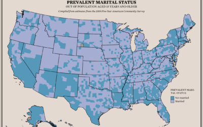
Where People are Married and Not
About 48% of the U.S. population aged 15 and older is married. I was curious if there were regional variations, so I mapped it.
-
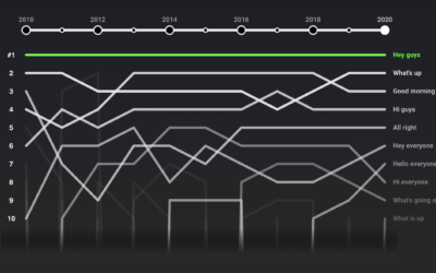
Rankings for YouTube video greetings
If you’ve watched even just a few videos on YouTube, you probably noticed…
-
Visualization accessibility
Øystein Moseng for Highcharts provides a brief guide on making your visualizations for…
-
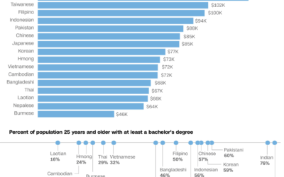
Varying demographics within the Asian American population
We often hear about the Asian American community as one big group of…
-

All the art in the Oval Office
The President of the United States chooses the art for the Oval Office,…
-
Members Only
Visualization, Manually – The Process 138
Put in the time to get to know your data and design around that for best results. Usually this part of the process isn’t automated.
-

Bird song sonographs show distinct drawing patterns
These sonographs of bird song, in contrast to the sounds from traditional instruments,…
-
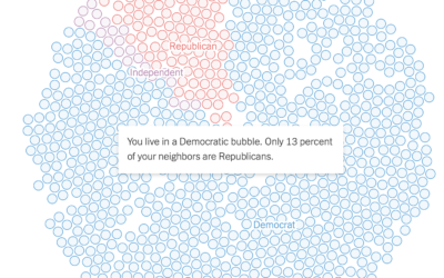
See if you live in a political bubble
Gus Wezerek, Ryan D. Enos, and Jacob Brown for NYT Opinion use neighborhood-level…
-
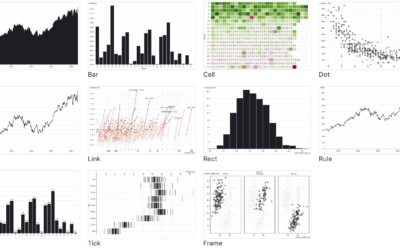
Observable Plot, a JavaScript library for more straightforward visualization of tabular data
If you’re into the notebook workflow, Observable Plot is a JavaScript library built…
-
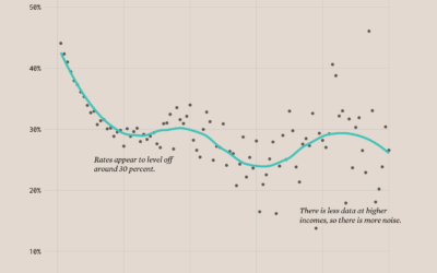
Divorce Rates and Income
Divorce rates are tied to job security, age, and occupation, so it should make sense that we see a pattern when we plot divorce rates against income.
-
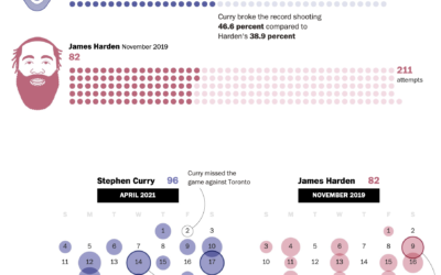
Stephen Curry’s record-setting month for shooting threes
Steph Curry has been on a tear as of late. In April he…
Recently for Members
Browse by Chart Type See All →


Browse By Topic
Get the Book
 Visualize This: The FlowingData Guide to Design, Visualization, and Statistics
 Visualize This: The FlowingData Guide to Design, Visualization, and Statistics
Available now.