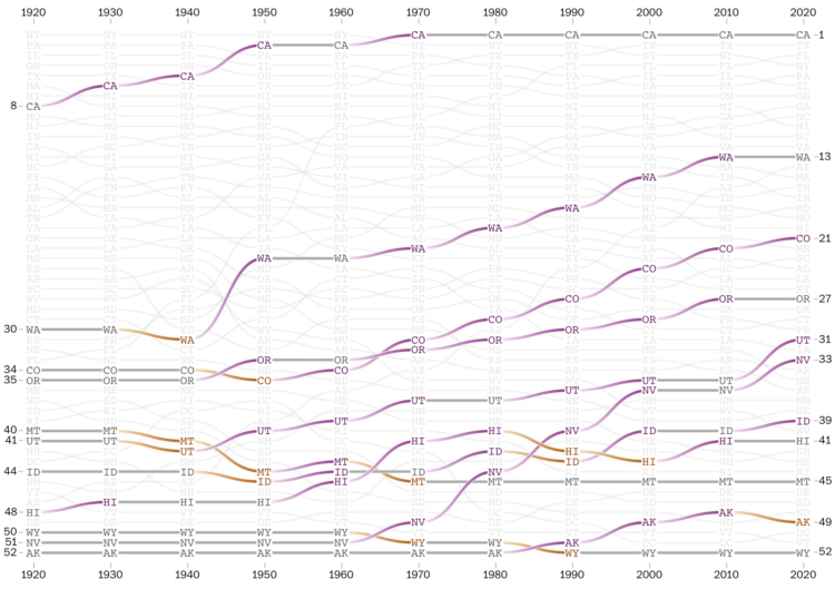
The places in the United States with the highest populations weren’t always like that. There were shifts over decades. With the recent Census release for state populations, Harry Stevens and Nick Kirkpatrick for The Washington Post go all in with a series of bump charts to show the changes in state population rankings since 1920.
They point out historical markers along the way, split it up by region, and provide an explorer at the end to look at your states of interest. In the end, it all comes down to weather and air conditioning.
Still deciding what I think about those gradient connections.

 Visualize This: The FlowingData Guide to Design, Visualization, and Statistics (2nd Edition)