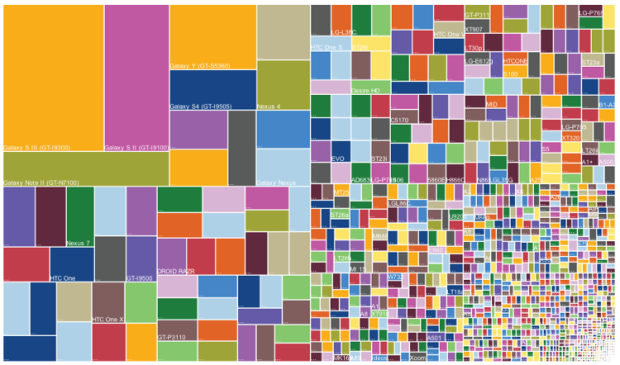
The Guardian posted a small collection of useless infographics. It kind of looks like my suggestion inbox.
Useless infographics
Second Edition
 Visualize This: The FlowingData Guide to Design, Visualization, and Statistics (2nd Edition)
 Visualize This: The FlowingData Guide to Design, Visualization, and Statistics (2nd Edition)
New tools, refined process.