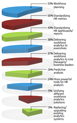
 I’m not entirely sure where this came from, but it’s from someone who describes himself as “an innovation leader in delivering analytics.” Yep. The 3-D. The layering. The piemaster. [via]
Piemaster
Second Edition
 Visualize This: The FlowingData Guide to Design, Visualization, and Statistics (2nd Edition)
 Visualize This: The FlowingData Guide to Design, Visualization, and Statistics (2nd Edition)
New tools, refined process.