Doctor timeline for Doctor Who

I have yet to see a full episode of Doctor Who, “the longest-running science fiction television show in the world” but it was apparently really big news that Peter Capaldi is set to be the next regeneration of the character. Capaldi will be the twelfth doctor since the first episode aired in 1963. Out of curiosity, I had a look at past seasons and how some past doctors have crossed paths.

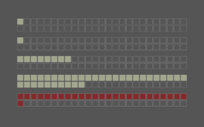
Counting specials and the one television movie, it’s been 800 episodes. Maybe there’s something to this phone booth guy.

Become a member. Support an independent site. Make great charts.

See What You Get

Learn to Visualize Data See All →

How to Make Animated (GIF) Heatmaps in R

Using color as the visual encoding, show changes over time in two dimensions.

How to Make a Semicircle Plot in R

It’s the half cousin of the bubble plot with less overlap and more straight edges.

How to Visualize Hierarchical Graphs in R, with ggraph and tidygraph

Network graphs are a good way to find structure and relationships within hierarchical data. Here are several ways to do it.

How to Make an Animated Pyramid Chart with D3.js

Compare distributions side-by-side with a pyramid chart. Observe the change over the years by animating it.

Favorites

What Qualifies as Middle-Income in Each State

The meaning of “middle-income” changes a lot depending on where you live and your household size.

Data, R, and a 3-D Printer

We almost always look at data through a screen. It’s quick and good for exploration. So is there value in making data physical? I played around with a 3-D printer to find out.

Jobs Charted by State and Salary

Jobs and pay can vary a lot depending on where you live, based on 2013 data from the Bureau of Labor Statistics. Here’s an interactive to look.

Air Quality Mapped Over Time

With wildfires burning in the western United States, smoke fills the air. This is an animation of the air quality during the past couple of months.