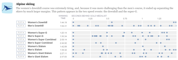
Like everyone, I’ve been watching the Olympics, and it continues to amaze me how hundredths of a second can make up the difference between a gold medal and nothing at all. Amanda Cox of The New York Times visualizes and audiolizes(?) these tiny differences. She got creative with this one.
Each row is an event and going from left to right, the first dot is the gold medal winner. The amount of space between the first dot and the dots that follow is how many seconds athletes finished after the winner.
Visually, this only sort of works, but click on play to hear how these differences sound, and it puts everything in perspective.
See the rest of NYT interactive Olympic coverage here. You know, just in case NBC coverage doesn’t cut it for you.
 Visualize This: The FlowingData Guide to Design, Visualization, and Statistics (2nd Edition)
When two notes overlap, it’s hard to distinguish that it’s two and not one. If she had chosen a different tone for each place, then two notes on top of each other would form a chord, and you could identify it as more than one.
Shouldn’t this also be scale-adjusted for the gold medallist’s time? Being 2s behind in a 5 min event is different to a 1 min event…
Pingback: Das Olympische Musical – Sekunden machen Unterschiede « Dressed Like Machines
Brilliant and innovative way to show this! I’m impressed.
@kenneth – i think that more than one note would be more confusing. The tones are simply to indicate the speed.
@chris – i don’t think that would be clear. being 2 seconds is 2 seconds….regardless of the length of the event.
@zoë – I think a nice, musical, C-D-E-F-G would be very clear and easy to interpret. The brain can extract different notes with great flexibility, while the current overlapping similar sounds make it difficult to distinguish multiple finish times in quick succession. Alternately, the tone could become louder if the tail of one note overlaps the head of another.
I found it interesting that the gap between the women’s winner and the silver medalist was usually larger than the gap for men. That trend is clear visually, and is more clear when we hear the tones.
Anyone know what program is used to create this sort of thing? Thanks.
I would have like to see a different color for silver, bronze and especially 4th. The point was to see how little time is between Gold and 4th but you have to count the places in each row. Be good to see it color coded in that way.