New to me, Anime.js by Julian Garnier seems like a fun library to…
JavaScript
-
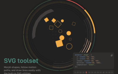
Anime.js, a JavaScript animation engine
-
Members Only
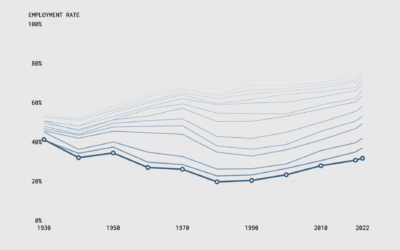
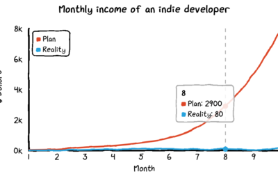
Make the Chart: Interactive Line Chart with Ghost Trails
Using faded lines to show the overall changes in a time series and to provide a point of reference for the present.
-
Members Only
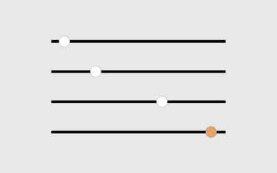
How to Use a Slider to Let Readers Customize Charts
A simple user-controlled slider can help readers look at a dataset from their own point of view.
-

Scrolly video JavaScript library
ScrollyVideo.js is a JavaScript library that makes it easier to incorporate videos in…
-
Agent-based modeling in JavaScript
Atomic Agents is a JavaScript library by Graham McNeill that can help simulate…
-
Observable Plot, a JavaScript library for more straightforward visualization of tabular data
If you’re into the notebook workflow, Observable Plot is a JavaScript library built…
-
Guide for React with D3.js
Amelia Wattenberger wrote a guide on how you can use the JavaScript library…
-

Small JavaScript library for density plots
Twitter released a small JavaScript library to make density plots — for when…
-
Arquero, a JavaScript library to query and transform datasets
An often painful yet necessary step in visualization is to get your data…
-
Two.js for two-dimensional drawing and animation in modern web browsers
“Two.js is deeply inspired by flat motion graphics. As a result, two.js aims…
-
Layer Cake, a graphics framework for more flexible web graphics
Michael Keller released a new version of Layer Cake:
Layer Cake is a… -
Members Only
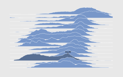
How to Make Interactive Frequency Trails with D3.js
Layering time series data or distributions with this method can change the feel and aesthetic versus a multi-line chart or small multiples. In some cases, frequency trails let you show more in less space.
-
xkcd-style charts in JavaScript
For xkcd fans, here’s a JavaScript library by Tim Qian that lets you…
-

Animating a lot of dots with WebGL and REGL.js
A couple of weeks ago, The Washington Post visualized 13,000 school districts using…
-

Getting Started with D3.js
Learn how to build a custom visualization using D3.js and get acquainted with the popular JavaScript library.
-
Members Only
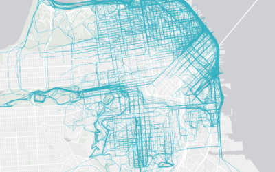
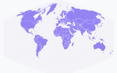
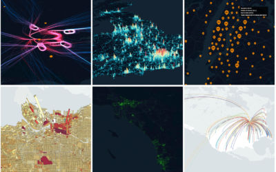
How to Make an Interactive Map of Geographic Paths
With latitude and longitude coordinates, there are a number of ways to map geographic data using D3.js and Leaflet.
-
Link
Rough.js →
Create graphics with a hand-drawn, sketchy, appearance.
-

Scrollama.js, a JavaScript library for scrollytelling
Russell Goldenberg released Scrollama.js in an effort to make scrollytelling more straightforward to…
-
Visualize large datasets with deck.gl
deck.gl is an open source framework developed by Uber to visualize large datasets…
-
Link
How to implement scrollytelling with six different libraries →
A brief look at six libraries to make your charts move as you scroll.
Recently for Members
Second Edition
 Visualize This: The FlowingData Guide to Design, Visualization, and Statistics (2nd Edition)
 Visualize This: The FlowingData Guide to Design, Visualization, and Statistics (2nd Edition)
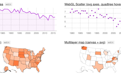
New tools, refined process.
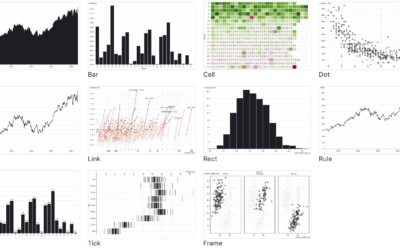
Browse by Chart Type See All →


