A brief look at six libraries to make your charts move as you scroll.
JavaScript
-
Link
How to implement scrollytelling with six different libraries →
-

Embedding.js: Data-driven environments for virtual reality
Embedding.js is a work-in-progress JavaScript library by Beau Cronin that makes it more…
-

Textured SVG patterns in JavaScript
In case you didn’t get the memo, pattern fills are back and so…
-
Members Only
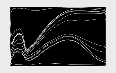
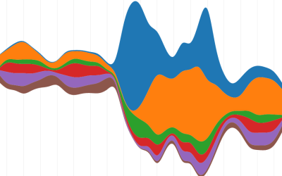
How to Make an Interactive Stacked Area Chart
Stacked area charts let you see categorical data over time. Interaction allows you to focus on specific categories without losing sight of the big picture.
-
Link
Squaire.js →
JavaScript library from Wall Street Journal to make the now popular square state grid.
-
Members Only

How to Make an Interactive Bar Chart With a Slider
Provide a slider for the standard bar chart so that users can shift focus to a point of interest.
-
Plotly.js, a JavaScript graphing library, open-sourced
Plotly, a service that lets you make interactive charts online, open-sourced their main…
-
Link
CSV to HTML Table →
“Display any CSV file as a searchable, filterable, pretty HTML table. Done in 100% JavaScript.”
-
Link
Datalib →
“Datalib is a JavaScript data utility library. It provides facilities for data loading, type inference, common statistics, and string templates.”
-
htmlwidgets: Create interactive web charts in R
If you don’t want to bother with JavaScript but want to publish interactive…
-
Members Only
Making an Interactive Map with Category Filters
Let readers focus on the regions they care about to make their own comparisons and conclusions.
-

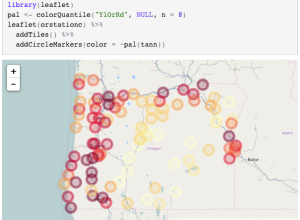
Easier online choropleth maps with Landline
Despite the frequent use of choropleth maps online, they’re still kind of tricky…
-
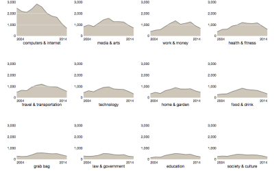
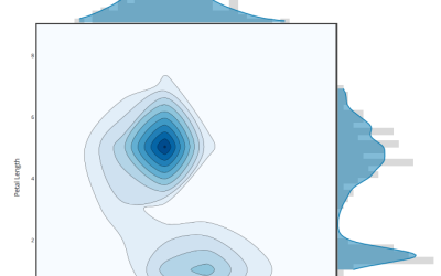
How to Make Interactive Linked Small Multiples
Small multiples are great, and the right interactions can make them even better. A primer and a how-to.
-
Members Only

How to Make an Animated, Self-Sorting List
You have a list of things that can be ordered by different values. Let them sort themselves out.
-
Members Only
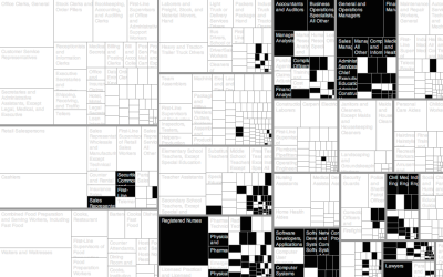
How to Make an Interactive Treemap
Treemaps are useful to view and explore hierarchical data. Interaction can help you look at the data in greater detail.
-
Link
Selections in D3
Mike Bostock continues to beef up the documentation and tutorials for D3. This one for selections.
-
Link
Crosslet
Crosslet is “a free small (22k without dependencies) JavaScript widget for interactive visualisation and analysis of geostatistical datasets.” It’s a combination of Crossfilter, Leaflet, and D3.
-
How to Animate Transitions Between Multiple Charts
Animated transitioning between chart types can add depth to your data display. Find out how to achieve this effect using JavaScript and D3.js.
-
Link
Hexagonal binning in D3 →
Useful with dense point clouds; also this method using size instead of color
-
Members Only
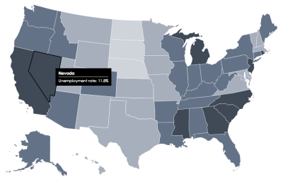
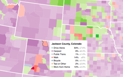
How to Make an Interactive Choropleth Map
When presented with a static graphic, it can be useful to see specific values after you see overall patterns. This tutorial shows you how to add simple interactions to a choropleth map so you can get specifics for regions.
Recently for Members
Second Edition
 Visualize This: The FlowingData Guide to Design, Visualization, and Statistics (2nd Edition)
 Visualize This: The FlowingData Guide to Design, Visualization, and Statistics (2nd Edition)
New tools, refined process.
Browse by Chart Type See All →


