ProPublica has been tracking members of Congress who oppose and support SOPA. You…
interactive
-
SOPA opposition surges
-
Members Only
Build Interactive Area Charts with Filters
When you have several time series over many categories, it can be useful to show them separately rather than put it all in one graph. This is one way to do it interactively with categorical filters.
-
Bach Cello Suites visualized
As a resident at Eyebeam, Alexander Chen visualizes the first Prelude from Bach’s…
-
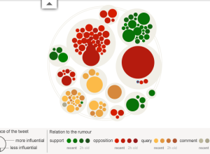
Rise and fall of riot rumors on Twitter
During the riots in London this past summer, a lot of information spread…
-
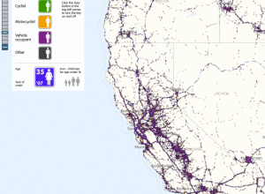
US road fatalities mapped, 9 years
For The Guardian, ITO World maps about 370,000 road-related deaths from 2001 through…
-
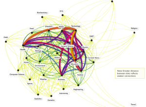
What topics science lovers link to the most
Hilary Mason, chief scientist at bitly, examined links to 600 science pages and…
-
Who owes what to whom in Europe
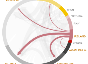
As the Eurozone crisis develops, the BBC News has a look at what…
-
Public opinion of the Occupy movement
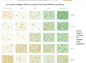
To get a gauge of public opinion and the Occupy movement, The New…
-
American migration map
Overhauling his migration map from last year, Jon Bruner uses five year’s worth…
-
Politilines shows what candidates talk about during debates
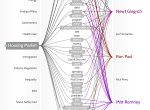
If you don’t watch the candidate debates — and let’s face it, that’s…
-
7 billion people in the world: past, present and future
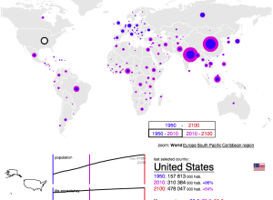
According to estimates from the United Nations Population Division, there are now over…
-
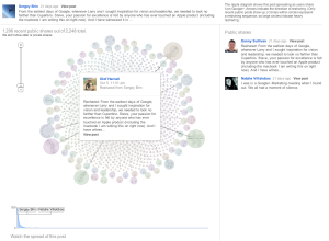
Google+ Ripples show influence and how posts are shared
Posts and links get shared over and over again, but we usually don’t…
-
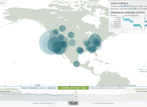
Visualizing Yahoo email in real-time
Hundreds of thousands of emails are sent every second, and yet, you wouldn’t…
-
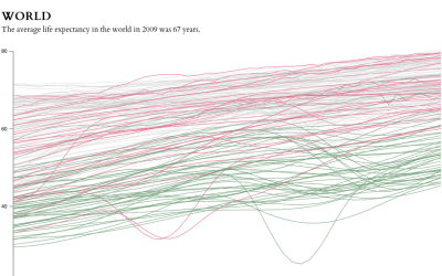
Life expectancy changes
The data goes back to 1960 and up to the most current estimates for 2009. Each line represents a country.
-
Kill Math makes math more meaningful
After a certain point in math education, like some time during high school,…
-
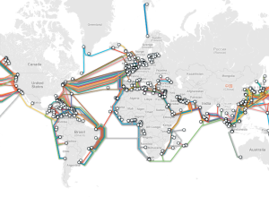
Submarine cable system connecting the world
TeleGeography maps underwater cables that connect countries and continents:
TeleGeography’s free interactive submarine… -
The Fortune 500, 1955 to 2010
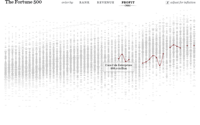
Since 1955, Fortune Magazine has published a list of America’s 500 largest companies.…
-
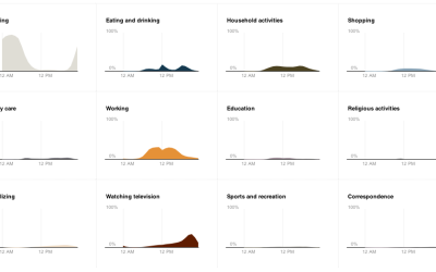
How do Americans spend their days?
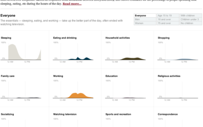
One of my favorite data graphics is an interactive piece by The New…
-
Breast cancer conversations
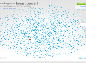
With Breast Cancer Awareness Month coming up in October, data visualization firm Periscopic…
-
Evolution of the Web
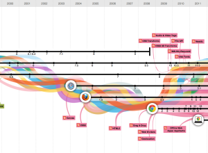
In celebration of Chrome’s third birthday, Google teamed up with Hyperakt and Vizzuality…





 Visualize This: The FlowingData Guide to Design, Visualization, and Statistics (2nd Edition)


