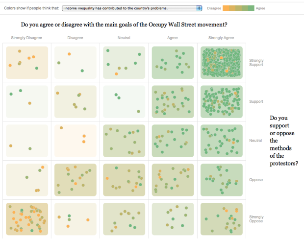
To get a gauge of public opinion and the Occupy movement, The New York Times asked readers what they they thought, placing their comments on a two-axis grid ranging from strongly disagree/oppose to strongly agree/support.
On the horizontal: “Do you agree or disagree with the main goals of the Occupy Wall Street movement?” On the vertical: “Do you support or oppose the methods of the protestors?” So comments on the top right are those who strongly agree with the goals of the movement and strongly approve of protestors’ methods. You can also color the dots and grid spots based on a range of disagree to agree for statements such as “Income inequality has contributed to the country’s problems.”
Then to bring it home, comments are listed on the bottom with a small grid showing where that person selected. Put it all together and it’s way more useful than just open threads elsewhere.
 Visualize This: The FlowingData Guide to Design, Visualization, and Statistics (2nd Edition)
What does the position of the dot inside each square mean?
$10 says it’s random – if you refresh the page, there seems to be the same number of blobs in every square but they’re in different positions within each square.
A few feedbacks on this viz…
1) These results offer no real insight….the people who strongly agree and support the protestors also really think income inequality is the cause the nation’s problems. to turn a phrase from the occupiers…Duh.
2) color choice is horrible….for those of us who are color blind (10% of the pop or so)…the little dots make us feel like we can’t see something.
May I ask which kind of colour blindness you have, and how the colours appear to you? It’s important to know about colour blindness variants which can’t be caught and accommodated the standard ways. The colours used here vary by lightness and saturation as well as hue, and using vischeck.com (my first port of call for checking for colour blindness) they seem perfectly discriminable for the 3 most common types of colour blindness, so I’m surprised that it has colour blindness issues and I’d like to know what practical lessons can be taken from this.
Separately, I’d disagree with 1) for three reasons:
a) I believe NYT are looking for a flexible type of opinion visualisation which they can use for other controversial issues in future. If apparent correlations in OWS opinions don’t surprise, that doesn’t mean they never will for other issues.
b) A negative or expected result is still a result. Often in my work I get a feedback cycle that goes like this: Client gives brief, which includes among other things, showing the relationship between X and Y. I make design. Client A gives feedback: “So the relationship between X and Y is exactly what we’d expect. That’s not interesting, cut it out”. I cut it out. Everyone I show it to from then on immediately asks, “So, what’s the relationship between X and Y? I’m surprised it’s not on here. Is it what we’d expect?”
c) It actually works as a neat way to pick out interesting, unusual opinions. Chose a question, pick a blob that’s a different colour to the majority of its neighbours, click on it, and chances are you’ll get an interesting opinion that’s got some personal thought behind it and is worth thinking about. (either that, or a free game of “Guess which part of the question this guy didn’t understand…).
Personally I really like this graphic – it’s a very rare case where one graphic works as an eye-catching, quick and effective communications tool, and also works as an interface for analysing a complex data set, without significant compromises being made to either aim.
I think this is an effective presentation and as good a linking of quantitative and qualitative data as I’ve ever seen. Bravo to the folks at The New York Times.
Can you recommend a resource or two on basic design considerations for accommodating color blindness in graphic design (with tight spaces). It is one thing to design with b&w photo copying in mind but this other dimension certainly makes things more interesting.
re: choosing colors for color blindness — check out http://colorbrewer2.org
For checking designs try http://www.vischeck.com/vischeck/vischeckImage.php – you can upload images and put in web addresses and it simulates three common types of colour blindness (although this design looks fine in the three types vischeck simulates…)
It would appear this survey was taken from OWS participants. Most New Yorkers are fed up with this crowd no matter how much they agree with some of their causes.
I’m also wondering about Pat’s question: the X-Y position of the dots within each square of the grid. The questions are binary: either you fall into the square or you don’t. So what does the position in the square signify exactly?
The color coordination of with other statements is an interesting way to throw in another dimension, and it shows that some free-thinking (or unthinking, depending on your point of view) outliers exist. . And I like how the answers cluster in the upper right (agree with goals and methods), lower left (oppose goals and methods) and to a small extent lower right (agree with goals, oppose methods).
There’s a lot here. I just wish I could figure out whether the scatter within each square of the grid is bogus or simply badly explained.
Numbers of dots are cute but do communicate the information as well as percentages. If you need graphics for this then use bars and stack by the 3rd dimension.
Qualify!! This is a voluntary response to the NYT. That biases the information substantially. There is even a sense of elitism. One could infer that only NYT readers matter. Who responded. Couldn’t that upper right square be the result of only people who felt strongly responded.
Glad to see so many strong supporters
dude are you kidding me? do you think that the protesters heard about it ran home and took the survey?
Just shut up dude most people support getting wall street out of out government. that is people that are patriotic at least.
Please help
This is somethng that we call can do in 3 minutes.
Its a very real message to congress.
It will help show our numbers.
I know that we do not support candidates or political parties but i felt obligated to include this message and request for help. A congressmen just emailed me regarding an effort underway to pass unemployment extension for 2012. he sent me a link to a sort of petition site where you can write a short story regarding your situation to be brought to the floor.
the address is: http://democrats.waysandmeans.house.gov/singlepages.aspx?NewsID=11869
Again I do not support the Dems but at least they are offering us a voice in this matter. It takes longer then 6 months to find a job that is good enough to may our mortgages these days. the extension program for many of us is the difference between saving and losing our homes. It gives us a reasonable amount of time to find work. That is ultimately what we want!
Thanks for all you do.