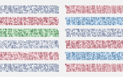
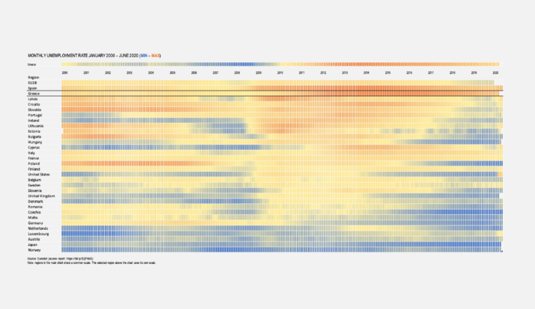
How to Make a Heatmap in Excel
Heatmaps quickly translate data tables into a visual form, making them a great tool to explore a new dataset.
To access this full tutorial, you must be a member. (If you are already a member, log in here.)
Get instant access to this tutorial and hundreds more, plus courses, guides, and additional resources.
Membership
You will get unlimited access to step-by-step visualization courses and tutorials for insight and presentation — all while supporting an independent site. Files and data are included so that you can more easily apply what you learn in your own work.
Learn to make great charts that are beautiful and useful.
Members also receive a weekly newsletter, The Process. Keep up-to-date on visualization tools, the rules, and the guidelines and how they all work together in practice.
See samples of everything you gain access to:
About the Author
Jorge Camoes is a data visualization consultant based in Lisbon. Author of the book Data at Work. Runs ExcelCharts.com, where he discusses how to use Excel as data visualization tool. Recently playing with PowerBI & PowerQuery.