How to Make a Customized Excess Mortality Chart in Excel
Show current evolution against expected historical variability and add one or more series that could account for the difference.
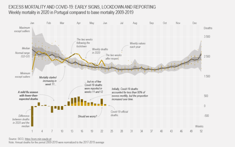
Displaying expected versus actual values is a common task in data visualization, and multiple levels of detail and complexity can be used. The chart below lets you compare a reference line to current data and see how they change over time. It includes several subtasks, like displaying expected variability, absolute differences and the data for a major component of that difference.
To access this full tutorial, you must be a member. (If you are already a member, log in here.)
Get instant access to this tutorial and hundreds more, plus courses, guides, and additional resources.
Membership
You will get unlimited access to step-by-step visualization courses and tutorials for insight and presentation — all while supporting an independent site. Files and data are included so that you can more easily apply what you learn in your own work.
Learn to make great charts that are beautiful and useful.
Members also receive a weekly newsletter, The Process. Keep up-to-date on visualization tools, the rules, and the guidelines and how they all work together in practice.
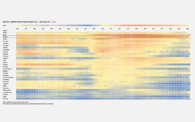
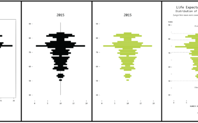
See samples of everything you gain access to:
About the Author
Jorge Camoes is a data visualization consultant based in Lisbon. Author of the book Data at Work. Runs ExcelCharts.com, where he discusses how to use Excel as data visualization tool. Recently playing with PowerBI & PowerQuery.