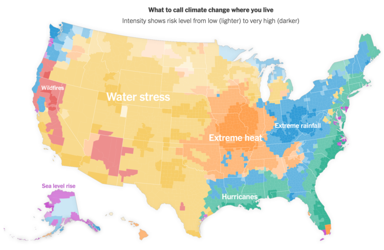
For NYT Opinion, Stuart A. Thompson and Yaryna Serkez mapped the most predominant “climate threat” in each county:
This picture of climate threats uses data from Four Twenty Seven, a company that assesses climate risk for financial markets. The index measures future risks based on climate models and historical data. We selected the highest risk for each county to build our map and combined it with separate data from Four Twenty Seven on wildfire risks.
Got me thinking about Tim Meko’s maps of natural disasters.
 Visualize This: The FlowingData Guide to Design, Visualization, and Statistics (2nd Edition)