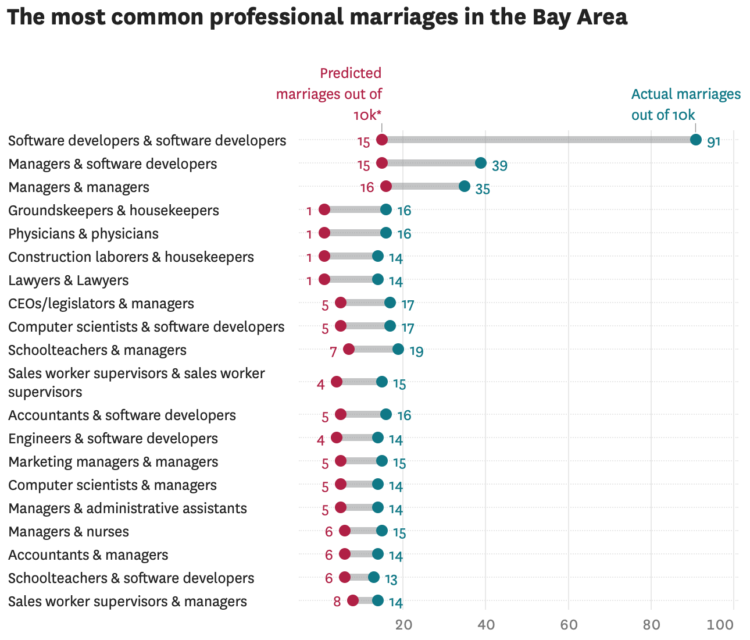
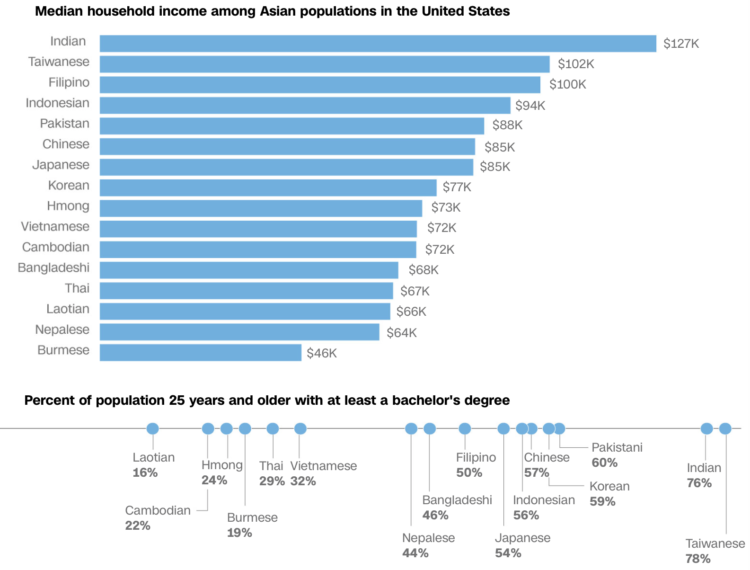
• Membership
  • Newsletter
  • Projects
  • Learning
  • About
  • Member Login
  • How the mob broke into the U.S. Capitol

    January 6, 2021

    Topic

    Infographics  /  Capitol, government, mob, Washington Post

    The Washington Post pieced together video footage from multiple sources for a timeline of the events. Terrible.

  • Neural network creates images from text

    January 6, 2021

    Topic

    Statistics  /  images, neural network, OpenAI, text

    OpenAI trained a neural network that they call DALL·E with a dataset of text and image pairs. So now the neural network can take text input and output random combinations of descriptors and objects, like a purse in the style of Rubik’s cube or a teapot imitating Pikachu.

  • Turn images into LEGO builds in R

    January 5, 2021

    Topic

    Software  /  brickr, LEGO, R, Ryan Timpe

    The brickr package in R by Ryan Timpe takes an image, converts it to a mosaic, and then provides a piece list and instructions for the build. While not officially affiliated with the LEGO group, Timpe is a data scientist for LEGO, so it’s probably as close as you’re going to get to real deal.

    Timpe made a package a couple of years back, but when I went to use it, the link was broken and I assumed it was defunct. This is a nice surprise.

    My kids are deep into LEGO these days. We just finished watching the LEGO Masters show. I have LEGO minifigures on my office wall. I’m definitely making use of this.

  • How the Census translates to power, a cat comic

    January 4, 2021

    Topic

    Infographics  /  census, comic, government, NPR

    State population dictates the number of seats in the House of Representatives, so ideally, the decennial Census counts everyone and power is fairly distributed. On the surface, that seems straightforward? For NPR, Connie Jin and Hansi Lo Wang explain with a cat comic.

    Because cats.

    See also the cat guide on spotting misinformation.

  • Pollution exposure plotted, a comparison between two kids’ day

    December 31, 2020

    Topic

    Infographics  /  India, New York Times, pollution

    The New York Times measured pollution exposure during the day for two kids who live in New Delhi. Usually just described in terms of micrograms of particulate matter, the piece puts in more effort to give a feel for each person’s day-to-day. Side-by-side video along with a scrolling line chart provide a clear contrast between the two lives.

  • Mapping disappearing beaches in Hawaii

    December 30, 2020

    Topic

    Maps  /  beach, Hawaii, Honolulu Star-Advertiser, ProPublica, wall

    Ash Ngu for ProPublica and Sophie Cocke for Honolulu Star-Advertiser show the harm of building seawalls on Hawaii’s beaches. The walls protect luxury beachfront properties, but they have been built through administrative loopholes and destroy beaches, which are owned by the public.

    I like the combination of video footage and map, providing a scroll along the coastline. It provides an anchor for where you are and what you’re looking at.

  • 2020.

    December 29, 2020

    Topic

    Site News  /  annual review

    Last year, in 2019, my main goals for FlowingData and work were to stay focused and make charts. I was satisfied with my progress, and for 2020, I had hoped to step that up with more depth and more play.

    But you know what happened. The year was challenging for many reasons, and it was hard to concentrate or to think of much else other than the day’s current events.

    I’m lucky to be able to work from home though, and I am thankful for that. So FD was able to roll on.

    As I do every year, I like to bookend with an annual review, so here we go.
    Read More

  • Reconstructing the killing of Breonna Taylor

    December 28, 2020

    Topic

    Infographics  /  Breonna Taylor, New York Times, reconstruction

    The New York Times reconstructed the night. Based on a collection of court documents, ballistics reports, body camera footage, and interviews, they built a 3-D model of the scene depicting what appears to be an unorganized and unexpected raid.

  • Climate change in 2020

    December 28, 2020

    Topic

    Statistical Visualization  /  climate change, Reuters

    It used to be that climate changed seemed like something far off in the future, like something that would only affect future generations. But it’s looking more urgent these days. For Reuters, Chris Canipe, Matthew Green and Sam Hart show the “fingerprints of climate change” we saw this year.

  • Members Only

    Visualization Tools and Resources Roundup – December 2020

    December 24, 2020

    Topic

    The Process  /  roundup

    Here’s the good stuff for December in the last issue of the year.

  • Visualization  /  best-of

    Best Data Visualization Projects of 2020

    It’s been a year. We saw a lot of charts. These are the best ones.

    Read More
  • Evolution of coronavirus strains

    December 23, 2020

    Topic

    Statistical Visualization  /  coronavirus, Reuters, strains

    Reuters looked at how seven main strains of the virus evolved around the world:

    The analysis shows there are currently seven main strains of the virus. The original strain, detected in the Chinese city of Wuhan in December 2019, is the L strain. The virus then mutated into the S strain at the beginning of 2020. That was followed by V and G strains. Strain G mutated yet further into strains GR, GH and GV. Several other infrequent mutations were collectively grouped together as strain O.

    It’s interesting to see the continent multiples. Different approaches to the pandemic led to different rates of mutations and a different spread of strains.

  • Historical cost of light

    December 22, 2020

    Topic

    Infographics  /  cost, light, Pudding, work

    These days, most of us don’t have to do much to turn on a light when it’s dark out. But what if I told you it used to take a lot more time and money to get that sweet artificial light? For The Pudding, Ilia Blinderman and Jan Diehm equate scrolling down one pixel to one second for an average waged worker. See how much you have to scroll/work to earn one hour of light.

  • Who catches the most fish

    December 21, 2020

    Topic

    Maps  /  Bloomberg, fishing, Global Fishing Watch

    Using data from Global Fishing Watch, Hayley Warren and Ian Wishart for Bloomberg mapped the predominant country for fishing in European Union and British waters. There’s disagreement between the U.K. and the EU about who gets to fish where.

  • 1 in 5 prisoners had Covid-19, a grid map

    December 18, 2020

    Topic

    Maps  /  Associated Press, coronavirus, Marshall Project, prison

    The Marshall Project and The Associated Press report on the Covid-19 rates in prison, which are multiple times greater than the general population. Katie Park shows the regional variation with this cross between a dot density map and a grid map.

    They’ve made the data available here.

  • Tracking world’s biggest iceberg

    December 18, 2020

    Topic

    Maps  /  iceberg, Reuters, scale

    The world’s biggest iceberg, A68a, is on track to crash into a remote island in the Atlantic. For Reuters, Marco Hernandez and Cassandra Garrison show the path, the scale, and what might happen with A68a:

    The iceberg is comparable in size to many well-known islands. A68a is very similar in size and shape to Jamaica, almost as long as the U.S. territory Puerto Rico, and dwarfs China’s Hong Kong Island as well as the Southeast Asian city state of Singapore.

    Observers from the British Antarctic Survey told media that a flight last year over the A68a took about one and a half hours. The berg is so big, Royal Air Force pilots this week were unable to capture it all in one, single photograph.

  • Members Only

    Knowing Nothing (Process 119)

    December 17, 2020

    Topic

    The Process  /  beginners, learning

    Obviously, knowing nothing can be a negative, but some of my favorite work came about when I didn’t know how to do something or what to expect.

  • Blob Opera is a machine learning model you can make music with

    December 17, 2020

    Topic

    Statistics  /  blob, David Li, Google, machine learning, opera

    David Li, in collaboration with Google Arts and Culture, made a fun experiment to play with:

    We developed a machine learning model trained on the voices of four opera singers in order to create an engaging experiment for everyone, regardless of musical skills. Tenor, Christian Joel, bass Frederick Tong, mezzo‑soprano Joanna Gamble and soprano Olivia Doutney recorded 16 hours of singing. In the experiment you don’t hear their voices, but the machine learning model’s understanding of what opera singing sounds like, based on what it learnt from them.

    So smooth. So blobby.

  • Basketball court designed as a national park map

    December 16, 2020

    Topic

    Maps  /  basketball, Kirk Goldsberry, park

    Kirk Goldsberry, whose basketball charts you might recognize, made the Naismith International Park Map:

    This map blends two of my passions: cartography and hoops. The elevation surface on the map is derived from the most common scoring areas in the NBA during the 2019-20 season. Higher places indicate the areas where NBA scorers scored the most from. Naturally this includes the areas near the rim and the areas just outside the 3-point line.

    The original plan was to make a fun map poster emphasizing the best scorers from the 2019-20 season, but the project quickly spiraled out of control as I started to label more and more historic places.

    So good.

  • How to Make an Animated Beeswarm Chart

    Beeswarm charts are useful to highlight individual categories or entities. Animating them can help highlight change over time.

  • Page 89 of 391
  • <
  • 1
  • ...
  • 86
  • 87
  • 88
  • 89
  • 90
  • 91
  • ...
  • 391
  • >

Analyze, visualize, and communicate data usefully, beyond the defaults.

Become a member →

Recently for Members

May 8, 2025
When the data is not what it seems

May 1, 2025
Finding the Right Charts

April 24, 2025
Visualization Tools, Datasets, and Resources – April 2025 Roundup

April 17, 2025
Breaking Out of Chart Software Defaults

April 15, 2025
Line Chart with Decorative Neon Accents

Browse by Chart Type See All →

Calendar Difference Chart Glyph Chart Streamgraph Alluvial Diagram Mosaic Plot Ternary Plot Box Plot Stacked Area Chart Line Chart

Browse By Topic

  • Visualization

    Seeing data

  • Maps

    Seeing geographic data

  • Infographics

    Explaining data

  • Networks

    Connecting data

  • Statistics

    Analyzing data

  • Software

    Working with data

  • Sources

    Getting data

  • Design

    Making data readable

Get the Book

Visualize This: The FlowingData Guide to Design, Visualization, and Statistics

Available now.

Order: Amazon / Bookshop

Made by FlowingData

  • The Process

  • Data Underload

  • Chart Everything

  • Guides

  • Books

  • Shop

  • About
  • Contact
  • Newsletter
  • LinkedIn
  • Instagram
  • Bluesky
  • RSS
Copyright © 2007-Present FlowingData. All rights reserved.