For NYT’s The Upshot, Alicia Parlapiano and Quoctrung Bui outlined all of the provisions of Biden’s Build Back Better bill and where the $2 trillion over 10 years will come from. A treemap provides an overview that sticks to the top of the page as you scroll through the table of line items.
-
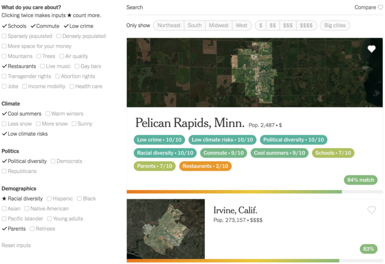
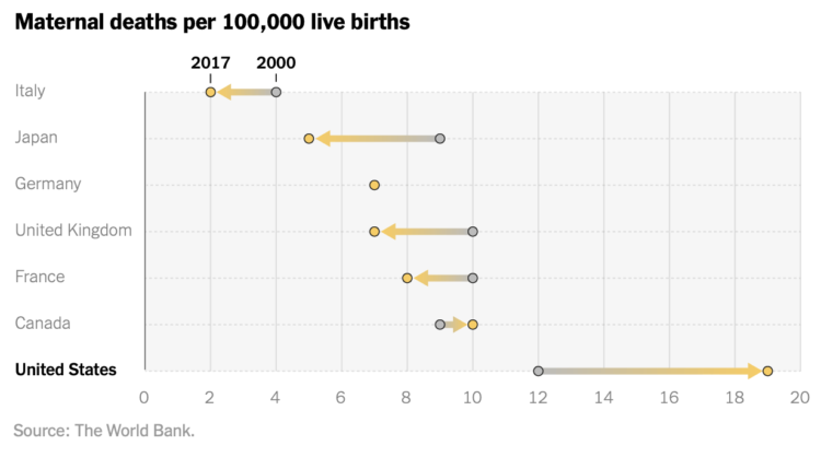
Choosing a place to live is always full of trade-offs, but it’d be nice if there was a way to minimize those trade-offs. For NYT Opinion, Gus Wezerek and Yaryna Serkez, made a calculator that lets you weight your priorities to find the city that fits best with how you want to live:
Places can score zero to 10 points for each metric. To calculate each place’s match percentage, we add up its scores across metrics that a reader has selected and divide by the total number of possible points. If a reader selects the checkboxes for trees and mountains, a place with a score of 6 for trees and 8 for mountains will be a 70 percent match.
Places with no data for a metric receive zero points. For starred metrics, we double the number of points scored and available to make them count twice as much toward the match percentage.
Read more on their methodology here. The interactive is based on data from the Census Bureau, Realtor.com, AccuWeather, and Yelp.
After checking the boxes that are important to you, you get a list of cities that best fit the criteria, based on an aggregated match percentage.
I found this is also an excellent way to feel less sure about your current residence and to wonder why areas that you thought would strongly dislike appear at the top of the list.
-
We all have our routines, but from person-to-person, the daily schedule changes a lot depending on your responsibilities.
-
Some people point out that vaccinated people are still hospitalized as a defense against getting vaccinated. But they ignore the inverse which compares the number of those who are not hospitalized. Marc Rummy made this Euler diagram to illustrate the inverse. (Update: Rummy provides an updated version of the diagram here.)
It’s about making a fair comparison. People who wear seat belts can still die in a car collision. People who use condoms can still get STIs. People who eat healthy can still have high cholesterol. But we know these things reduce the chances of dying in a car crash, of getting an STI, and having high cholesterol, so we adjust our choices.
[via @visualisingdata]
-
Statisticians David Spiegelhalter and Anthony Masters for The Guardian on reframing risk estimates:
An earlier UKHSA study estimated two Pfizer/BioNTech doses gave around 99.7% (97.6% to near-100%) protection against Delta-infected hospitalisation, but after 20 weeks that effectiveness waned to 92.7% (90.3% to 94.6%). This estimated decline for people over 16 may not sound much, but if we look at it in terms of “lack of protection”, their estimated vulnerability relative to being unvaccinated went from 0.3% to 7.3%. That is a major, although uncertain, increase in risk.
Such “negative framing” can change impressions: “90% fat-free” sounds rather different than “10% fat”.
-
What is the best french fry shape? Curly of course. But Chris Williams took it a step further and used 3-D models of various fried potato forms to find out. It’s all about the ratio between crispy exterior and fluffy interior.
-
Members Only
-
While still relatively rare, maternal mortality in the United States increased over the years. In most other developed countries, rates decreased over the same time period. From NYT Opinion:
Over the past two decades, maternal mortality has increased almost 60 percent. The United States is the only other Group of 7 country besides Canada to experience such a drastic decline in maternal health. (Canada saw a minor increase in pregnancy-related deaths.)
-
Andrew Van Dam for The Washington Post used a bar chart with corrections to show new monthly estimates from the Bureau of Labor Statistics for job growth:
After the revisions, disappointing months like August looked a lot more like October, a month that was hailed as a labor market rebound. In hindsight, while a blockbuster June and July were even better than they looked, they didn’t lead to months of stagnation — they diminished somewhat, but still produced solid, steady growth that continued through October.
It’s like the data carries uncertainty, which can make estimation a challenge. Imagine that.
-
Pitch Interactive and the Census 2020 Data Co-op, supported by the Google News Initiative, made a tool that lets you easily map population shifts since 2010. It’s called Census Mapper.
Built with journalists in mind, you can zoom in to the tract level and select any set of racial groups. The map updates. Once you’ve found what you’re looking for, you can embed the tool on a website. You can only embed the entire tool for now, as opposed to just the map of a specific geographic area and level, but it looks promising.
-
David Leonhardt for The New York Times looked at the partisan gap for Covid deaths and cases. It keeps getting wider:
The brief version: The gap in Covid’s death toll between red and blue America has grown faster over the past month than at any previous point.
In October, 25 out of every 100,000 residents of heavily Trump counties died from Covid, more than three times higher than the rate in heavily Biden counties (7.8 per 100,000). October was the fifth consecutive month that the percentage gap between the death rates in Trump counties and Biden counties widened.
-
This is a fun map by Matt Dzugan. Search for a city, and see the segments of highway in the United States that are headed that way:
I set up thousands of queries to Google Maps, asking for directions from Point A to Point B and parsed its responses, looking for the text toward ___, signs for __, and ramp to ___.
This enabled me to build a database of all the segments of road that are listed as heading towards various cities.
-
[arve url=”https://www.youtube.com/watch?v=Q5C7sqVe2Vg” loop=”no” muted=”no” /]
We know the oceans are deep, but it’s difficult to grasp the scale of just how deep, because, well, it’s underwater. MetaBallStudios, a YouTube channel that focuses on perspective and 3-D animation, guides you through the depths of major bodies of water. You’ll pass notable on-land monuments along the way. [via kottke]
-
Patrick Sisson for The New York Times reports on the growing popularity of tracking customer movement in stores:
Complicating efforts to address privacy concerns is a lack of regulatory clarity. Without an overarching federal privacy law or even a shared definition of personal data, retailers must sort through layers of state and municipal rules, such as California’s Consumer Privacy Act, said Gary Kibel, a partner at the law firm Davis+Gilbert who specializes in retail privacy.
Technology companies counter the pushback by noting that their systems are designed to limit what they collect and anonymize the rest. For instance, Standard AI’s system does not capture faces, so they cannot be analyzed with facial recognition technology.
Uh huh.
-
Members Only
-
Palm oil is in our food, cosmetics, cleaning supplies, and biofuels, but it has no flavor or color, so we’re not really aware of how much we use — on average 8 kilograms per year. Bloomberg explains why this is problematic, starting with the farmers, to the producers, to the consumers.
-
Sergio Peçanha and Yan Wu for The Washington Post made a calculator that shows how much time you spend commuting in a year and what you could do with that time instead. The input, interaction, and calculations are straightforward. Just use the slider to specify your roundtrip commute time, and the numbers update.
The easiest thing to do would be to just provide the total hours. You commute for an hour per day? That’s 250 hours in a year. That seems like a lot of time, but on its own it’s an abstract calculation. The interactive takes the natural next step with what you could do with that time, which makes the calculation more tangible.
I do the same thing when describing money saved. A few dollars here and there doesn’t seem like much, but extrapolate that to Jack in the Box tacos, and you’re getting somewhere.
-
xkcd poked fun at the sometimes questionable color choices of researchers.
-
Using Consumer Price Index, Alyssa Fowers and Rachel Siegel for The Washington Post show how the prices of everyday things rose since 2019. A set of baseline charts show lines moving up much more than one would hope, due to coronavirus and supply chain issues.