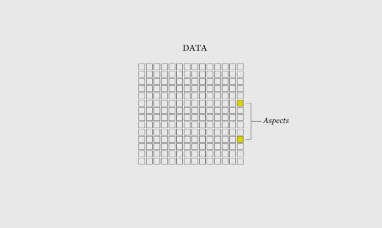
When you visualize aspects of the data instead of just the data itself, what you show grows more obvious.
When you visualize aspects of the data instead of just the data itself, what you show grows more obvious.
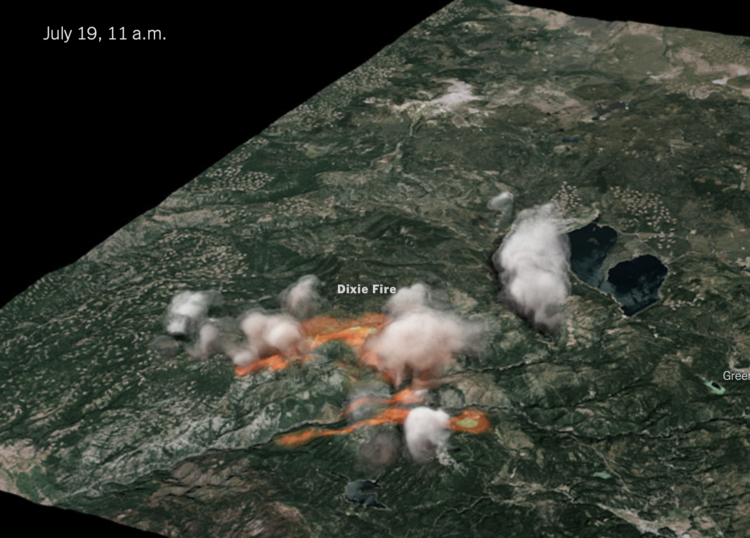
The New York Times used radar data to create a 3-D model of the Dixie fire smoke clouds:
The raw data was collected every 10 minutes in radial sweeps around the radar stations, each at a higher altitude. The Times combined and reformatted the data using Py-ART, a collection of algorithms and utilities used regularly in radar analysis. We then filtered it to reduce noise.
We applied color and texture to the 3-D volume to approximate a smoke- and cloud-like look. And we interpolated the sequence in time to create a smoother video animation.
The data comes from the NOAA Next Generation Radar (seems to be down right now), and the rendering was inspired by Neil Lareau’s more barebones chart.
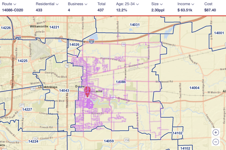
I’m not sure how long this has been around, but the USPS has a tool where you can see the mail route in any geographic area. Just search for an address and you can see where they go. It’s meant for businesses interested in direct mail, so it also shows average income, number of houses, and how much it’d cost to send mail on that route.
I had no idea it was that easy to focus on a geographic area, but it makes sense now that I think about the type of ads I get in the mailbox.
[arve url=”https://www.youtube.com/watch?v=aD1OQ9UBwuU” loop=”no” muted=”no” /]
NASA Goddard visualized the point of view from the south pole of the Moon, based on years of data collection to map the Moon’s surface. The result is a data-based time-lapse that shows Earth moving up and down and long shadows because the run shines at a low angle.
It’s a neat contrast to what we see from Earth and makes me wonder what other points of view there are.
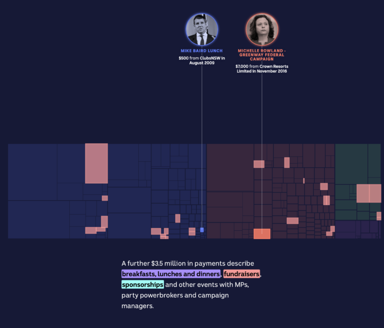
The Digital Story Innovation Team for ABC News in Australia looked at political donations from the gambling industry. The piece goes all-in with treemaps in a scrollytelling format to show categories and individual donations.
It starts with an individual point and keeps zooming out more and more. Then when you think it’s done, it zooms out more.
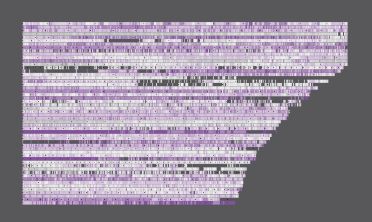
Most television shows don’t get past the first season, but there are some that manage to stick around. These are the 175 longest running shows on IMDb that have ratings.

Not everything has to be in the visualization at the same time.

Yuhao Du, Jessica Nordell, and Kenneth Joseph used simulations to study the effects of small gender biases at entry level up to executive level. It doesn’t take much to skew the distribution. For NYT Opinion, Yaryna Serkez shows the simulation in action with moving bubbles and stacked area charts for each work level.
The simulation imagines a company where female performance is undervalued by 3 percent. Each dot represents an employee, and they either move up with promotions or stay still. The distribution of men and women start even but end very uneven.
[arve url=”https://www.youtube.com/watch?v=2p3NIR8LYoo” loop=”no” muted=”no” /]
Vox shows how the 3-point line is “breaking” the game.
The basic math says a 3-point shot is more efficient for scoring points than a 2-point shot if the team can make a high enough percentage of attempts. It’s why the mid-range shot has fallen out of favor.
But it’s more an evolution than a breaking. Defense adapts, and then offense adjusts to that, etc. Stephen Curry making double-digit threes is still way more exciting than Curry not making threes.
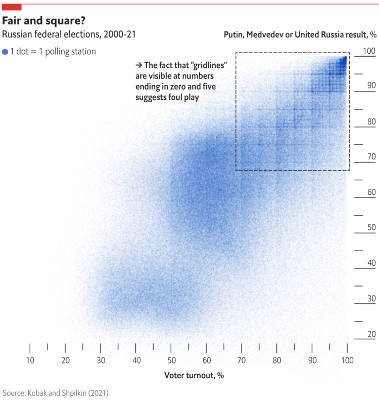
When plotting Russian election results, a structured grid patterns appear. From The Economist:
When Dmitry Kobak and Sergey Shpilkin, two researchers, analysed the results, they found that an unusually high number of turnout and vote-share results were multiples of five (eg, 50%, 55%, 60%), a tell-tale sign of manipulation. According to Messrs Kobak and Shpilkin, there were at least 1,310 polling stations (out of 96,325) with results that were suspiciously tidy, with rounder numbers than you would expect to see by chance.
I’m not familiar with Russian elections, but this seems like lazy cheating. Are they just making up numbers by hand or what?
Check out the full results of Kobak and Shpilkin’s analysis in Python notebook form.

Nightingale is a publication from Data Visualization Society that offers more depth for many topics in the field of visualization. They’re working on a print magazine of the same name.
Subscribed.
Tim Harford warns against bad data in science:
Some frauds seem comical. In the 1970s, a researcher named William Summerlin claimed to have found a way to prevent skin grafts from being rejected by the recipient. He demonstrated his results by showing a white mouse with a dark patch of fur, apparently a graft from a black mouse. It transpired that the dark patch had been coloured with a felt-tip pen. Yet academic fraud is no joke.
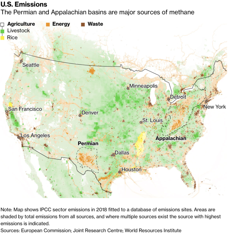
We often hear about increased CO2 in the context of global warming. Hayley Warren and Akshat Rathi for Bloomberg show why we should talk more about methane:
In the fight against global warming, methane has flown under the radar for too long. But there’s increasing recognition that tackling the invisible, odorless gas is one of the easiest, cheapest, and most feasible ways to make a real difference in slowing climate change. It’s the rare climate problem with a fix that can be felt by those alive right now, not their great-grandchildren.
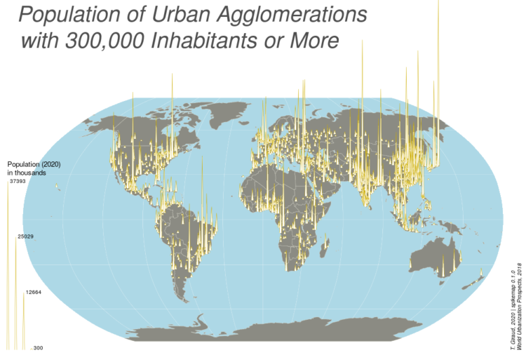
Spike maps use the height of spikes to encode data geographically. The format provides a similar effect to frequency trails where the layering looks 3-D-ish, except spikes are typically centered on an area instead of running parallel.
Anyways, like most visualization methods with a name, there is an R package for spike maps by Timothée Giraud.
If D3.js is your jam, there’s also a solution for that. You can also take the no-code route with Datawrapper.
This is the best freelance advice ever written.

The Washington Post, in an effort that I’m sure took more energy and time than it looks, compared U.S. abortion laws against those in other countries:
In the last three decades, countries around the world have made it easier to legally get an abortion. In some parts of the United States, however, it’s gotten harder. Just this month, Mexico’s supreme court ruled to decriminalize the practice. Argentina’s Senate legalized abortion in December. Meanwhile, New Zealand, Thailand and Ireland have all taken steps to ease abortion restrictions in recent years.
Hm.
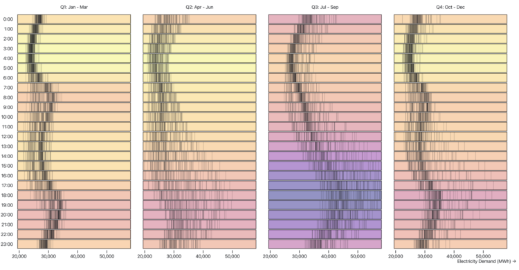
Zan Armstrong, Ian Johnson, and Mike Freeman for Observable wrote a guide on analyzing time series data. Using an energy dataset, they show how asking different questions can lead to different findings and visualizations:
These are stories about analyzing data that changes over time. While most of us don’t dig into data about energy day-to-day, we hope the feel of this data and these questions will be familiar to anyone who regularly faces questions like “what changed?”, “what happened?”, “was that normal?”, “what is typical?”, and “did things go as expected?” We hope that this will spark an idea about how to look at your own data in a new way.
I will never tire of the multiple-views-from-the-same-dataset teaching device.
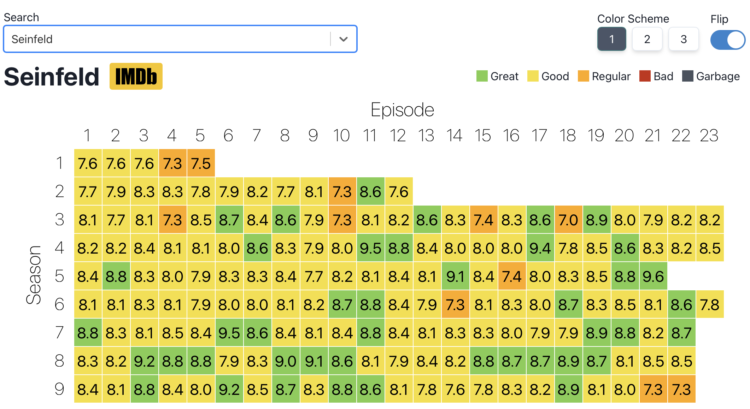
Inspired by a graphic on Reddit, Jim Vallandingham expanded the format for all the shows. Search for a show and get a heatmap for average ratings by season and episode. See how your favorite show went into the dumpster at the end or withstood the test of time. Nice.
The data comes from IMDb Datasets, which seems like a fun time series dataset to poke at.
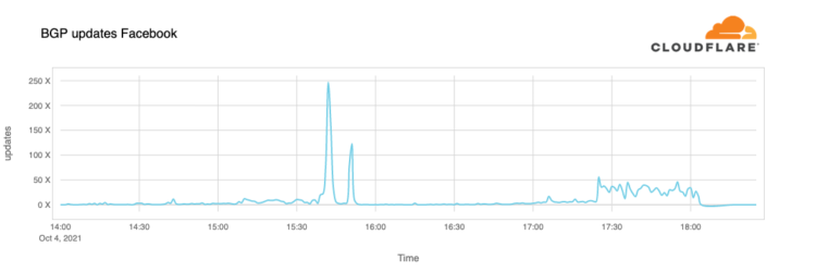
Cloudflare describes how things looked from their point of view the day that Facebook, along with its other properties, went down. From the Border Gateway Protocol, which defines routing information:
A BGP UPDATE message informs a router of any changes you’ve made to a prefix advertisement or entirely withdraws the prefix. We can clearly see this in the number of updates we received from Facebook when checking our time-series BGP database. Normally this chart is fairly quiet: Facebook doesn’t make a lot of changes to its network minute to minute.
But at around 15:40 UTC we saw a peak of routing changes from Facebook. That’s when the trouble began.

Aaron Steckelberg and Tik Root for The Washington Post provide a visual guide on how to protect your home from wildfire. It starts with an ember floating carefree in the air, and then the tour highlights actions you can take.
Can’t wait for the guides on how to protect your home from flooding and/or how to dress for extreme temperatures.


 Visualize This: The FlowingData Guide to Design, Visualization, and Statistics
Available now.