How the Longest Running Shows Rated Over Episodes
Most television shows don’t get past the first season, but there are some that manage to stick around. These are the 175 longest running shows on IMDb that have ratings.
Episodes are colored by average rating. Some shows are consistently good, some shows people seem to love to hate, and then there are shows that are good at some point but eventually drop off.
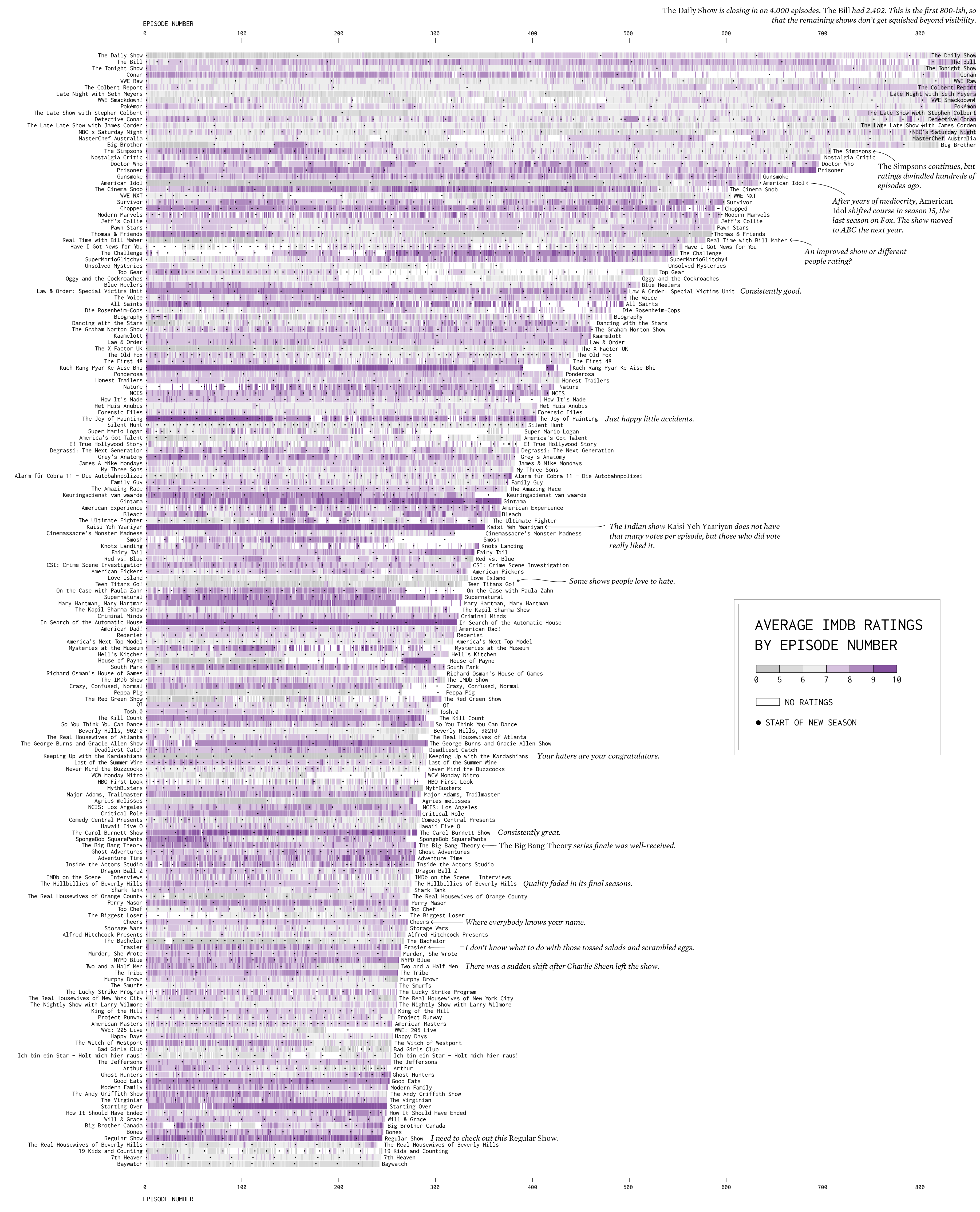
This was inspired by Jim Vallandingham’s heatmap interactive, which shows a grid of ratings for one show at a time. As I looked at various shows, I wondered how all the shows compared.
There are over 164,000 shows in the IMDb data though, for regular television series, talk shows, reality shows, specials, mini-series, and failed pilots, across various countries. Availability of ratings, titles, and categorizations also vary a lot across shows.
The ratings in particular are dependent on registered IMDb users who rate shows, which means there’s a lot of self-selection. For example, soap operas such as Days of Our Lives have thousands of episodes over decades but relatively few IMDb ratings, which is why they are not listed above. Kid-centric shows like Mister Rogers’ Neighborhood were similar.
Still, it’s a start. All that variation across shows and episodes has me interested.
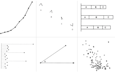
Chart Type Used

Become a member. Support an independent site. Get extra visualization goodness.
See What You Get