It’s nice that visualization has developed over the years to the point that there are dedicated classes for it, but I also like learning informally.
It’s nice that visualization has developed over the years to the point that there are dedicated classes for it, but I also like learning informally.
People have been having fun with the text-to-image generators lately. Enter a description, and the AI churns out believable and sometimes detailed images that match the input. The reason these systems work is because the models were trained on a lot of data, in the form of images. Andy Baio and Simon Willison made a tool to browse a subset of this data behind the recently released Stable Diffusion.

In the never-ending quest to find the perfect color scheme for any given situation at any given moment, Coolors is another set of tools to find the right shades for your application. The twist is that there’s a generator that shows you schemes based on inputs, such as a certain hue or a photograph. There is also a list of trending palettes.

To serve the ball in tennis, a player first tosses the ball in the air. The New York Times explained the details behind the simple action, from mechanics, positioning, to point of contact. They got fancy with it.
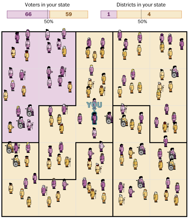
Harry Stevens, for The Washington Post, how simulations can be used to detect severely gerrymandered congressional districts. In the interactive, you play the role of concerned citizen with the task of proposing a map that more closely resembles the political leanings of the state as a whole.
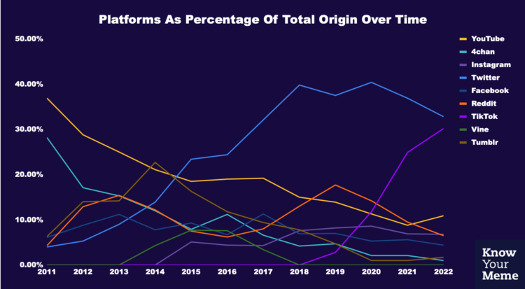
Know Your Meme analyzed a decade of meme data to see where the memes have come from, breaking it down by year. It’s all Twitter and TikTok these days, but it used to be YouTube and 4chan.
The American Time Use Survey asks people to log their activities for a day, and in the most recent release, people also rated the meaningfulness of the activities. Here’s how activity categories rated, sorted by most meaningful to least meaningful.
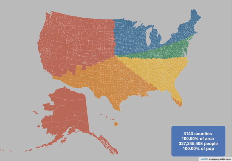
By Engaging Data, this interactive map shows various splits of the United States with the condition that each division has the same population:
This visualization lets you divide the US into 1,2,3,4,5,8 and 10 different segments with equal population and across different dimensions. The divisions are made using counties as the building blocks (of which there are 3143 in the US). There are numerous different ways to make the divisions. This lets you make the divisions by different types of geographic directions and divisions by population density.
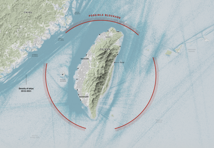
It appears China wants to impose a blockade around Taiwan with ships, submarines, and airplanes. The New York Times mapped the possibility and how it could disrupt life in and around the island.
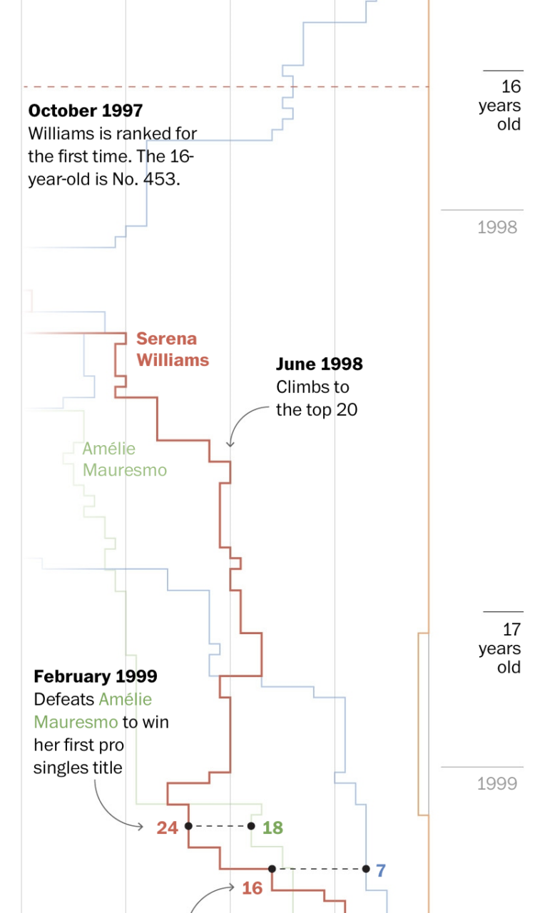
We tend to celebrate the wins in sports and often forget about or don’t see the climb that athletes take to get to the top. Artur Galocha and Adrian Blanco, for The Washington Post, look back at Serena Williams’ winning career, focusing on who or what she had to compete against from age 15 to 40.
They start with a wideout view that shows Williams’ full career. Then they zoom in to notable career milestones where past competitors fade in and out of the picture. Years and age run along the same axis, and annotation points to key wins.
The timeline view is simple and static, but it is well-made.
The contents of this diagram is not in my scope, but it is a very big, detailed diagram of metabolic pathways. Many steps, many arrows.
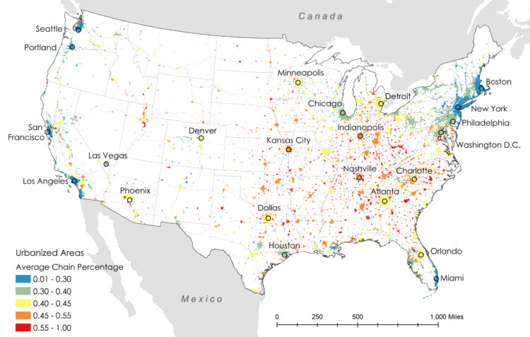
Researchers Xiaofan Liang and Clio Andris estimated the percentage of restaurants that are chains and independent to identify “McCities”:
These high chainness McCities are prevalent in the Midwestern and the Southeastern United States. Independent restaurants were associated with dense pedestrian-friendly environments, highly educated populations, wealthy populations, racially diverse neighborhoods, and tourist areas. Low chainness was also associated with East and West Coast cities.
Check out the interactive map here.
My only criticism is that they used a rainbow color scale instead of using a single hue or a diverging color scale that breaks at half.
Introduction to Probability for Data Science is a free-to-download book by Purdue statistics professor Stanley H. Chan:
We need a book that balances the theory and practice. We need a book that provides insights and not just theorems and proofs. We need a book that motivates the students, telling them why probability is so essential to their work. We need a book that highlights the impacts of the subject. From over than half a decade of teaching the course, I have distilled what I believe to be the core of probabilistic methods. I put the book in the context of data science, to emphasize the inseparability between data (computing) and probability (theory) in our time.

Here’s the good stuff for August.
Meteorologist Greg Dutra was delivering the daily weather news for ABC Chicago and accidentally discovered that his map was interactive when he touched the screen:
This wasn’t in the training manual! @TBrownABC7 @valwarnertv and I go OFF THE RAILS when I discovered the TV is a touch screen while on-air on @ABC7Chicago 😂 pic.twitter.com/almrdxqz3d
— Greg Dutra (@DutraWeather) August 4, 2022
It’s good, wholesome joy from a data display, in case you forgot what that looks like.
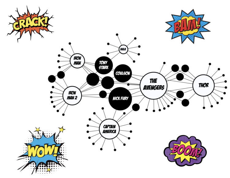
With a fun view of the Marvel Cinematic Universe, Tristan Guillevin walks through a network of characters and movies from 2008 through 2012. Each white-filled circle represents a movie, and each black-filled circle represents a character, connected to the movie he or she appeared in.
See also the 3-D network by The Straits Times from a few years back that goes into more depth with interactions between characters.
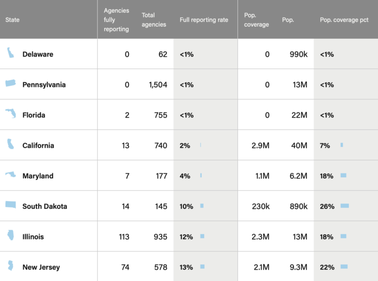
When the FBI switched to a new data collection system, which relies on local police departments to report their numbers, about 40% of agencies didn’t switch over. The Marshall Project made an interactive to see who’s reporting data in your state:
Many criminologists fear the missing data means the nation would not get reliable crime data for years to come. If a local police department did not report crime data to the FBI, it would also mean scholars, policy makers and the public cannot compare what’s happening with crime in their community with other places.

It’s getting hot in cities around the world, each city with its own set of problems. The Washington Post combined all the problems into one fictional city called Meltsville. There are travel delays because the road is melting, bridges are cracking from heat expansion, and it’s generally a hard place to live.
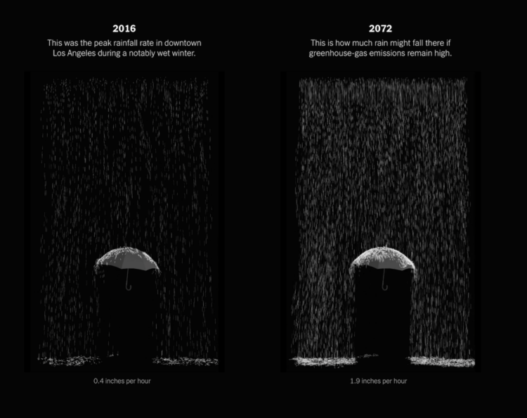
Highlighting research by Xingying Huang and Daniel L. Swain, who studied “plausible worst case scenario” extreme storm sequences, The New York Times provides a glimpse of what that might look like in California. There are maps, there are charts, and there is an augmented reality view to put rain in your living room.
 Visualize This: The FlowingData Guide to Design, Visualization, and Statistics (2nd Edition)
New tools, refined process.