Jeff Horwitz, for Reuters, tells the story of 76-year-old Thongbue Wongbandue, who grew infatuated with a Meta-made chatbot via Facebook Messenger. He packed his bags for the city, hit his head on they way, and passed a few days after.
The device showed that Bue traveled around two miles, then stopped by a Rutgers University parking lot a little after 9:15 p.m. Linda was about to pick Bue up in her car when the AirTag’s location suddenly updated. It was outside the emergency room of nearby Robert Wood Johnson University Hospital in New Brunswick, where Linda had worked until she retired.
Bue had fallen. He wasn’t breathing when an ambulance arrived. Though doctors were able to restore his pulse 15 minutes later, his wife knew the unforgiving math of oxygen deprivation even before the neurological test results came back.
Bue’s family looked at his phone the next day, they said. The first thing they did was check his call history and texts, finding no clue about the identity of his supposed friend in New York.
Then they opened up Facebook Messenger. At the top of Bue’s inbox, just above his chats with family and friends in Thailand, were messages from an attractive young woman going by the name “Big sis Billie.”
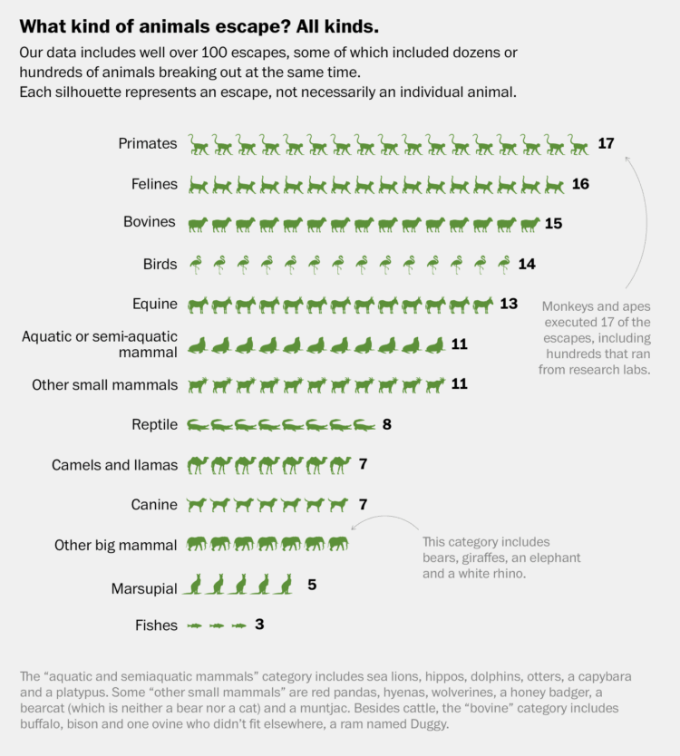
Remember when Facebook was about connecting people to real people? Those were the days.
 Visualize This: The FlowingData Guide to Design, Visualization, and Statistics (2nd Edition)


