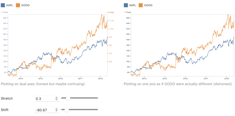
• Membership
  • Newsletter
  • Projects
  • Learning
  • About
  • Member Login
  • Using satellite imagery to assess the damage in Ukraine

    February 28, 2023

    Topic

    Maps  /  damage, Economist, satellite imagery, Ukraine, war

    The Economist combined two satellite imagery sources, one that estimates fire events and one that estimates building damage, to assess the extent of damage in Ukraine:

    Both approaches have weaknesses. NASA’s firms cannot see through cloud cover, a particular problem in winter. sar can pick up damage even through clouds, but is much less sensitive to changes outside of urban areas. But by combining the two datasets, we can form a fuller picture of the war. Our study shows that rather than being limited to a few big offensives and grinding battles, the war has left a brutal mark on large swathes of Ukraine. Fighting has reached 14% of municipalities, and damaged nearly half the built-up area in the hardest-hit cities.

  • 100 visualizations from a single dataset with 6 data points

    February 27, 2023

    Topic

    Statistical Visualization  /  Ferdio, variation

    The structure of a dataset can help you pick a visualization method or chart type, but it only takes you part of the way there. To demonstrate, Ferdio started with a simple dataset with six data points and made 100 charts with it:

    Every time we turn a set of data into a visual depiction, hundreds of design choices have to be made to make the data tell the best story possible. Many of the choices are unconscious, often resulting in similar solutions. The obvious and uninspired. This project goes beyond common solutions and best practice. It demonstrates how even the simplest dataset can be turned into 100 proper data visualizations telling different stories, using very limited visual properties and assets.

  • Greatest unexpected NBA performance

    February 24, 2023

    Topic

    Infographics  /  basketball, Pudding

    [arve url=”https://www.youtube.com/watch?v=jV49bDzkQhY” /]

    This is a fun one from Russell Samora and Reshad Malekzai for The Pudding. When watching basketball, one of the best things is when a player has an unexpectedly great game, so Samora looked for the greatest and most unexpected game based on data.

    The video is also a nice example of how distributions and outliers can be applied in an analysis. Check out the data yourself on GitHub.

  • Members Only

    Visualization Tools and Learning Resources, February 2023 Roundup

    February 23, 2023

    Topic

    The Process  /  roundup

    Here’s the good stuff for February.

  • Trying to isolate Russia

    February 23, 2023

    Topic

    Statistical Visualization  /  New York Times, Russia, sanctions, Ukraine

    The New York Times shows how the west tried to isolate Russia and how things haven’t gone as expected. A series of packed bubbles, cartograms, and flowcharts provide a visual timeline for each country’s reactions.

  • Countries with the longest healthy retirements

    February 23, 2023

    Topic

    Infographics  /  Bloomberg, health, retirement

    Bloomberg compared retirement years in the context of life expectancy and healthy life expectancy. The latter represents how long the average person stays healthy, which is shorter than the former.

    The data are clear on one thing though: it’s pensioners in Western Europe who enjoy the longest, healthy retirement periods. The Americas, by contrast, have some of the shortest.

    In the above, the yellow dots represent retirement age, the green dots represent healthy life expectancy, and the purple dots represent regular life expectancy. Starting at the top and going clockwise, countries are ordered by the difference between healthy life expectancy and retirement age.

    I like circles, but I think I would’ve gone with a more list-like layout here. The patterns and reference points get lost in all the dots and spokes.

  • Data Underload  /  income, wealth, work

    Wealthy Percentiles Rising

    The rich continue to get richer, and everyone else either only kind of earns more or stays where they’re at. This chart shows how Americans in the 99th percentile, or the top 1%, separated from the bottom more over the years.

    Read More
  • Map of homes bought with all cash

    February 20, 2023

    Topic

    Maps  /  real estate, Washington Post

    For The Washington Post, Emmanuel Martinez, Kevin Schaul and Hamza Shaban mapped the share of houses bought with all cash in 2022. It was about a third of all homes, which was an 8% increase from 2021, meaning owning a house continues a trend towards the rich.

  • Spy balloons and UFOs

    February 17, 2023

    Topic

    Infographics  /  balloon, Eleanor Lutz, illustration, New York Times, UFO

    For The New York Times, Eleanor Lutz illustrated things in the sky, because there are other objects up there other than spy balloons and UFOs. A long vertical scale is used to represent altitude. Bonus points for moving the objects around to give a floating effect.

  • Cyanotype to represent grief

    February 17, 2023

    Topic

    Data Art  /  coronavirus, Reuters

    Marking the third anniversary of the first Covid deaths in the United States, Ally J. Levine, for Reuters, used cyanotype to talk about the grief of those who lost a loved one. Levine explained the process behind the piece here.

  • Members Only

    Real Bits

    February 16, 2023

    Topic

    The Process  /  abstract, illustration, reality

    Tie in the real bits among the abstract shapes, colors, and geometries of charts to make the latter easier to understand.

  • Data warehouse at the supermarket

    February 16, 2023

    Topic

    Data Sharing  /  Albertsons, grocery, Kroger, privacy, The Markup

    Grocery stores with loyalty programs collect data on what and when you buy at their stores. Then they sell that data, because of course they do. For The Markup, Jon Keegan delves into why that matters when two big companies, Kroger and Albertsons, plan to get together:

    In October 2022, Kroger and another top supermarket chain, Albertsons, announced plans for a $24.6 billion merger that would combine the top two supermarket chains in the U.S., creating stiff competition for Walmart, the overall top seller of groceries. U.S. regulators and members of Congress are scrutinizing the deal, including by examining its potential to erode privacy: Kroger has carefully grown two “alternative profit business” units that monetize customer information, expected by Kroger to yield more than $1 billion in “profits opportunity.” Folding Albertsons into Kroger will potentially add tens of millions of additional households to this data pool, netting half the households in America as customers.

  • Guide for working with machine learning datasets

    February 16, 2023

    Topic

    Data Sources  /  ethics, guide, machine learning, Sarah Ciston

    As part of the Knowing Machines research project, A Critical Field Guide for Working with Machine Learning Datasets, by Sarah Ciston, offers advice for working through the life cycle of complex and large datasets:

    Machine learning datasets are powerful but unwieldy. They are often far too large to check all the data manually, to look for inaccurate labels, dehumanizing images, or other widespread issues. Despite the fact that datasets commonly contain problematic material — whether from a technical, legal, or ethical perspective — datasets are also valuable resources when handled carefully and critically. This guide offers questions, suggestions, strategies, and resources to help people work with existing machine learning datasets at every phase of their lifecycle. Equipped with this understanding, researchers and developers will be more capable of avoiding the problems unique to datasets. They will also be able to construct more reliable, robust solutions, or even explore promising new ways of thinking with machine learning datasets that are more critical and conscientious.

    Plus points for framing the guide in a spreadsheet layout.

  • Why modern popular songs have so many more writing credits

    February 15, 2023

    Topic

    Statistics  /  Chris Dalla Riva, music, producers, Tedium

    For Tedium, Chris Dalla Riva examined why the number of credited songwriters per song appears to have increased so much over the past decade:

    Between 1960 and 1980, 48 percent of number ones had at least one common person get both a songwriting and production credit. Between 2010 and 2020, that percentage had risen to over 99 percent. Songwriting just isn’t what it used to be. And I don’t mean that in a condescending way. I mean that we are using the same word to describe two very different things.

    It’s not about a decline in skills and instead about a change in process.

  • Tour of romantic comedies through the decades

    February 14, 2023

    Topic

    Infographics  /  movies, Reuters, romantic comedy

    In celebration of the most romantic day of the year that is sometimes comedic, Sam Hart, with illustrations by Catherine Tai, for Reuters, tours the genres within the genres of romantic comedy. You had me at analysis.

  • Data Underload  /  animation, target

    Growth of Target, an Animated Map

    Watch the growth strategy behind Target stores, starting with the first location in 1962 in Minnesota.

    Read More
  • Sources and attribution for AI-generated images

    February 13, 2023

    Topic

    Statistics  /  AI, attribution, ethics, Stable Diffusion

    AI-based image generation take bits and pieces from existing people-made images and tries to smartly mash sources together for something new. However, that something new often looks a lot like someone else’s work. It’s why Getty Images is suing Stability AI, the company behind Stable Diffusion.

    Stable Attribution goes in the opposite direction of image generation, and instead tries to identify source images of a given AI-generated image. Load an image and Stable Attribution looks for the most similar images in the Stable Diffusion training data.

    The explainer on the Stable Attribution homepage is a nice abstraction of how the process works.

  • LeBron James’ longevity

    February 10, 2023

    Topic

    Statistical Visualization  /  basketball, LeBron James, Washington Post

    Okay, one more LeBron James thing, mostly because I like seeing different looks at the same data and topic. For The Washington Post, Artur Galocha and Ben Golliver focus on the longevity and consistency of James’ scoring. You expect scoring ability to decline with age, but James, at 38 years old, is still holding steady.

  • Search and rescue after an earthquake, illustrated

    February 10, 2023

    Topic

    Infographics  /  earthquake, illustration, Reuters

    After a big earthquake, such as the 7.8 that hit Turkey and Syria, it is important that search and rescue be carried through in an organized way when everything around is chaos. For Reuters, Adolfo Arranz, Simon Scarr, and Jitesh Chowdhury illustrate the guidelines recommended by the International Search and Rescue Advisory Group.

  • Members Only

    Preserving Visualization Work that Will Probably Break or Disappear

    February 9, 2023

    Topic

    The Process  /  archive, history

    Not everything has to be permanent, but it would be nice if the best visualization projects were still available many years from now.

  • Page 46 of 392
  • <
  • 1
  • ...
  • 43
  • 44
  • 45
  • 46
  • 47
  • 48
  • ...
  • 392
  • >

Analyze, visualize, and communicate data usefully, beyond the defaults.

Become a member →

Recently for Members

May 8, 2025
When the data is not what it seems

May 1, 2025
Finding the Right Charts

April 24, 2025
Visualization Tools, Datasets, and Resources – April 2025 Roundup

April 17, 2025
Breaking Out of Chart Software Defaults

April 15, 2025
Line Chart with Decorative Neon Accents

Browse by Chart Type See All →

Area Chart Spike Map Small Multiples Baseline Chart Treemap Line Map Alluvial Diagram Scatter Plot Chord Diagram Parallel Coordinates

Browse By Topic

  • Visualization

    Seeing data

  • Maps

    Seeing geographic data

  • Infographics

    Explaining data

  • Networks

    Connecting data

  • Statistics

    Analyzing data

  • Software

    Working with data

  • Sources

    Getting data

  • Design

    Making data readable

Get the Book

Visualize This: The FlowingData Guide to Design, Visualization, and Statistics

Available now.

Order: Amazon / Bookshop

Made by FlowingData

  • The Process

  • Data Underload

  • Chart Everything

  • Guides

  • Books

  • Shop

  • About
  • Contact
  • Newsletter
  • LinkedIn
  • Instagram
  • Bluesky
  • RSS
Copyright © 2007-Present FlowingData. All rights reserved.